I have a strong appreciation for the Miami Hurricanes in the social space. Brian Bowsher and company continue to shine season after season, consistently ranking in the top 25 for athletic departments across all platforms. Their Facebook page sits at No. 6 for engagement, which in my opinion is more important than the number of fans.
From the outside looking in, it seems that it’s not so much about jumping on the latest platform, but being great at where they choose to play. I admire that. Year-after-year they continually improve their content across platforms, always coming out with something a little different. This year is no exception.
Below is a look at four of my favorite trends and initiatives from Miami this year, with some thoughts on what we can takeaway:
No. 1 – Video infographics.
Miami has always been on the emerging trend of using infographics to highlight game notes and stats, but this year they took it up several notches and turned their infographics into video productions. The results are outstanding:
Takeaway: Everything can be tweaked. Take a look at your content and the story you want to tell. Ask yourself how it can be improve. Your social media presence will not continue to grow and shine if you get stuck in a content rut.
No. 2 – Consistent look and feel.
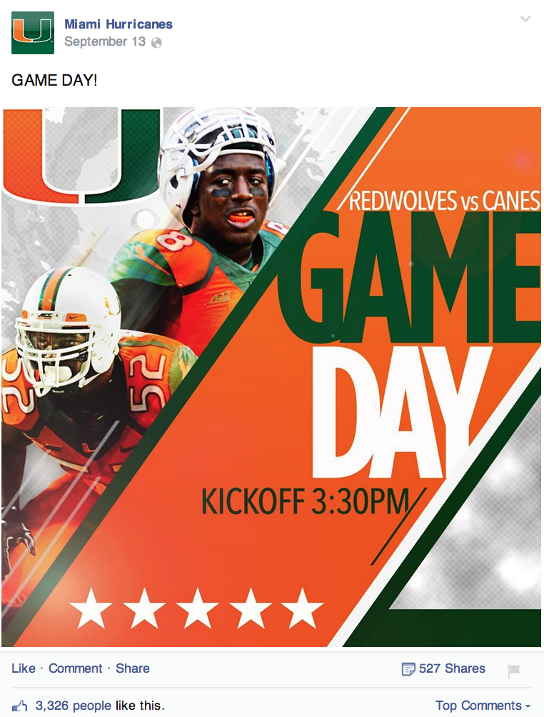
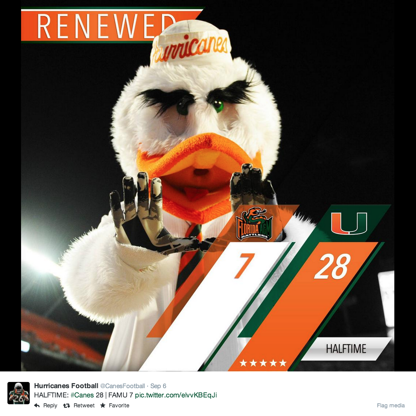
Teams are a brand. They represent something bigger than scores—they represent a university and a whole community of people. I think it’s crucial that schools have some consistency in their look and feel across all platforms. And, Miami is a good example of this. They have taken the time to put together a style guide and it shows. Their images are consistently sharp and on brand:
Takeaway: Take the time to work through a design guide exercise. Your social media platforms aren’t just a broadcast channel for scores; they are a reflection of the brand, the university and the community.
No. 3 – Empowering fans to cheer.
Miami is taking their social media images and encouraging fans to use them as cover photos. It’s not anymore work for their staff, but simply a different way to repurpose content:
Time to update your cover pic, it's #BeatNebraska weekpic.twitter.com/a0YYmqewpf
— Miami Hurricanes (@MiamiHurricanes) September 15, 2014
Add some JUICE to your social media profiles… New cover photo honors Duke's 2000+ career yards at The U. pic.twitter.com/ZHQqNEKA3C
— Miami Hurricanes (@MiamiHurricanes) September 7, 2014
Takeaway: A fan base, no matter how passionate, can sometimes use a little nudge when it comes to spreading team love. Look at your existing content and see how you can encourage fans to participate and engage. It’s easy to hate on calls to actions, but sometimes your fans need a little nudge.
No. 4 – A sense of humor.
No explanation is needed for this:
Initial reaction to Brad Kaaya’s two long distance passes. @TheRock approves. pic.twitter.com/JOAhQ2Px9a
— Miami Hurricanes (@MiamiHurricanes) September 13, 2014
KAAYA TO DORSETT. AGAIN! TD! pic.twitter.com/YYkUcSixWC
— Miami Hurricanes (@MiamiHurricanes) September 13, 2014
Takeaway: This is football (and sports). It’s supposed to be fun, so let’s not take ourselves too seriously. Miami has found a great balance between having a sense of humor and still being on brand. Take note from them and don’t be afraid to have a sense of humor. If you try it, just be sure to listen to your fans to see how they respond to it.
So, what stands out to you about Miami’s social media presence? Be sure to leave your thoughts below!
0

