National Signing Day has turned into a major production for athletic departments thanks to social media and the digital space. It’s now an opportunity to showcase a school’s brand, give fans an inside look and tell a broader story.
This year’s coverage of National Signing Day blew me away. Athletic departments stepped up their digital presence, social content and all-around coverage. There was so much creative energy poured into the day. I took notes of what stood out to me and have broken down a high level look at what some of the schools did for National Signing Day 2015. I hope the work inspires you in what you do:
AUBURN
Auburn did a good job with their coverage across social and digital, making their platforms the go-to source for their fans. Auburn’s initiatives included a six-hour live signing day show, a digital signing day hub, social content and more.
Microsite
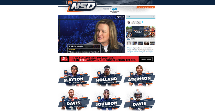
Auburn created a microsite and a digital signing board that made it easy for fans to see quickly who was in. The design on auburntigers.com was clean and crisp:
Social Content
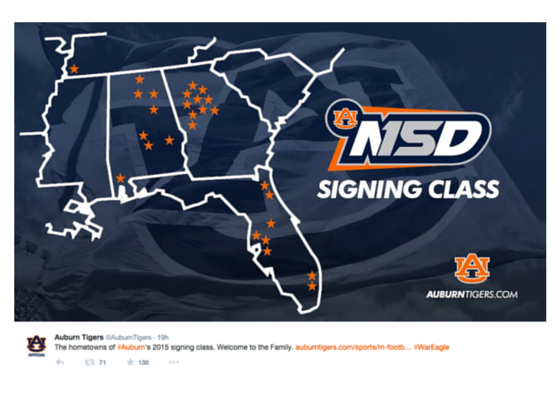
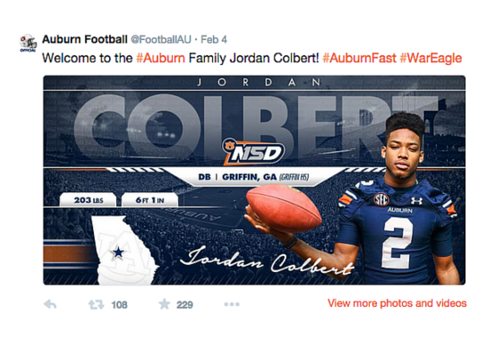
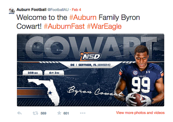
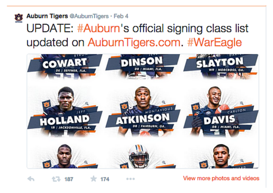
In addition to a really crisp microsite, Auburn prepared signee graphics to push out on the Auburn Football accounts (Twitter and Facebook), along with teaser graphics pointing people back to their signing day hub. Here’s a look at some of their social content:
They also hosted a behind-the-scenes photo gallery on Facebook that was updated throughout the day. It was a great way to get fans “in the room”:
Auburn wrapped up their coverage with a couple great videos. First, they created a YouTube playlist of all the signees’ highlights:
They also created two videos. One that gave a behind-the-scenes look at signing day and another one that explained what brought some of the new Tigers to The Plains:
ARKANSAS
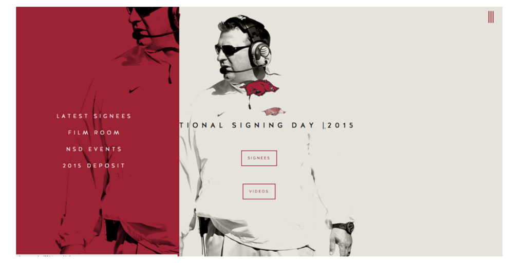
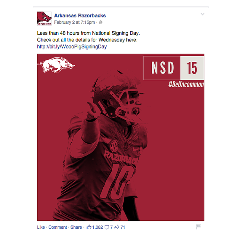
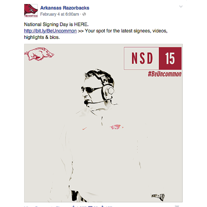
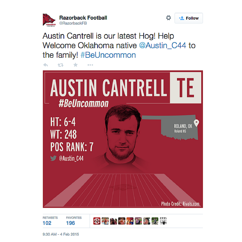
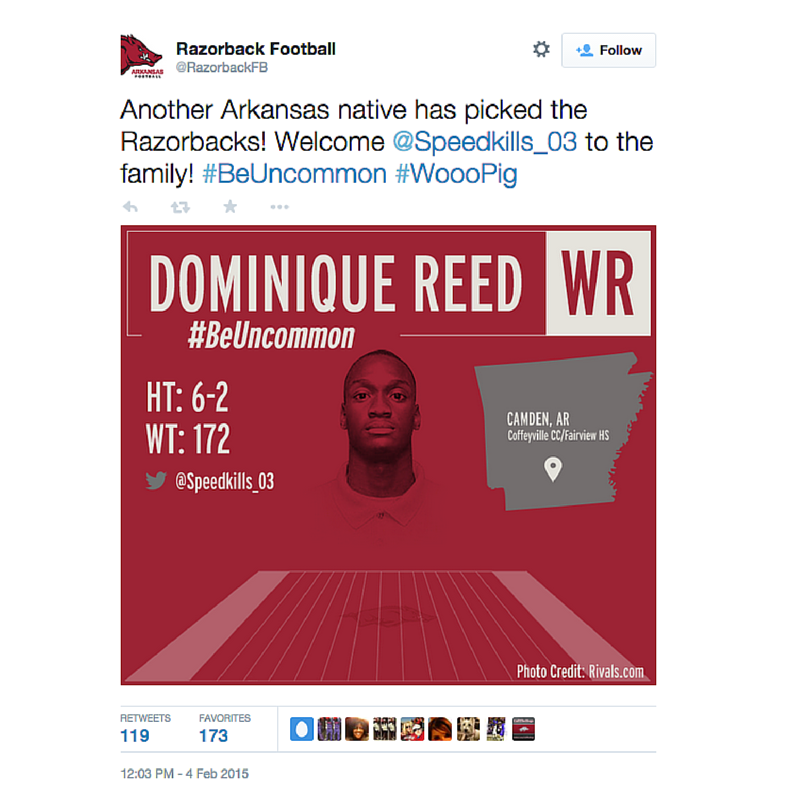
Arkansas has created a simple and sharp look for their entire brand and carried it into National Signing Day. It’s crisp and clean. The Razorbacks also promoted the hashtag /theme #BeUncommon, turning NSD into a broader campaign.
Microsite
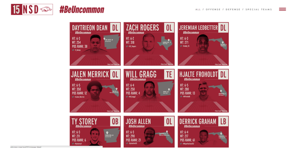
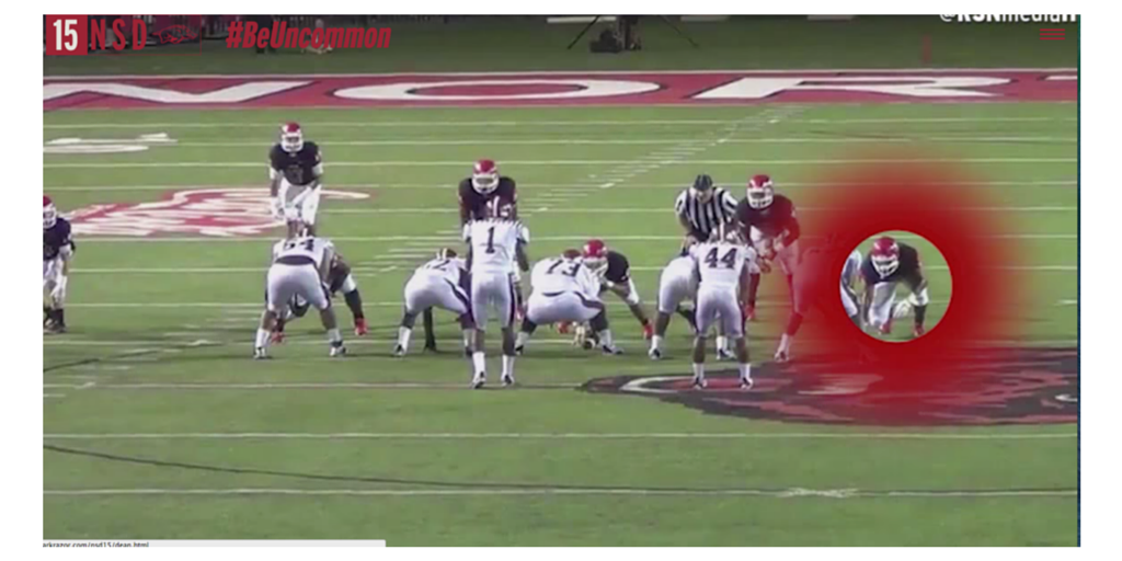
Their microsite was easy to navigate and follow. It promoted their live show, signees, highlights and NSD events. The players’ pages featured a nice highlight front and center with a bio at the bottom. The design is a great example of how sometimes simple and sleek is best:
Social
Arkansas carried the same look and feel from their microsite to their social content. It was nice to have the same look and feel throughout:
CAL ATHLETICS
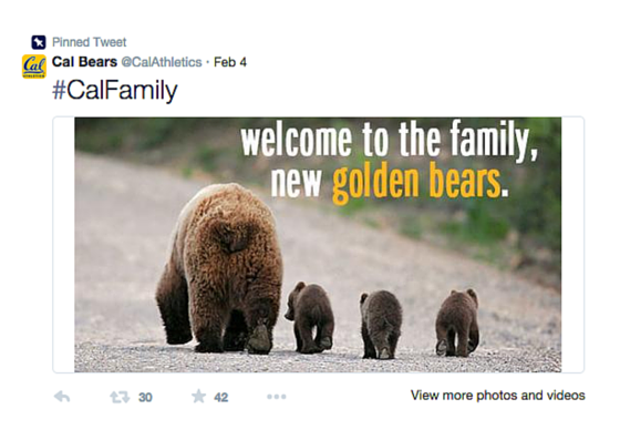
Cal focused on a theme of welcoming signees to their family. The sentiment is a strong angle to take because it resonates with both the signees and the fans. Heres’s a look at what they did across digital and social.
Website
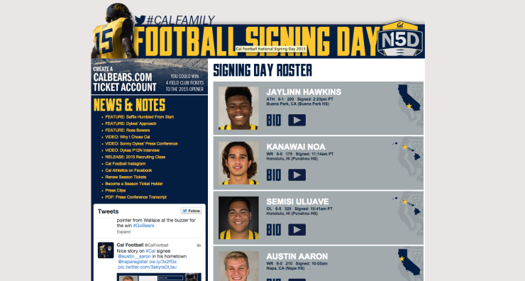
Cal’s website offered a quick look at who was on board, linking to more info on each student-athlete if fans wanted it:
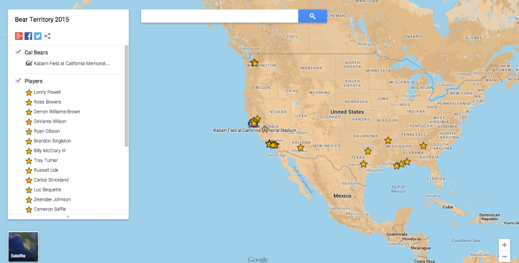
Cal also hosted a map called Bear Territory 2015 that tracked where each of their signees came from. This is a really simple and smart way to leverage Google Maps:
Social
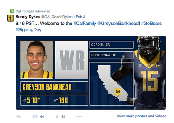
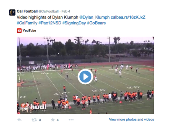
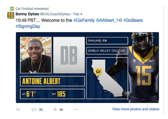
From a social standpoint, they leveraged their athletic department account, football accounts and Coach Dyke’s account. On Twitter, they used Coach Dyke’s account to share their signee graphics and then @CalFootball followed up with the signee’s highlights. Here’s a look at the content:
They also hosted a Facebook Q&A with some of the signees and coaching staff, which is a great way to allow fans to interact:
CLEMSON
Clemson’s coverage had a heavy social and video focus that gave fans an inside look at the day. Their team got creative with their social and video content.
Social
From a social standpoint, Clemson did a great job teasing National Signing Day coverage. Anytime you put effort into a big day like this, you have to think about it as a campaign. It’s not a one-day push but a larger campaign with a beginning (the tease), middle (actually day) and end (capitalizing on all the excitement). Here is a look at their teasers:
Who will join the #ClemsonFamily on #NationalSigningDay? Follow us for OFFICIAL updates & exclusive content! https://t.co/unm701HalN
— Clemson Football (@ClemsonFB) February 3, 2015
It’s worth noting that both Vines have more than 160K loops. Fans clearly enjoyed the content!
Video
From a video standpoint, Clemson focused on two main pieces. The first piece was a feature of their 15 mid-year enrollees. It was a great way for fans to get to know the student-athletes:
The second feature was a behind-the-scenes piece of NSD at Clemson and their party. From the looks of it, their staff sure knows how to have fun:
COLORADO STATE
The Rams put together a great instant reaction video and social graphics. Here’s a look their work.
Instant Reaction Video
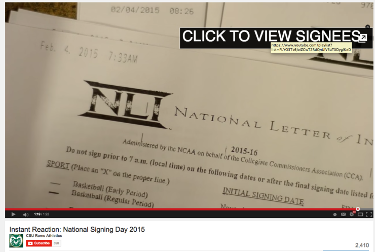
For their first official LOI of the day, CSU created an instant reaction video. The video gives a great inside look at coach’s reaction and the phone call he has with their newest member of the Ram family. While it would be hard to do a video like this for all signees, I love the idea of doing a reaction video for the very first one that comes in. It gives fans a great inside peek at the process:
Additionally, the end of the video prompts you to a great playlist of the signing classes’ highlights. This is a great use of YouTube annotations:
Social
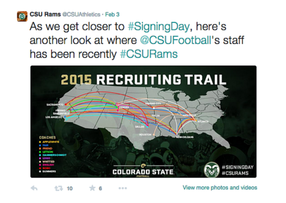
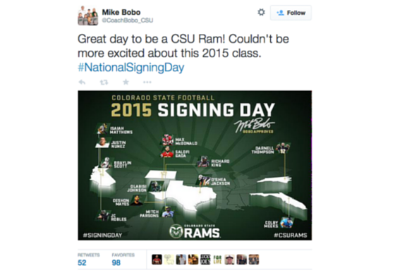
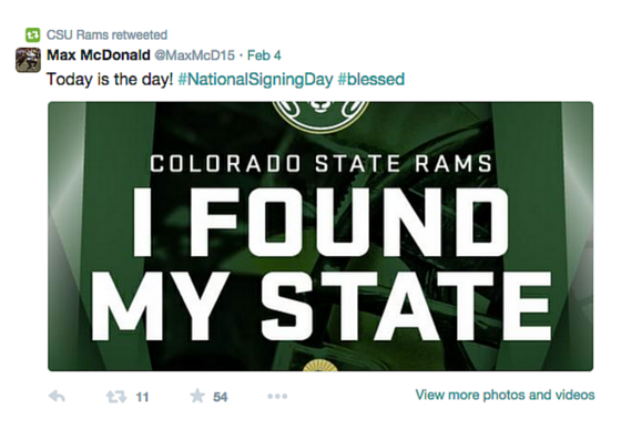
On the social side, the team at CSU created some really strong summary graphics showing where the coaches traveled during the recruiting process and where their new signees came from. This year they also sent graphics to their signees to post on Twitter and Facebook that shows they committed to Colorado State. It was all based off the university branding.
HOUSTON
Houston took the signee day graphics up a notch and turned them into animations. Here’s a look at a few of them here:
.@UHCougarFB just got better with the addition of Jordan Milburn to the Cougar family! #GoCoogs #UHNSD #PlantTheFlag pic.twitter.com/ejJJWBEhCR
— Houston Football (@UHCougarFB) February 4, 2015
.@UHCougarFB welcomes its latest signee @OvO_Cam5 to the family! #GoCoogs #UHNSD #PlantTheFlag pic.twitter.com/931Iz9Ywxd
— Houston Football (@UHCougarFB) February 4, 2015
MINNESOTA
Minnesota had a very fan-friendly signing day hub and stellar social graphics. Their work is a great example of how good execution doesn’t mean it has to be complicated.
Microsite
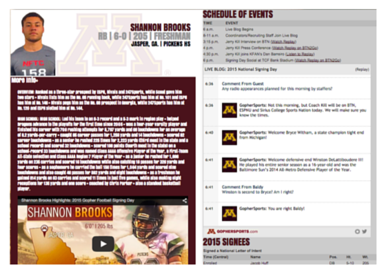
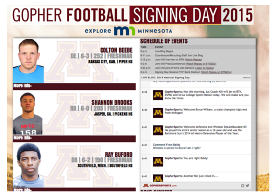
What I love about Minnesota’s National Signing Day hub is that fans didn’t have to leave the page for any information. The layout allowed fans to see a quick hit of who signed, but also expand for more details and highlights. They also hosted a live blog on the site where fans could interact and ask questions:
Social
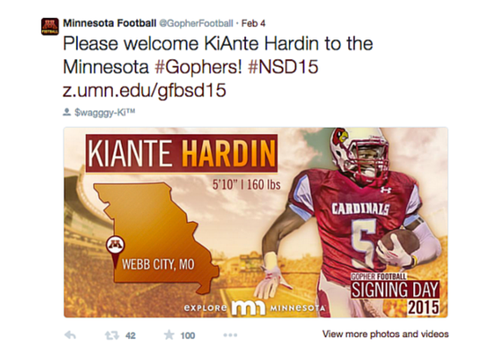
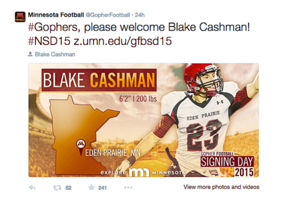
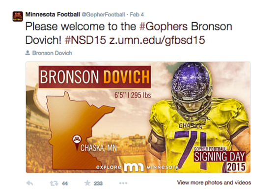
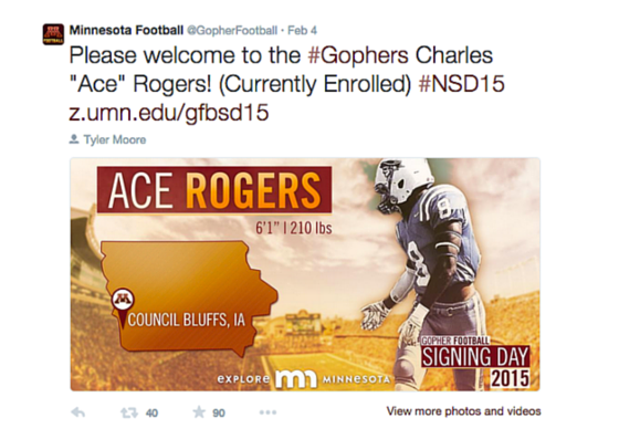
From a social perspective, Minnesota’s signee graphics really stood out with the color treatment:
NEBRASKA
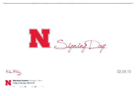
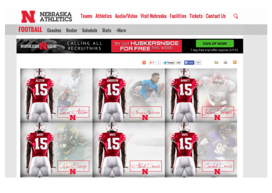
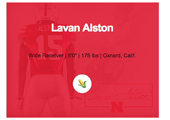
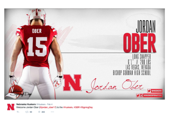
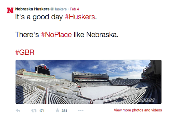
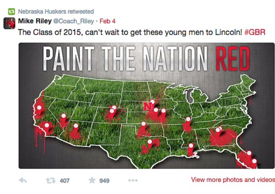
Across social and digital, Nebraska had a look that was clean, sharp and fresh. The subtle autograph integration across their content was a nice touch. After all, it is National Signing Day.
OKLAHOMA
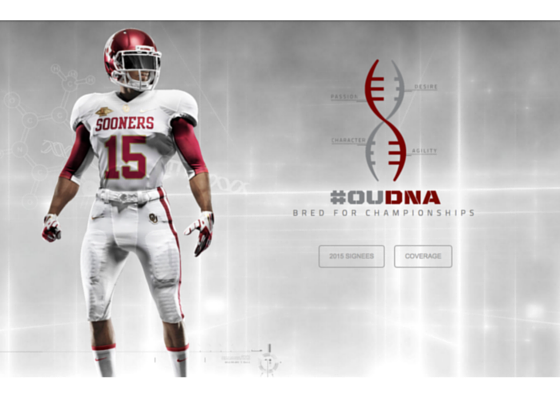
From a strong digital presence to great social content, Oklahoma nailed their coverage this year. Their look across the board was sharp and consistent. It’s evident they “get” their brand. They created a theme around signing day, focusing on “OU DNA”. It was ventolin-albuterol.com into their social content, digital presence, etc. I love when teams think about big moments, seasons, etc. as campaigns; it’s a great way to tell a stronger and more emotional story.
Microsite
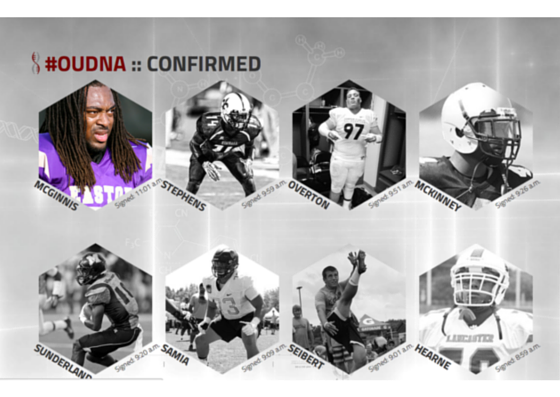
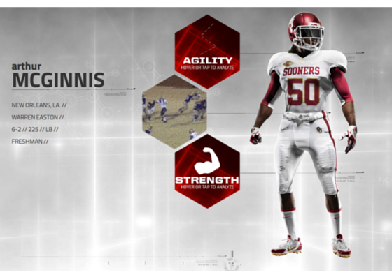
Oklahoma’s microsite was phenomenal. The DNA theme was carried over into the design, and it was easy to use and fun to explore. Their player bios allowed fans to “tap and explore” the highlights that showcased agility, power and strength.
Social
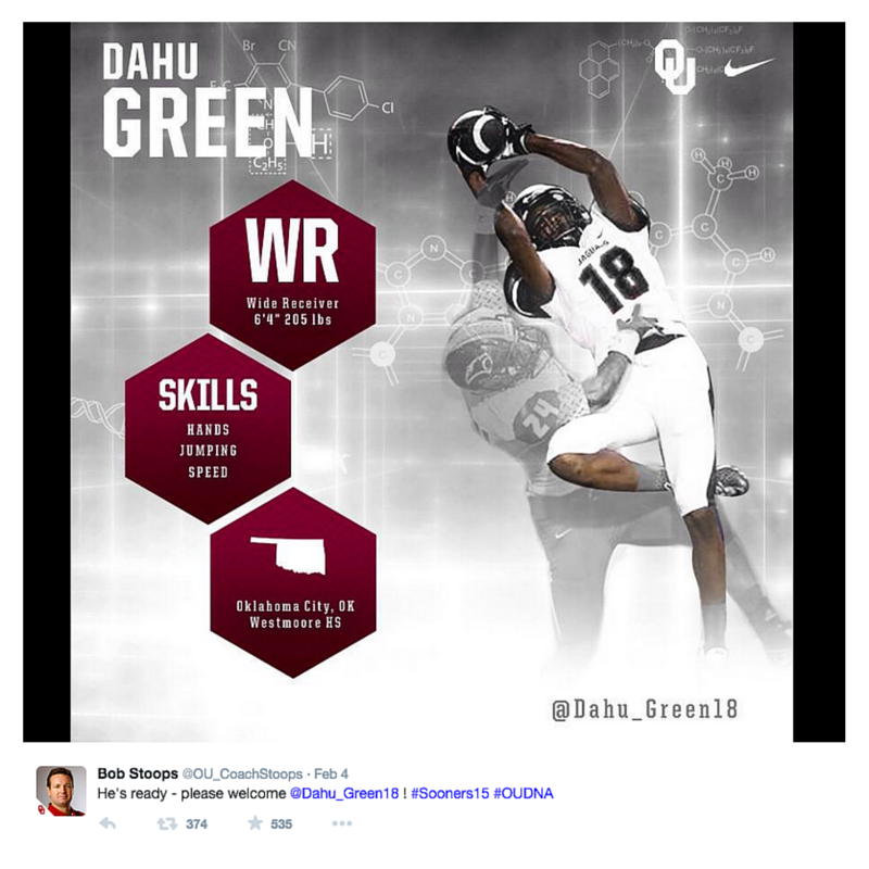
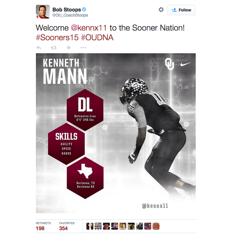
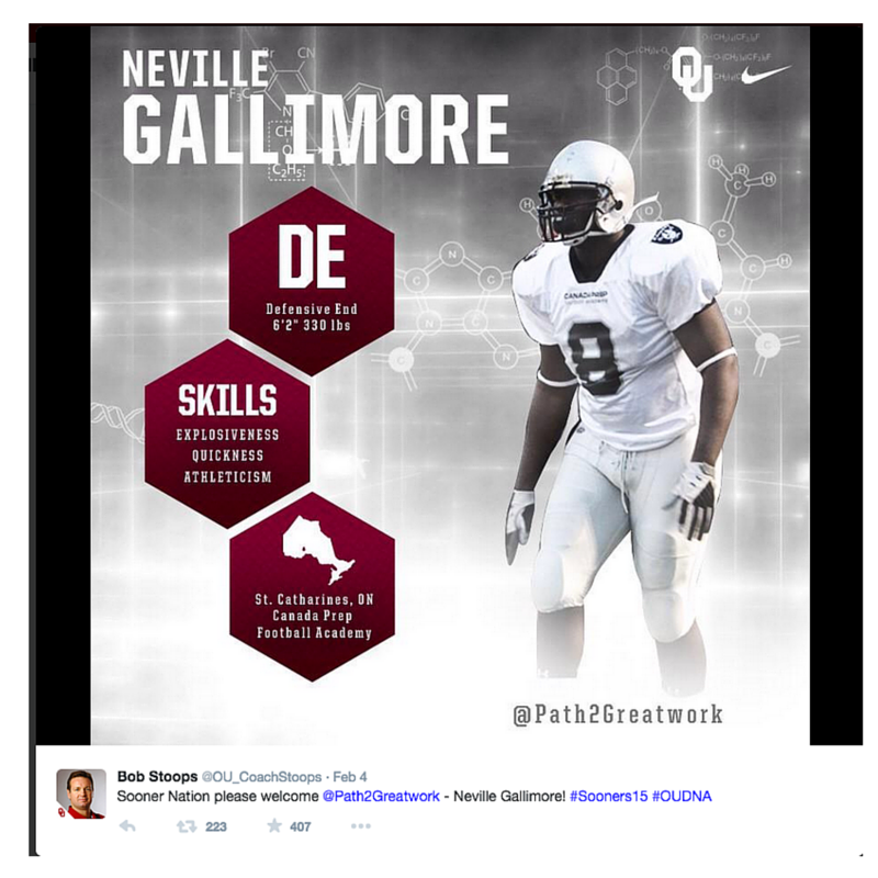
On Twitter, Oklahoma leveraged Bob Stoops account to tweet out each signee graphic and then @SoonerFootball retweeted them. The graphics were inline with their microsite and they promoted the hashtag #OUDNA.
OKLAHOMA STATE
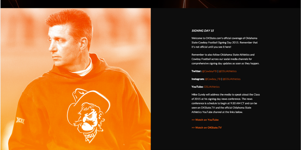
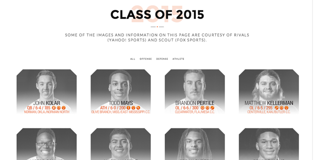
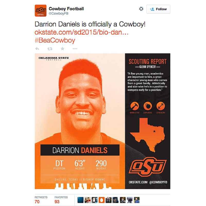
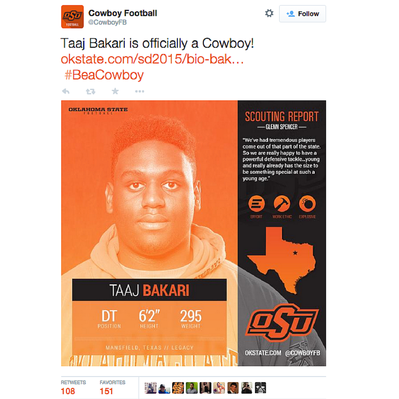
Oklahoma State created a sharp and consistent look across their digital and social efforts. Below are snapshots from their microsite:
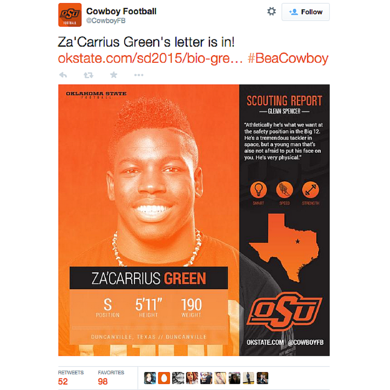
And here’s how their content looked across social. The icons used to promote each player’s strengths is a great idea:
OREGON
Sometimes simple is best. Oregon’s signing day graphics were a great example of this:
Congrats @MalikLovette! Welcome to the Oregon Family. #MenOfOregon #GoDucks #NSD #Pac12NSD pic.twitter.com/jJanQ3XMhJ
— OregonGridiron (@OregonGridiron) February 4, 2015
OREGON STATE
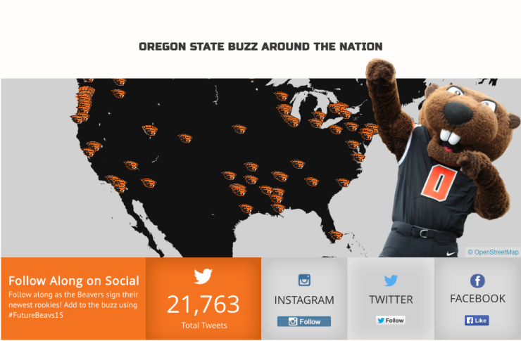
Oregon State rallied around the social conversation. They promoted the hashtag #FutureBeavs, tracked the conversation online for fans (and had 21K+ tweets) and then showcased the conversation at their team’s dinner.
TVs are up and running at tonight's dinner. Use #futurebeavs15 and see your tweets up there. #smsports #GoBeavs pic.twitter.com/zOsamnfX0n
— Oregon State Football (@BeaverFootball) February 5, 2015
Penn State
When PSU made an accidental phone call, they found a way to turn it into a piece of content. This is a great example of looking for content when you least expect it:
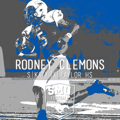
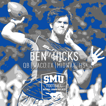
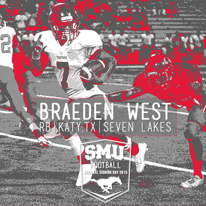
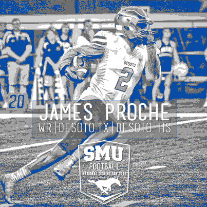
SMU
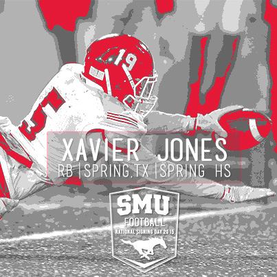
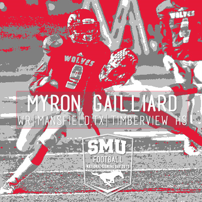
SMU designed some stellar graphics in house. Here’s a look at what they shared across Facebook, Twitter and Instagram:
I also love how SMU had some fun with the good ‘ole fax machine:
TENNESSEE
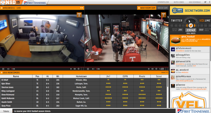
Tennessee created a “war room” where fans could get live coverage all day. The theme for them was building “brick by brick”. They integrated the theme throughout social with a #BrickByBrick hashtag and into the war room by physically laying down a new brick each time a LOI came in. Tennessee nailed the concept around brick by brick, integrating it across the board.
Digital Hub
This is a snapshot from their signing day hub. You can see the brick wall they built on the “war room” cam. Access like this is stellar; it makes fans feel like they are a part of the journey.
Social Content
Brick by brick was also integrated into their social content.
NEW BRICK IS IN: Pleased to welcome Eli Wolf (@eliwolf16) as the newest member of #Team119! #VolFamily #VolsNSD15 pic.twitter.com/IHGL5HQOlX
— Tennessee Football (@Vol_Football) February 4, 2015
Defensive Lineman @qpicou9 is the next #Brick to the foundation. Welcome to the family! #VolsNSD15 pic.twitter.com/XIPrNLLasG
— Tennessee Football (@Vol_Football) February 4, 2015
#BricksOnBricks pic.twitter.com/I4NMPKGGj5
— Tennessee Football (@Vol_Football) February 4, 2015
USC
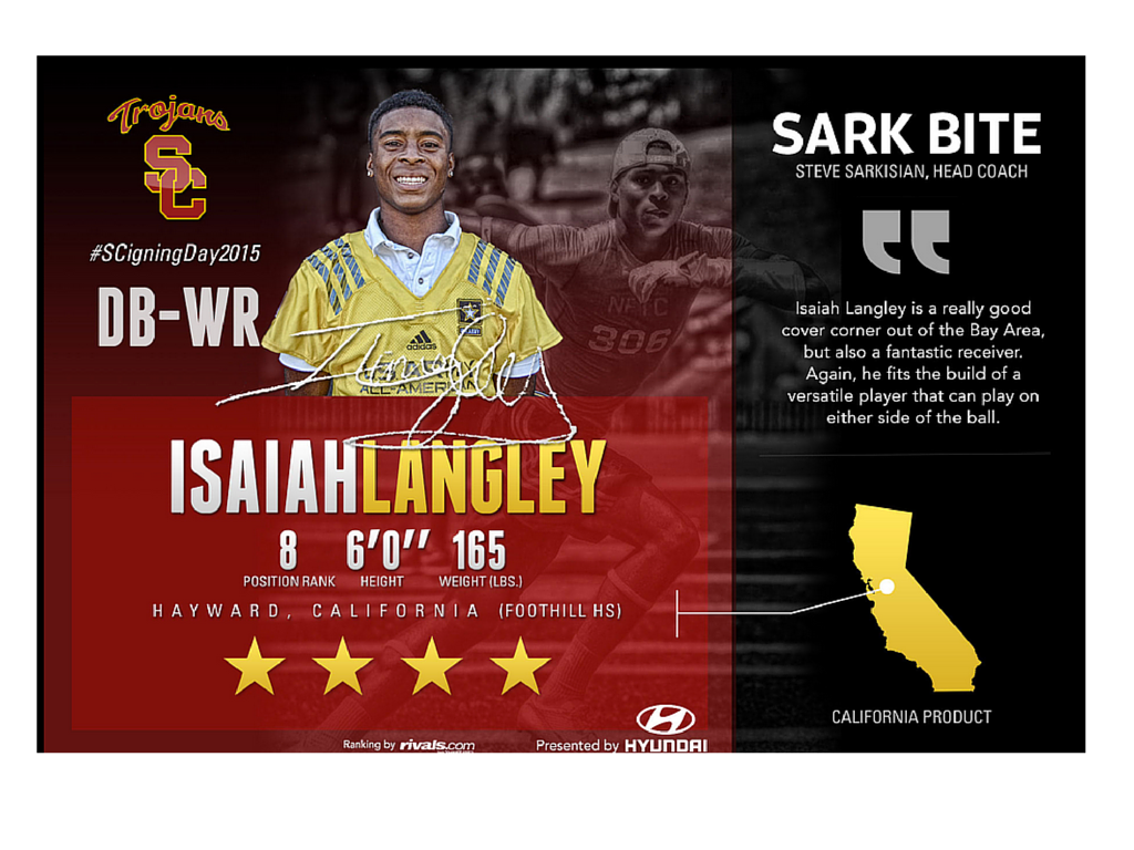
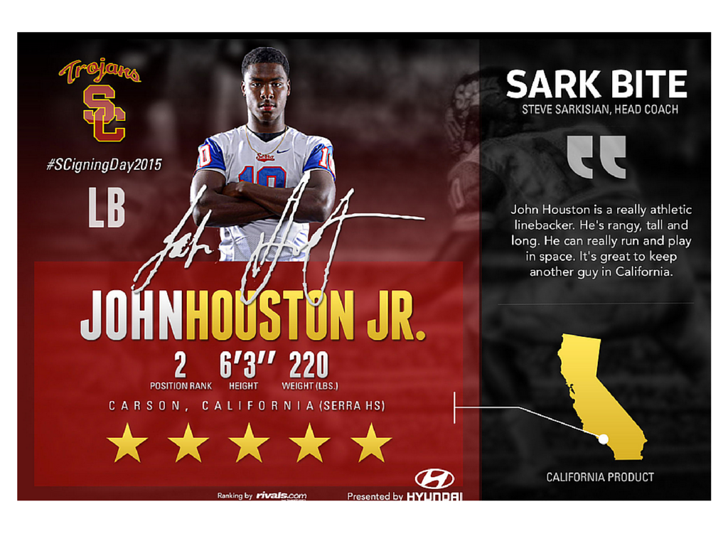
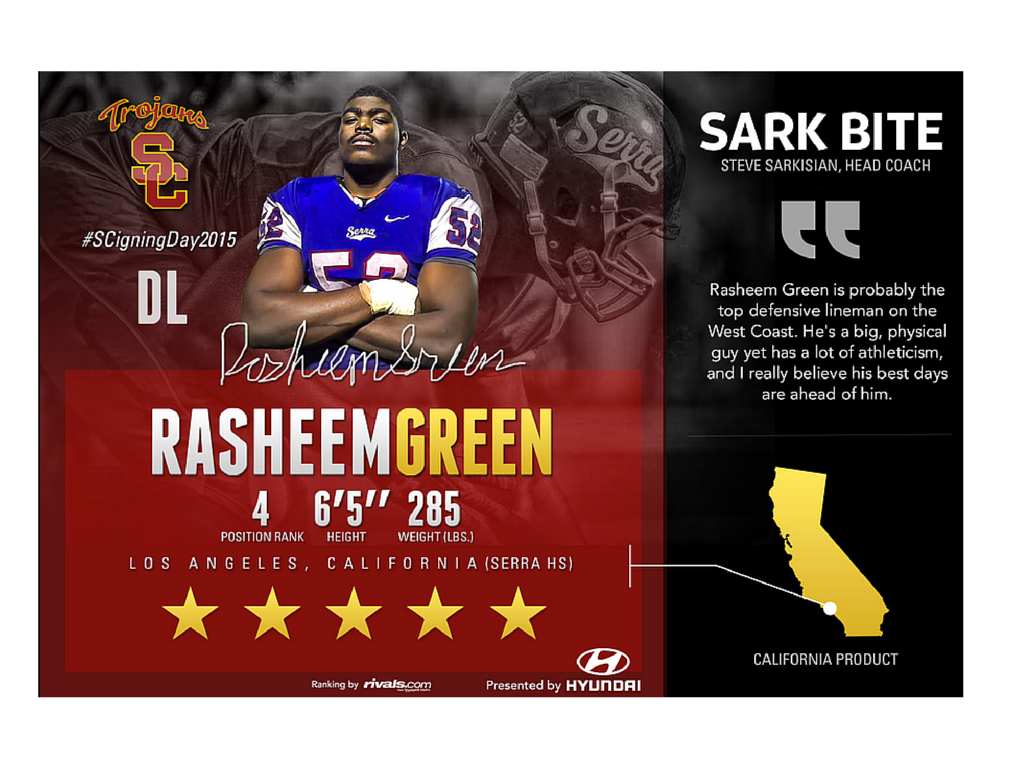
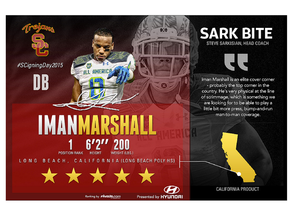
The signee graphics from USC were pretty sharp. The soundbite from their coach about each student-athlete is a great touch:
WASHINGTON
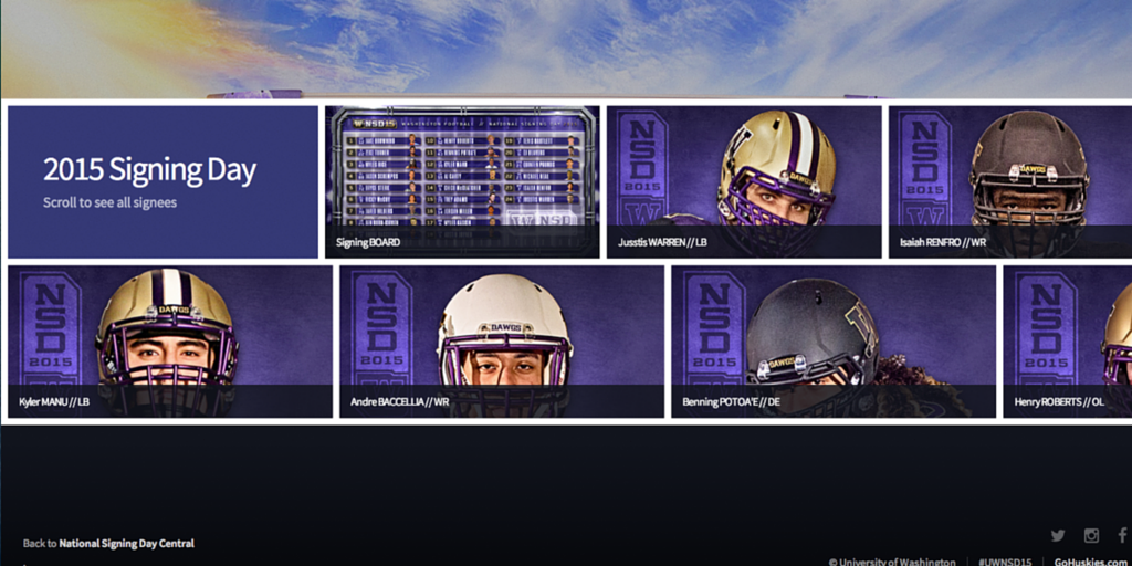
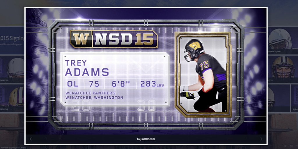
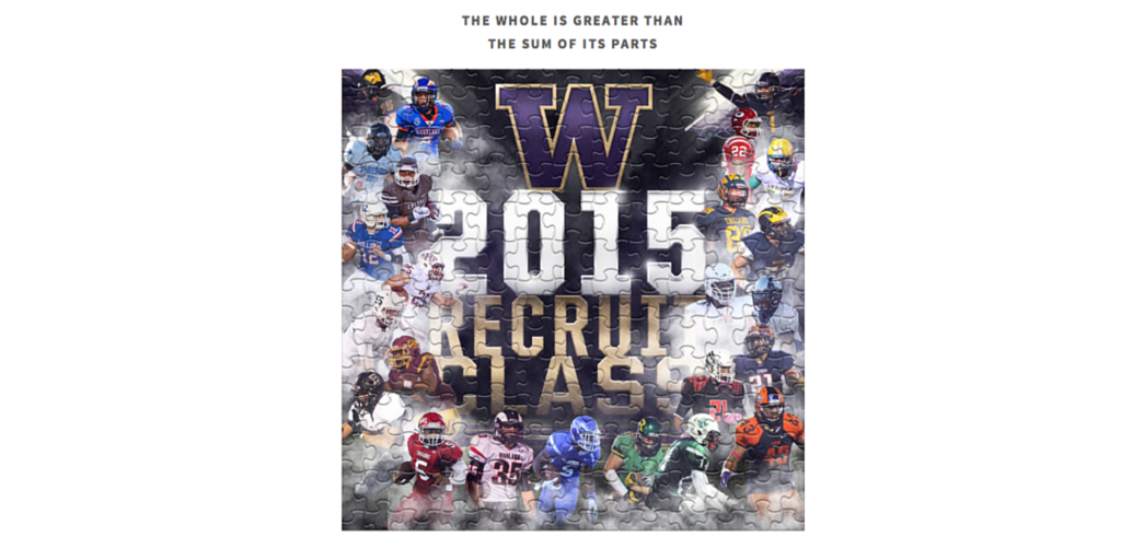
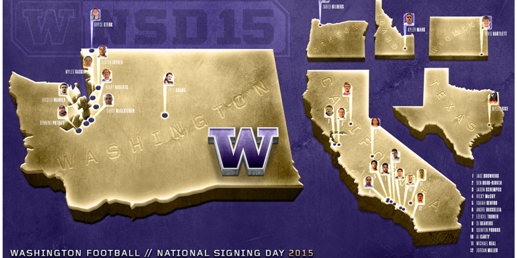
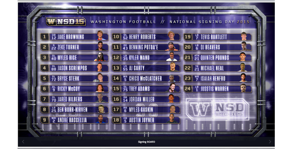
Washington nailed it from a digital perspective, thinking strategically about their fans. Brian Wagner, Manager of Digital Media, had a smart and sharp idea when the Seahawks made it to the Super Bowl: He needed to design for mobile first in case the Seahawks won. If the Seahawks had won the Super Bowl, there would have been a parade during the heart of National Signing Day. So, Brian and team designed a light and responsive site that would have worked well for parade attendees if there had been one. The site also included fun pieces like a signing day puzzle, map of the signees and more:
BONUS
And finally, pro teams got in on the action:
Matthew Stafford was one of two #Lions that were 5-star recruits on #NationalSigningDay. Can you name the other? pic.twitter.com/LIPKxx288C
— Detroit Lions (@Lions) February 4, 2015
It's #NationalSigningDay. RT if you're committing to your Phoenix Suns today. #SunsSigning #KidsThatIsAFaxMachine pic.twitter.com/ihmv6Far13
— Phoenix Suns (@Suns) February 4, 2015
Here's how #Redskins on the active roster were rated leading up to their #NationalSigningDay | http://t.co/QlxZJ9whZg pic.twitter.com/shrsRdXlbm
— Washington Commanders (@Commanders) February 4, 2015
I know there was a lot of other great work done on National Signing Day, so please be sure to share some of the things you loved from the coverage below!
Thanks for reading!
