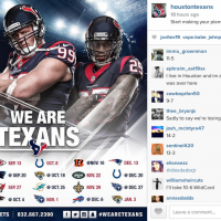
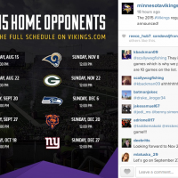
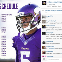
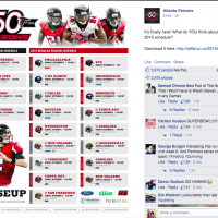
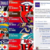
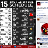
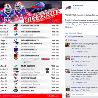
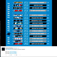
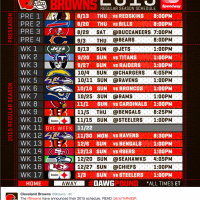
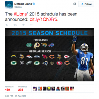
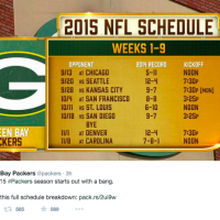
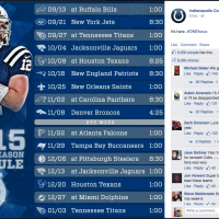
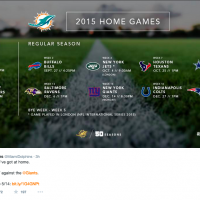
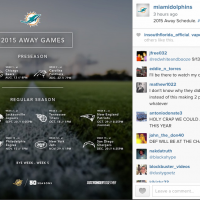
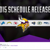
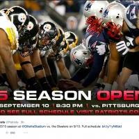
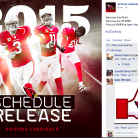
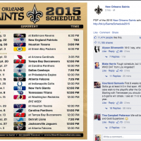
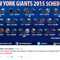
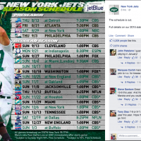
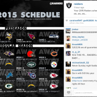
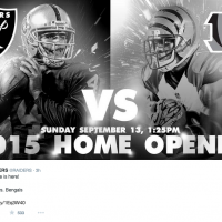
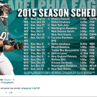
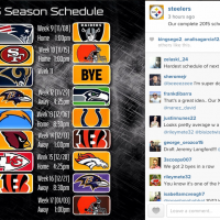
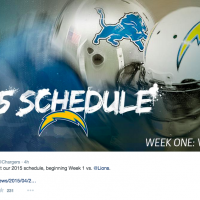
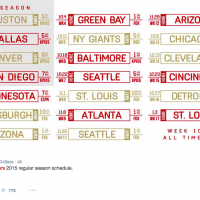
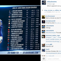
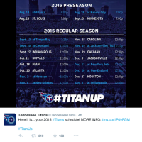
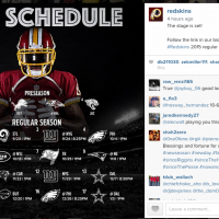
The NFL schedule release is a big day now for sports fans and teams. Social media gives the league and teams an opportunity to drum up excitement for the upcoming season like never before. And of course, most teams are taking advantage of that opportunity. Some teams opted to publish the schedule in its entirety on their platforms, while others drove people to their websites . Whatever the approach, here’s a look at the schedule graphics from each team:
In addition to solid graphics, there were several trends that stood out from the NFL schedule releases that would apply to other big announcements. If you are planning on releasing big news or information, then consider these tactics that NFL teams used:
Countdown.
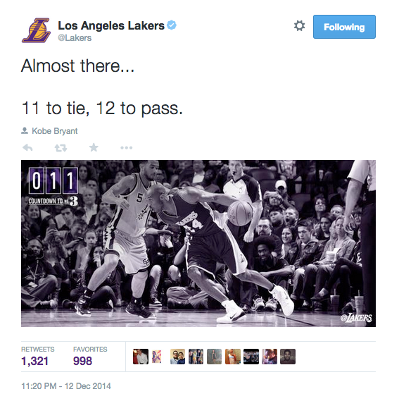
Many NFL teams reminded fans about their schedule release through countdown graphics and copy. When drumming up excitement for opening day, a big announcement, etc. a countdown is always a good way to go. Not only does it drum up excitement for fans, but it also keeps the date and time top of mind.
Six hours until the 2015 NFL schedule is released! Which matchup are you most excited for?http://t.co/pmItD4HWkg pic.twitter.com/bfSxHpE3Ad
— Detroit Lions (@Lions) April 21, 2015
One. More. Hour. pic.twitter.com/9HSxPWl9tp
— Miami Dolphins (@MiamiDolphins) April 21, 2015
What do you mean we have to wait one more hour?!? pic.twitter.com/5CuTwZ5cqS
— Minnesota Vikings (@Vikings) April 21, 2015
15 minutes until kick off of the announcement of the 2015 schedule. #Steelers pic.twitter.com/Srd34dX1yY
— Pittsburgh Steelers (@steelers) April 21, 2015
Give an emotional tease.
During schedule releases and big announcements, fans are filled with emotions. Tap into the emotion by teasing the fans throughout the day with content that pulls at them, like GIFS. Here are a few examples from NFL teams (some of these also fall inline with the countdown):
When that #NFLSchedule is released… pic.twitter.com/CnTMvxWKbh
— Arizona Cardinals (@AZCardinals) April 21, 2015
Coming soon. #ONEfocus pic.twitter.com/VluBGW2NhL
— Indianapolis Colts (@Colts) April 21, 2015
#Saints schedule will be posted in 2 hours!!! pic.twitter.com/Hr1WLuEVg5
— New Orleans Saints (@Saints) April 21, 2015
Tell the story in a different way.
It’s easy to default to copy and graphics to tell the story when working on an announcement or social media plan leading up to a big event. There are many ways to tell a story though, so be sure to capitalize on all of them. Here are a few examples of how NFL teams tackled their schedule release a little differently, from the schedule in a Vine to unique video content:
Here's a game-by-game look at the 2015 #Packers schedule.https://t.co/DoyGf3gThH
— Green Bay Packers (@packers) April 22, 2015
Here's what your Fall looks like. Plan accordingly.
Single Game Tickets on sale May 14th: http://t.co/vOXYKsvl8Xhttps://t.co/gZ90lSbXve
— Miami Dolphins (@MiamiDolphins) April 21, 2015
The wait is over.
View the 2015 #Chiefs Schedule in photos: http://t.co/4uXdt3ssaT pic.twitter.com/VF3syZj1hA
— Kansas City Chiefs (@Chiefs) April 22, 2015
The 2015 #Chiefs schedule is finally here. Week 1 at Houston #KCvsHOU | 9-13 | Noon https://t.co/ITcfWiYvSa
— Kansas City Chiefs (@Chiefs) April 22, 2015
https://instagram.com/p/1wdmTzJOSp/?taken-by=raiders
Keep the momentum going.
Many NFL teams kept the momentum going by linking backing to interesting content on their websites and sharing interesting tidbits. With any kind of announcement or big moment, it’s important to keep the momentum. Don’t announce and walk away, but instead, find ways to engage and share content throughout the day:
Five primetime games. History for Peyton #Manning?
Analyzing the #Broncos' 2015 schedule: [http://t.co/nnwQwozJ1a] pic.twitter.com/kcXBQ9O6R5
— Denver Broncos (@Broncos) April 22, 2015
8 key notes on the #49ers 2015 regular season schedule.http://t.co/H79jTj1FPA pic.twitter.com/shqJ3z3lln
— San Francisco 49ers (@49ers) April 22, 2015
Falcons will open the 2015 regular season at home on #MNF vs. the @Eagles. #RiseUp
— Atlanta Falcons (@AtlantaFalcons) April 22, 2015
As you digest the #Redskins 2015 schedule, here are a few more tidbits to chew on.
READ | http://t.co/Vi1RTGtJY6 pic.twitter.com/jIy8s17QGd
— Washington Commanders (@Commanders) April 22, 2015
The #Panthers will play on Thanksgiving for the first time in team history.
Schedule Notes: http://t.co/k1EV1juQ6n pic.twitter.com/d5Fk3aBusU
— Carolina Panthers (@Panthers) April 22, 2015
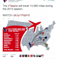
The #Texans will travel 14,060 miles during the 2015 season.
WATCH: http://t.co/XsrIaD6fgU pic.twitter.com/baed87NBmU
— Houston Texans (@HoustonTexans) April 22, 2015
So next time you are ramping up for a season opener, big event or announcement, remember these tactics from the NFL: Count it down, give an emotional tease, tell the story differently and keep the momentum going. If you do this, you will be sure to make a big splash!
What stood out to you about the 2015 schedule release content from NFL teams? Share your thoughts below!
Thanks for reading!
