There are moments in sports that everyone seems to rally around. Moments where inevitably people will watch and pay attention. From championship games to historic milestones, these moments are worth investing in. And, Kobe Bryant’s Jersey Retirement Ceremony is a good example of that.
The internet went crazy with content the day the Lakers retired his jersey. And, there was inspiration everywhere from the Lakers fantastic digital pieces to Bleacher Report’s array of unique content.
Below are a few highlights and takeaways from Kobe’s big jersey retirement day:
1 – Quantity requires diversification.
Bleacher Report pushed out a lot of content around Kobe’s jersey retirement. The difference between their push from others though is how much they vary their content. Bleacher Report has a tone of diversity in their content strategy from illustrations to tribute videos. Below are a few highlights:
The sports world congratulates Kobe. pic.twitter.com/2LWdFbvpSO
— Bleacher Report (@BleacherReport) December 19, 2017
Unstoppable…from one era to the next. #Ko8e24 pic.twitter.com/hnELh8rmTh
— Bleacher Report (@BleacherReport) December 18, 2017
The publisher mentality is detrimental to content performance unless pieces offer variety, value. Bleacher Report’s coverage of Kobe’s jersey retirement is a great example of that.
2- Dynamic can be simple.
The GIF below was one of the stronger pieces of content from the day. It’s simple, sure, but it’s eye-catching and evokes emotion. Good content doesn’t have to be complicated. This is the perfect example.
Let's have some fun tonight!! #Ko8e24 pic.twitter.com/prYSXIwL49
— Los Angeles Lakers (@Lakers) December 18, 2017
3 – Split screens are underrated.
There was something powerful about watching the split screen of the jersey’s rising and Kobe’s reaction. And while the split screen is often a broadcast play, it’s underrated as a specific social content piece.
A split screen execution can showcase different perspectives, evolution, comparison, tension. All of which work well in social. It might be time to think about incorporating them into your content arsenal.
Forever immortalized 🐍#Ko8e24 pic.twitter.com/qB3HaO9rRs
— Bleacher Report (@BleacherReport) December 19, 2017
4- There’s something about tension.
The Utah Jazz created a beautiful tribute video to Kobe. The Jazz did a beautiful job weaving in the story of Kobe, the Jazz and the love / hate. This wasn’t an instance of FOMO; they focused on the role their brand played in the story of Kobe. There’s a bit of tension in the piece and that’s what makes it work.
LOVE | HATE – Thank you, @kobebryant https://t.co/rci5Owxhn9
— Utah Jazz (@utahjazz) December 19, 2017
5- Access still wins.
The sports space is crowded now. The competition includes teams, leagues, bloggers, media and even fans. And in this crowded space, one thing most teams or leagues can offer that others can’t is access. No matter what, you always add value if you give a look behind the curtain.
The man of the hour has arrived 🐍 #Ko8be24 pic.twitter.com/ZavAPETeD3
— Los Angeles Lakers (@Lakers) December 19, 2017
https://www.instagram.com/p/Bc3q7y0F9yx/?taken-by=nba
6- Long-form has its place.
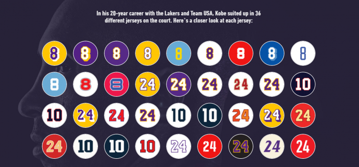
The Lakers produced several, beautiful pieces on their site that allowed fans to dig deeper. From the chapters of his career to a unique piece on jerseys, their digital content fed the fans who wanted more Kobe content. Check out the two pieces below.


Social doesn’t always allow for the full story, so during big moments, we can’t neglect long form. If you deliver on the content and the design, fans will spend time consuming.
When it mattered, a lot of brands stepped up their content game yesterday to honor Kobe. What stood out most to you?
0