The offseason presents an interesting opportunity for teams to try new things. It’s a time where the scores don’t impact the approach. Teams can let personalities shine, show a different side to the organization and push the boundaries a little more. And, there’s something freeing about that.
The Knicks are one of the NBA teams whose offseason coverage has been strong. They haven’t been afraid to mix it up. From a fresh new graphics package to tapping into the NYC lifestyle, they’ve made the most of the offseason. Below are a few highlights that have stood out:
Lifestyle content.
Sports teams are lucky. They have a product that consumers want to identify with. It’s not just transactional. It’s emotional. And, as such, teams should tap into the opportunity.
This offseason, the Knicks created a “Knicks Summer” content series that shows how their brand is part of the fabric of their fans’ lives. In the series, they showcase fans doing NYC summer things and in Knicks gear of course. The creative feels like a lifestyle shoot that you would see from the likes of a Nike, Under Armour or adidas. Check out a few examples below:
Family First. #KnicksSummer pic.twitter.com/m2uGpmu06s
— NEW YORK KNICKS (@nyknicks) August 19, 2018
Puppy love 🐶 #KnicksSummer pic.twitter.com/u8T8vFypcr
— NEW YORK KNICKS (@nyknicks) August 15, 2018
The content is relatable for their fans and effortlessly cool. If someone was scrolling through their feed it would be easy to think the content was coming from an IG style influencer. More teams should start thinking about all the ways their brand seeps into fans beyond the game. Content like this not only deepens the relationship with fans — but it also, for example, can help sell merchandise.
A look BTS.
From offseason training to watching the World Cup, the Knicks have done a good job of giving their fans a glimpse of what their players are up to this offseason. The content is simple but engaging, proving that behind-the-scenes content does not need to be a labor-intensive piece.
Last season was just the beginning for @TreyBurke 🤫 pic.twitter.com/Vg3HtUqHE2
— NEW YORK KNICKS (@nyknicks) August 15, 2018
Behind-the-scenes content keeps the upcoming season top of mind for fans, while also, showing another side of the players and team. We could use a lot more of this type of content from teams. It adds a human element, is uniquely ownable for teams and helps develop a closer connection between fans and players.
Fresh Graphics Package.
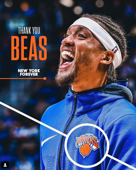
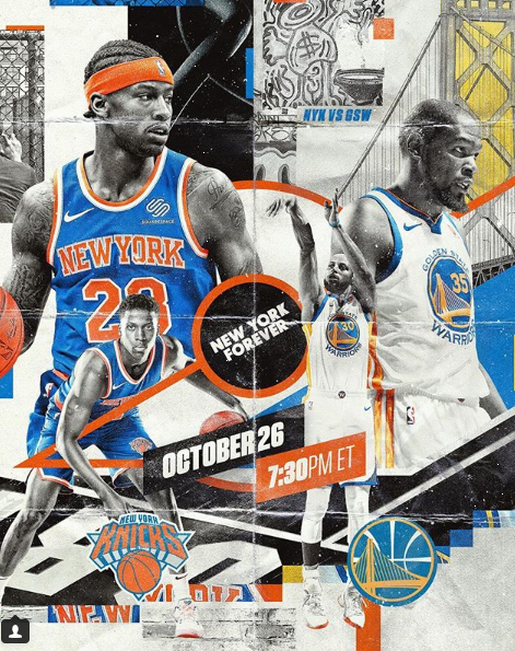
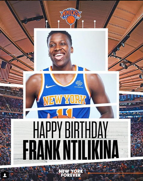
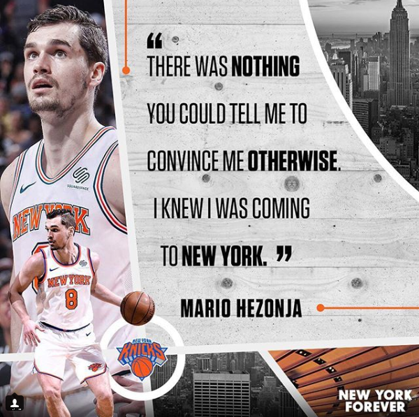
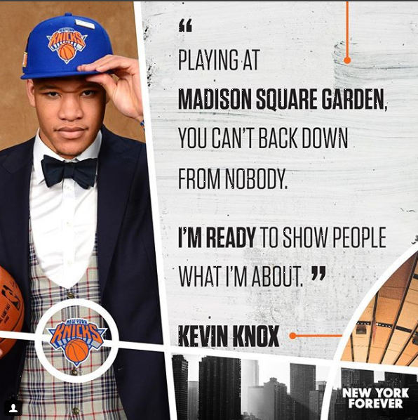
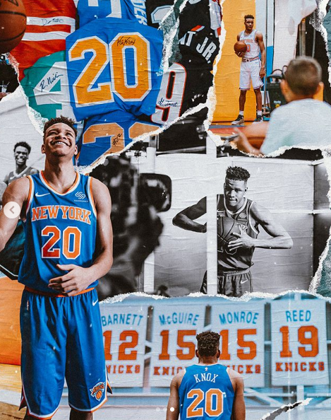
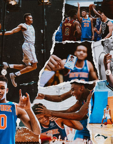
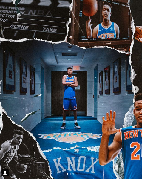
The Knicks have experimented with a graphics package this offseason that is unbelievably fresh. It’s vibrant, at times gritty, and is able to manifest in many different ways. Below are some of their swipes for inspiration:
A strong visual identity should be a major focus for teams today. It helps set your content apart from the rest. And, this from the Knicks is a great example of how it’s done.
NYC Roots
Finally, the Knicks have done a good job tapping into the city they call home beyond the “Knicks Summer” series. First, they had an interesting series around the NBA Draft that compared player stats to NYC-centric stats. The result was an interesting and unique spin to typical stats that made them more relevant for their audience:
Secondly, their schedule release also had local flavor by tapping into local basketball courts and fans for their creative.
If teams want to find a way to make their content more relatable, tapping into local flavor and insights is always good start. Not only does it help to build a stronger connection with your community, but it’s also an angle that teams can truly own.
If the Knicks’ social is not on your radar, it’s time to put them there. From their strong visual identity to their lifestyle angle, they’ve raised the bar this offseason. Follow them here: Twitter, Instagram, Facebook.
What other NBA teams have been doing good work this offseason? I would love to hear your thoughts below!
0