We all know that Twitter + sports make a great combination. During peak game times, there’s a good chance you’ll find sports dominating the trending topics. The platform is perfect for our industry.
Even though Twitter and sports are a match made in heaven, it’s great to take a step back and look at ways to improve platform use. I’ve spent time looking at the latest trends working for teams and leagues, and I compiled a list of the ones winning right now. Many of them translate across platform. If you are looking for new ways to dominate Twitter, here are some ideas:
Simple graphics and copy.
Sometimes simple is better. We live in a world filled with limited attention spans. If you make it hard for fans to digest and understand content, you’ll lose them before they think about engaging, sharing, etc. I love the trend of keeping things simple in both copy and graphics:
[graphics]
Have a Day @Broncos! #MIAvsDEN pic.twitter.com/kBqs0st3s5
— NFL (@NFL) November 24, 2014
.@samajp32 pic.twitter.com/X7BlU14ybM
— Oklahoma Football (@OU_Football) November 22, 2014
It's #SaintsGameday – 12 hours away! #SFvsNO pic.twitter.com/Ft1U4cvO5P
— New Orleans Saints (@Saints) November 9, 2014
[copy]
WE WIN.
— Las Vegas Raiders (@Raiders) November 21, 2014
#RevisIsland pic.twitter.com/8MNtKIxUov
— New England Patriots (@Patriots) November 24, 2014
Soon. pic.twitter.com/ly1ltVAqft
— Chicago Blackhawks (@NHLBlackhawks) November 23, 2014
Don’t overthink your content. As the examples prove above, complicated and overstated isn’t always the way to go.
Starting lineup graphics.
Michigan and Washington have found ways to spruce up starting lineup announcements through graphics. Michigan is using player cards that have an old school look and feel; Washington’s graphics are crisp, sharp and clean. Both are great ways to make content more visual and interesting:
And your backcourt: @DerrickWalton10, @CarisLeVert & @zirvin21. #LiveFromCrisler pic.twitter.com/jSG6sYTvd5
— Michigan Men's Basketball (@umichbball) November 20, 2014
5, 11, 12, 21 and 40 starting vs Pacific tonight at KeyArena pic.twitter.com/xBN2jJzKal
— Washington Men's Basketball (@UW_MBB) November 24, 2014
GIFS.
In case you didn’t know, the NBA is all about the GIFS. You can view an awesome Twitter timeline with examples here (courtesy of @JuliePhayer).
While I think GIFS are often overplayed, it’s hard to deny their popularity. They’re a great way to show humor and humanize teams when used the right way. With GIFS, I think it’s important to highlight players and personnel as much as possible and not force pop culture just for the sake of it. Instead, use pop culture references strategically and sparingly to make a bigger splash. Here are some great examples:
. @KlayThompson's final line: 41pts (14-for-18 FGs, 5-for-7 3FGs, 8-for-9 FTs), 5rebs, 2assts. pic.twitter.com/Iqexc3kJbN
— Golden State Warriors (@warriors) November 2, 2014
How we feel the day after game-winners… #Knicks pic.twitter.com/Mpl4rvOmgT
— NEW YORK KNICKS (@nyknicks) October 23, 2014
It's #SixersMediaDay! pic.twitter.com/yq4sKCQPPn
— Philadelphia 76ers (@sixers) September 29, 2014
After a flurry of 3s, Portland now leads 101-85 with 2:20 left!#RipCity #PORvsOKC pic.twitter.com/cXhzveAoP5
— Portland Trail Blazers (@trailblazers) October 30, 2014
Emojis.
A couple weeks ago, I asked people on Twitter what they thought about brands using emojis. The answers were quite diverse and interesting. And whatever your thoughts about them are, there’s one thing for certain: There’s an emoji craze going on.
Much like GIFS, emojis are often abused and overused. When used at just the right time and moments tough, emojis can help make a statement and make a team account more human. The key (again) is to use them strategically and sparingly. Here are some good examples:
Fresh ✂️ pic.twitter.com/qZLmwU87lM
— Philadelphia 76ers (@sixers) February 22, 2015
Telling it in a screen shot.
You can’t always rely on people to click through, so you need to prioritize. Do you want to get the message out or drive people to your website? Lately I’ve seen a few examples of schools, leagues, etc. opting to post a screen grab instead of linking to more. If the message is important enough, then I think it’s a good move:
Full statement from Will Muschamp: pic.twitter.com/PyafZHRC9j
— Florida Gators Football (@GatorsFB) November 16, 2014
Explanation on why Mo'ne Davis may be paid for appearing in Chevy commercial without impacting NCAA eligibility: pic.twitter.com/EGKlqYkdoL
— NCAA News (@NCAA_PR) October 22, 2014
Use of multiple photos.
I love the multiple-photos feature from Twitter because it’s a great tool for teams and leagues to paint a full picture in one tweet. Instead of cluttering your timeline with a ton of tweets, see if there’s an opportunity to put together a statement / story in one tweet:
Next stop: Denver. #BusinessTrip #StrongerTogether pic.twitter.com/20CqJnFbpf
— Miami Dolphins (@MiamiDolphins) November 22, 2014
Who holds the record for most passing yards in a single Thanksgiving Day game? Click to guess! #SCTriviaTuesday pic.twitter.com/5ZY0goUV6u
— SportsCenter (@SportsCenter) November 25, 2014
Here are a few pics from tonight at the Collegiate Basketball HOF. A great experience for our guys! #RollTide pic.twitter.com/sPxzRZnjQS
— Alabama Men’s Basketball (@AlabamaMBB) November 24, 2014
Focused. #LAvSEA #FirstToFive pic.twitter.com/ii5u01zeW7
— LA Galaxy (@LAGalaxy) November 23, 2014
Byron going over defensive principals with @JClark5on at the end of today's session. pic.twitter.com/prkHFGFiyy
— Los Angeles Lakers (@Lakers) November 15, 2014
Look and feel based on the uniforms.
Since the start of basketball season, I’ve been swooning over the @Lakers’ score graphics. The colors change up based on the uniforms they’re wearing that game, but they still keeping a consistent look and feel. They are using gold at home, purple on the road and Sunday white / black. The concept is a great way to integrate gameday initiatives into a team’s social presence:
#LakersWin for the second time in two nights. pic.twitter.com/CkdTf29Oau
— Los Angeles Lakers (@Lakers) November 20, 2014
Lakers shooting just 33.9% (19/56) at the half. @kobebryant is up to 28-points. pic.twitter.com/mTAgvxysG5
— Los Angeles Lakers (@Lakers) November 17, 2014
That’s a final from @STAPLESCenter.
Back here Sunday night at 6:30pm PT against Golden State. pic.twitter.com/KSoQMzxVJs
— Los Angeles Lakers (@Lakers) November 15, 2014
Video call to action.
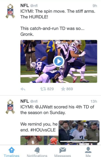
Twitter has an awesome new CTA feature on their hosted video card: The ability to let users watch a video on the bottom right, while browsing other ones. It’s a great way to keep fans engaged longer:
Now it’s your turn to sound off: What trends have you seen lately on Twitter that have stood out to you? Be sure to share them below!
Thanks for reading!
