Standards, Consistency & Focus Matter: A Lessons From The Lakers

The Lakers have one of the strongest social media presences in the NBA. Sure, they have a large audience that comes with their powerhouse brand, but their digital team does not rest on their laurels. The Lakers consistently produce best-in-class content from their beautiful crispy GIFS to their Instagram Stories on game day. And while there is a lot to take away from their approach, there is one big lesson: consistency and brand standards matter.

The Lakers are committed to putting their best foot forward all the time in digital. It’s apparent they have defined their brand standards and don’t cut corners. And as a result, they have one of the strongest visual identities and social presences in sports.

Scroll through their accounts and you’ll see. The Lakers take the way their brand comes to life very seriously (as they should). Photos are carefully curated. Watermarks are always applied. They are a team that dots their “Is” and cross their “Ts”. Below is a small sample of some of their content:

https://www.instagram.com/p/BqLdQybnQTj/


Yes, it takes the Lakers a second more time to add the watermark. Yes, sometimes they hold a highlight to package it for a carousel recap later on Instagram. And yes, their work is always strong and consistent.

But, why does their approach matter?

First, their work is instantly recognizable.
Today, so much of a team’s brand comes to life through their visual identity. Consumption happens in a split second. Consumers scroll, tap and move through their social feeds without giving things a second glance. As they scroll, content needs to stand out.

It should be clear which team, brand or league the content is from with or without a logo. And that’s where a strong graphics package that reflects the brand comes into play. When teams put in the work to define their brand standards and their visual identity – and actually see it through in execution like the Lakers – the result is work that instantly connects with fans.

Second, they package with purpose.
We’ve fallen into a content trap in sports. There’s this idea that more is better and that we have to cover “everything”. This mindset has resulted in more stuff and less quality. And, that’s not a win for a team, league of the fans.

The teams that win in social media today have purpose and focus. They understand that they can’t be everything to everyone and instead focus on what matters most (as they have defined). Focus allows teams to put their best foot forward. It’s impossible to do it all. Once you understand that, you can produce work that matters, engages fans and is right for the brand.

The Lakers are a good example of a team that does not post just to post. While yes, the Lakers still push out a good amount of volume, they don’t overproduce (especially by sports standards) and they certainly don’t let any sort of volume take away from the quality of work. Their approach to Instagram is a great example of this.

In the past 30 days, the Lakers have averaged 3.39 post on Instagram in-feed a day (the league average is 6). Yet, the Lakers boast a 3.2% engagement rate with an audience of more than 6M … the highest engagement rate in the league.  

The Lakers understand that Instagram is all about quality over quantity. They don’t fight the algorithm, and instead, let it work to their advantage. They use Stories to cover the more real-time moments and save their in-feed posts for big moments, packaged recaps and evergreen pieces. The approach is paying off.

On the flip side, the Lakers’ approach to Twitter is completely different to fit the platform. Their volume is high (25 posts in the past 30 days) and their content is packaged completely differently, with a lot more variety. It’s clear they have a distinct platform approach for each channel. 

More than ever, how we curate content and package is as key as the content itself. There’s no such thing as a strong social presence without a strong creative arm today. But, we can no longer just post and pray. We have to be thoughtful, deliberate and strategic about our work. We have to define our purpose then plan, program and package like the Lakers do.

And finally, they always put their best foot forward.
Social is the front door to brands today. Everything that goes up on a channel should be the best reflection of the brand, period. While it’s easy to post and get things up, it doesn’t mean we should cut corners and dilute the quality of the work. When looking at the Lakers feed it’s clear they take pride in their brand and work. All teams and leagues should strive for the same quality of work. 


In social it’s easy to get caught up in doing it now versus doing it right. There’s often a mentality that fast is best. And a result, corners are cut and the totality of everything is not thought through. In the end, this only hurts and dilutes the quality of our work. The Lakers’ digital presence is a great reminder that consistency and brand standards matter. And, their social numbers speak for themselves.

Instead of being fast, the focus should be on doing it the best and with speed. Of course timeliness matter in social, but not at the sake of quality. Work that is timely, engages fans and reflects the brand is the ultimate win. It’s okay to take the extra time to get the work right. It’s okay to pause, stop and think about your publishing approach even in the middle of chaos. It’s okay to forgo the right now for a little later if it means putting something stronger forward.

Take the little bit of extra time to do it right. Take pride in everything you push out. It all reflects the brand. And, it matters.
Highlights From The Knicks This Offseason

The offseason presents an interesting opportunity for teams to try new things. It’s a time where the scores don’t impact the approach. Teams can let personalities shine, show a different side to the organization and push the boundaries a little more. And, there’s something freeing about that.

The Knicks are one of the NBA teams whose offseason coverage has been strong. They haven’t been afraid to mix it up. From a fresh new graphics package to tapping into the NYC lifestyle, they’ve made the most of the offseason. Below are a few highlights that have stood out:


Lifestyle content.

Sports teams are lucky. They have a product that consumers want to identify with. It’s not just transactional. It’s emotional. And, as such, teams should tap into the opportunity.

This offseason, the Knicks created a “Knicks Summer” content series that shows how their brand is part of the fabric of their fans’ lives. In the series, they showcase fans doing NYC summer things and in Knicks gear of course. The creative feels like a lifestyle shoot that you would see from the likes of a Nike, Under Armour or adidas. Check out a few examples below:

The content is relatable for their fans and effortlessly cool. If someone was scrolling through their feed it would be easy to think the content was coming from an IG style influencer. More teams should start thinking about all the ways their brand seeps into fans beyond the game. Content like this not only deepens the relationship with fans — but it also, for example, can help sell merchandise.


A look BTS.

From offseason training to watching the World Cup, the Knicks have done a good job of giving their fans a glimpse of what their players are up to this offseason. The content is simple but engaging, proving that behind-the-scenes content does not need to be a labor-intensive piece.

Behind-the-scenes content keeps the upcoming season top of mind for fans, while also, showing another side of the players and team. We could use a lot more of this type of content from teams. It adds a human element, is uniquely ownable for teams and helps develop a closer connection between fans and players.


Fresh Graphics Package.

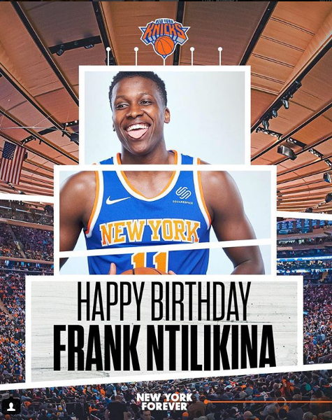
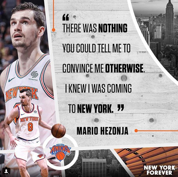
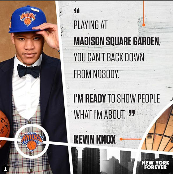
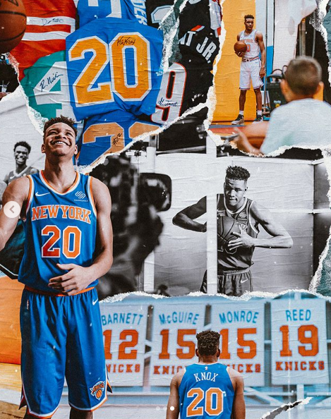
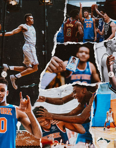
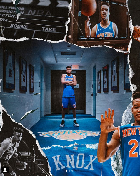
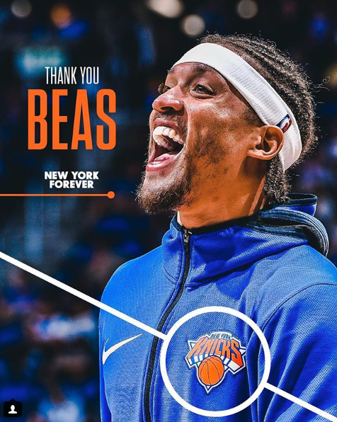
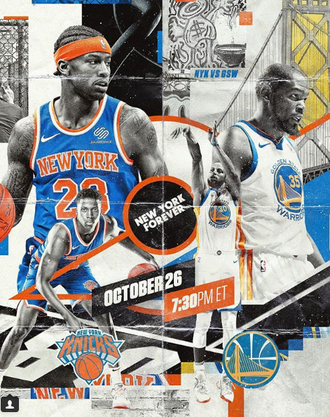
The Knicks have experimented with a graphics package this offseason that is unbelievably fresh. It’s vibrant, at times gritty, and is able to manifest in many different ways. Below are some of their swipes for inspiration:

A strong visual identity should be a major focus for teams today. It helps set your content apart from the rest. And, this from the Knicks is a great example of how it’s done.


NYC Roots

Finally, the Knicks have done a good job tapping into the city they call home beyond the “Knicks Summer” series. First, they had an interesting series around the NBA Draft that compared player stats to NYC-centric stats. The result was an interesting and unique spin to typical stats that made them more relevant for their audience:

Secondly, their schedule release also had local flavor by tapping into local basketball courts and fans for their creative. 

If teams want to find a way to make their content more relatable, tapping into local flavor and insights is always good start. Not only does it help to build a stronger connection with your community, but it’s also an angle that teams can truly own.

If the Knicks’ social is not on your radar, it’s time to put them there. From their strong visual identity to their lifestyle angle, they’ve raised the bar this offseason. Follow them here: Twitter, Instagram, Facebook. 

What other NBA teams have been doing good work this offseason? I would love to hear your thoughts below!

This Is What A Playoff Campaign Should Look Like

We talk a lot about digital being marketing and marketing being digital. But in order to walk the walk, we have to approach our channels and campaigns more seamlessly. This means that every marketing campaign or initiative should start with a singular idea or message. And, from there, the message and execution is molded to each channel.

Of course there will be times when you have digital-only initiatives, but for the most part, everything should still ladder back to broader brand priorities. This type of marketing maturity takes focus and purpose. Too often it feels like teams operate in the wild, wild west (especially in digital). There is inconsistent messaging, a focus solely on scores and the in-venue experience completely different than the digital.

Brand marketing might be one of the most underrated aspects in sports, especially with how it relates to digital. A strong brand strategy gives a reason for being, focusing on what makes your team unique and helps to build an emotional connection with fans.

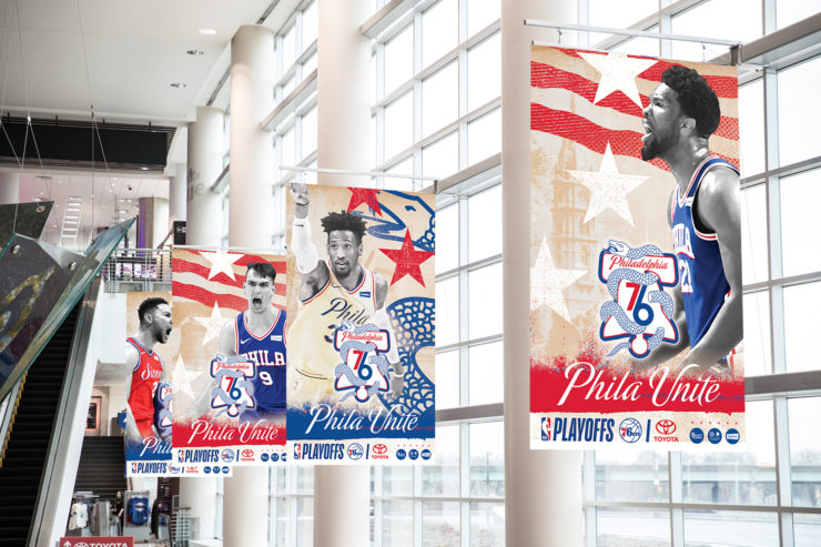
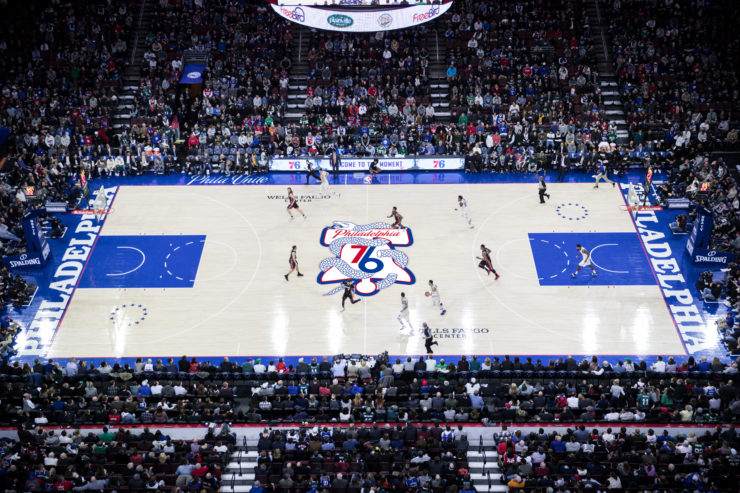
The Sixers rolled out an amazing campaign, #PhilaUnite, for the playoffs in honor of their first birth since 2011- 12. The campaign fires on all cylinders, from in-venue to creative and fan engagement. The inspiration behind the campaign is rooted in their city’s history while also celebrating the present and its new edge (read details here).

According to the team, the campaign “builds upon the ‘Spirit of 76’ initiative by combining the bell logo, inspired by imagery from Philadelphia’s 1976 bicentennial celebration, and the segmented snake, a hidden feature on the City Edition uniform that is derived from Benjamin Franklin’s historically-significant political cartoon of 1754.” More insight below:


“The ‘Phila Unite’ campaign was thoughtfully developed for our fans and city over the past several years in anticipation of this moment, the moment when the 76ers returned to the NBA Playoffs,” said Chris Heck, Philadelphia 76ers President of Business Operations. “The energy in the Greater Philadelphia Area is electric right now and we wanted to rally together all of our fans from not only this region, but from around the globe. ‘Phila Unite’ pairs the rich and storied history of our city with the passionate, proud fans who we consider irreplaceable members of the 76ers family. We’re thrilled that this moment has finally arrived and look forward to watching the best fans in the world come together for the 2018 NBA Playoffs.”


If you want to know what a thoughtful and deliberate brand campaign looks like – that’s integrated across all channels – look no further than #PhilaUnite. Below is a quick look at how it came together across channels. And, as you’ll see, the concept and execution is flawless.


Social + Digital

On social, the campaign has come to life seamlessly. The launch was led with a strong hype video, and from there, the design elements and messaging have been carried throughout (even with sponsored content).

All of the design work great example of what it looks like to refresh and elevate your messaging + graphics package when you’re on the big stage. And, how to keep it consistent yet fresh during a campaign.


Fan Engagement

In addition to strong creative, the Sixers gave fans the tools they need to get involved. Through a microsite, fans can join the movement and make their very own playoff graphic.

We talk a lot about UGC in the industry, but I especially like this because it’s UGC with purpose. It’s a badge of honor that rallies and unites their fans. And, it makes them feel part of the journey.


Leveraged Philly Athletes

We all know that it helps to have athletes and influencers join the conversation. And, #PhilaUnite has had it’s share of athletes join the conversation.

Enlisting influencers and athletes in and outside of your roster is a critical piece to your distribution strategy. It helps expand the reach and adds a level of credibility you can’t get elsewhere.


Physical World

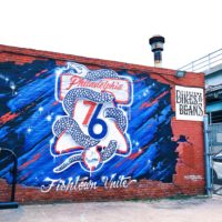
Integrating campaigns into the physical world, especially when we talk about rallying a community, is a huge piece of an integrated campaign. And, it appears #PhilaUnite presence is felt throughout the city. The Sixers staff strategically placed the campaign throughout the whole city. More than 10,000 76ers playoff logo decals were distributed by their staff and they adorned their city walls with #PhilaUnite murals.

Whether it’s the street art or a decal scavenger hunt, the people of Philadelphia will no doubt stumble on this campaign and hopefully get engaged. And all of these initiatives are Instagram-worthy, so there’s a very real chance the installations are being shared online.


https://www.instagram.com/p/BhpuJlOHOOS/?hl=en&tagged=philaunite


Game Presentation

And finally, from the pictures it looks like the campaign came to life beautifully in-venue. The perfect bow to tie it all together.

 
One look at #PhilaUnite and it’s easy to how much thought and energy was put into the campaign. Aside that this is a really strong brand marketing push, here’s what I like about the campaign:

1. They executed well across all channels.
A vision without execution is just a hallucination. Sorry for the corny phrase, but this is so true. The Sixers did not just do a great job concepting their campaign. They did an amazing job bringing it to life across ALL channels. The result is an impactful and cohesive campaign that is guaranteed to reach their consumer, wherever they are. That’s no easy feat.

2. Their creative is driven by insight.
The best type of campaigns are driven by strong creative briefs and clear objectives. It’s evident that this campaign was driven by both. There is so much intent and meaning behind their design, infusing both history and the present. Good brand work comes when creatives are armed with the right information. It’s so critical marketing teams spend time on the brief and that collaboration is seamless with the agency/creative.

3. They thought about the fans.
This campaign was as much about the fans as it was the teams. The Sixers made it easy for fans to get involved, rally and share the #PhilaUnite message.

The beauty about sport is that it’s so much bigger than the scores. It joins communities and brings people together. And, every marketer in sport should be focused on giving fans the tools they need to share in their fandom, just like the Sixers have.

 
The #PhilaUnite campaign is a great example of what a 360 marketing campaign should look like. The Sixers aligned on a message and overall direction, then figured out how to bring to the campaign to life across all channels. The result is an impactful brand push that is consistent across channels, no matter the consumer touchpoint.

Breaking down silos across channels is the only way to get work done like this. It’s about looking at marketing holistically from digital to game presentation. It’s about being focused and purposeful with your message. And, it leaves a lasting impression.

Everyone in sports should be paying attention to brand plays like this. After the scores, the thing that separates every team is how they define their DNA, their culture, their personality, their brand.

Three Things To Embrace From The @Raptors

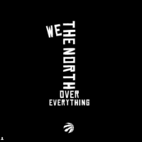
The Raptors have a strong identity in social. Ever since they unveiled their “We The North” campaign in 2014, they have burst on the scene with a solid presence that stands out. They’re a team that understands their brand through and through and aren’t afraid to push the boundaries. In honor of the Raptors’ great work, here are three things to embrace from their approach.


Embrace your identity.

The Raptors are a team that have gone through the exercise of branding. They have laid a foundation for what their brand stands for and it shine through online.

The core of their branding starts with the idea of “We The North”. It’s the embrace of everything uniquely Canadian. It taps into what makes their team different – the only NBA team outside of the US – and makes it a proud point of differentiation. The video below sets the whole tone:

The idea of the North has a bit of an edge. It’s about embracing being an outsider. It’s about something only the Raptors can own. And, it’s worked. The North has turned into a rallying cry, a passion, maybe even a bit of a cult following.

What strikes me most is the team has brought to life their identity by firing on all cylinders. North is about more than a slogan. Their brand comes together through strong messaging, a visual identity, a tone, strong creative / content, values, an emotional buy essay. They’ve built an identity and a culture for their fans.


All too often we talk about brand in a one dimensional way. For some teams, it’s about a strong understanding of their values. For others, it’s simply about words or a strong visual identity. It’s hard work to be deliberate about everything that defines a team’s identity. The Raptors are an example of the total package.

How does your team want to be perceived? Do the work and execute on it.


Embrace access.

The Raptors have invested in a strong identity alone. They have invested in a strong content strategy that allows fans to connect with the team and brings their brand to life.

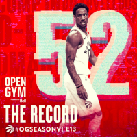
One of the things that stands out about their approach is their commitment to giving fans access. Through their series Open Gym, they give fans a behind-the-scenes look at the journey of the team on and off the court. Episodes highlight everything from overcoming injuries to personal moments. Below are a few snippets, including one of a player becoming a father for the first time.

Open Gym is a reality series that helps fans build an emotional connection with the team and leaves them coming back for more. It’s this all access and the raw emotion that is key to its success. Watch the full series here.

Another strong example of access from the Raptors is their new series The Spot, where ball meets food culture. The series gives fans a personal look at players’ favorite restaurants.

People and personalities help build a strong connection to teams. In this crowded sports space, intimate access is something unique only teams can provide. Take this page from the Raptors and you’ll build a deeper connection with your fan base.


Embrace partners to elevate content.

Sponsored content is an opportunity to elevate your presence. When teams move beyond slapping a logo on a score graphic and focus on finding the common themes with their brand and partners, magical things happen. Content gets created that is valuable for the team, the sponsor and the fans.

The Raptors are a great example of a team that has leveraged partners to elevate their content. Their sponsored content is anything but ad-like; it’s entertaining and often puts players in a fun and different light. Below are a few highlights.

It’s important to push partners, internally and externally, to hold sponsored content to a high standard. It should enhance the team’s social presence. The content should be something the team wants to push out; not something they want to bury. Creating content that is elevated like this comes with a price tag and a commitment to doing it right. Know the value of your channels and push back or walk away when something is not right for the brand.

 
From their strong identity to their intimate access, the Raptors set the bar high. What stands out to you about their presence?

Highlights from NBA the Schedule Release

Social media has infused creativity into everything teams and leagues do now. There’s pressure to be at the top of your game with the battle for attention in a crowded space. Teams’ content must stand out, whether it’s for a national championship or pseudo-holiday.

This need for creativity was evident in the NBA’s recent schedule release. Teams took to social to drive interest through strong content and off-the-wall ideas.

Below are a few of the highlights from the 2018 NBA schedule release. Whatever your brand’s style, voice and tone, there is inspiration here:


Brooklyn Nets- Orchestrated Creative

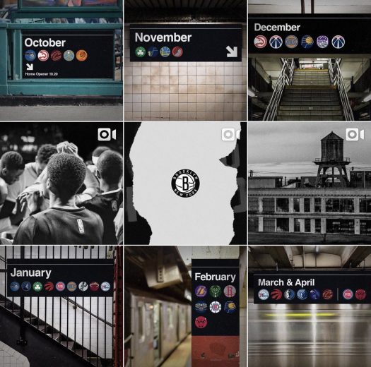
The Brooklyn Nets schedule release the a well orchestrated schedule release. They had strong creative paired with a platform approach. They tapped into iconic parts of NYC to together a dynamic unveil across all three platforms. Here’s a look at their creative and some of their execution:

https://www.instagram.com/p/BXylNwNFqaE/?taken-by=brooklynnets

One of the strongest aspects of their unveil was that they took their concept and molded it to each platform. On Instagram, they unveiled pieces through a grid unveil. On Twitter, the photos turned into a GIF. On Facebook, they focused on their video piece.


Denver Nuggets- Nostalgia

Channeling some nostalgia, the Nuggets took to a classic video game to unveil their schedule. Of course, collecting all their opponents all the way. For a topic that could otherwise be dry, the Nuggets did a good job of putting a creative spin on it.


76ers- Driving People to .com

The Sixers created a fun, illustrative video that called out highlights from their schedule, then drove people to .com to see the full release.

If one of your goals is to drive people to your site, this is a good example of how to do so. You never want your account to feel like a push notification, so tread with caution. The @sixers’ schedule content is engaging, so even if it doesn’t include the entire schedule, it adds value for their fans.

The Sixers also get an extra +1 for the music on this video (so please, turn the sound on).


Sacramento Kings- Use of IG Carousel

The Instagram carousel feature offers a lot of opportunity to tell and unveil stories different. You no longer have to rely on one photo, but instead, can string content together for a more engaging experience. The Kings schedule unveil is an example of this.

https://www.instagram.com/p/BXylDe2FDWH/?taken-by=sacramentokings


Warriors- Win With Puppies

The Warriors unveiled their schedule with adorable puppies, taking on and conquering their opponents (in the form of chew toys, of course). It’s a win, because who doesn’t love puppies?

While this content play might be a bit left feel, a schedule release is a good opportunity to think outside-the-box and have some fun. This isn’t mean to be a season-long marketing play. It’s a one day push to capture your fan’s attention and generate interest in tickets. Puppies will do that.


Raptors, Bucks & Trailblazers- Hype Videos

When all else fans in sports, you can also go the route of a good hype video. After all, fans love a combination of emotion and action. Below are a few examples that stood out from the Raptors, Bucks and Trailblazers.


Chicago Bulls- Infographic

The Chicago Bulls leveraged interesting facts in their schedule to generate interest, turning the information into fun and consumable infographics. The Instagram carousel is especially impressive.

What else stood out to you during the NBA schedule release? Share your thoughts below!