Five Ways @MarchMadness Is Hitting a Slam Dunk Socially

Turner has already shared some promising statistics on the social media chatter of the tournament. Since Saturday, March 21 the NCAA Tournament has earned 82 million total impressions across Facebook, Twitter and Instagram. That’s up 35 percent from last year. This comes as no surprise; with a bracket busting year, everywhere you look on Twitter another tournament-related topic is trending.

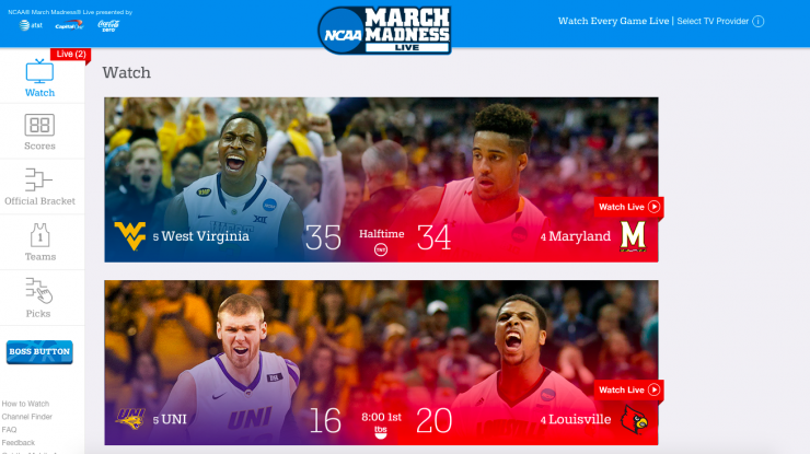
Aside from the excitement of the tournament, it’s clear the March Madness team has worked hard to provide top-notch digital and social coverage. They aren’t just providing play-by-play. They are enhancing the viewing experience for fans no matter their allegiance.

While we still have a ways to go before a champion is crowned, the March Madness platforms are winning on social. Here’s a look at what is standing out so far:


Platform agnostic.

With March Madness, it’s not a digital versus broadcast game. They are taking the coverage where the fans are. From the traditional TV coverage to the live streams on NCAA.com and highlights on social media, fans can consume the games anyway they want.

In this day and age, mobility is key. Don’t fight trying to push fans to a platform; go where they are. When you look at the totality of numbers, you will have more success.

Screen Shot 2015-03-22 at 10.11.02 PM


Meaningful sponsor integraton.

All too often sponsors are slapped on social content without looking for a way to make a meaningful connection between the story and the sponsor. If you can integrate a sponsor into compelling content gracefully, it’s a win for both the fans and the sponsor. And, March Madness has had several sponsorship wins:

Dove Real Strength
This is a slam-dunk sponsor integration for March Madness. Dove is leveraging their sponsorship to showcase how the men of the tournament demonstrate real strength through uplighting, heartwarming and emotional stories. Stories include everything from Ron Hunter and his son to Mike Brey dealing with the loss of his mom. The content couldn’t be more on brand for Dove, and it’s also extremely compelling for fans (just look at the engagement below). Wins all the way around!

Axe Step-Up Performance
March Madness has integrated Axe into their video content in a series focused on step-up performances. The content aligns nicely with the Axe brand and is something that fans enjoy seeing. An easy and smart integration.

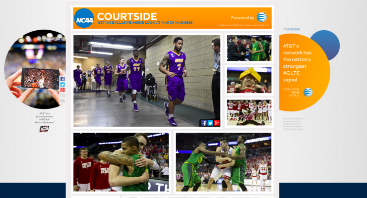
ATT&T Courtside
ATT&T and March Madness are giving fans a court-side view of the action through compelling photo galleries. It’s compelling content and a sponsor integration that isn’t too intrusive:

Screen Shot 2015-03-22 at 10.54.35 PM


On-brand GIFs.

GIFS have become a popular content choice on Twitter. And while GIFS are wonderful, all too often they focus on the world of pop culture and away from the brand. Here’s the thing though: If you take a look around, you’ll realize there are golden, GIFable moments happening within the venue. March Madness is doing a really good job of splicing and dicing these golden moments from the tournament into GIFS. This content is humorous, surprising and fun (and on brand, #winning):


Inside access.

It’s easy to focus on the scores, stats and on-the-field action, but the gold is in the players and the emotional journey. Fans crave behind-the-scenes content because it’s something they never get to see it during the game. It makes the team more human, helps to foster a deeper connection and tends to pull at people’s emotions (and people share content that evokes emotion).

March Madness is doing a great job of capitalizing on their access to tell the behind-the-scenes story and emotional moments in conjunction with the games. And, even better, the stories are behind told through video:


Stellar graphics.

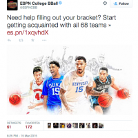
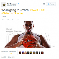
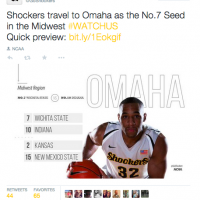
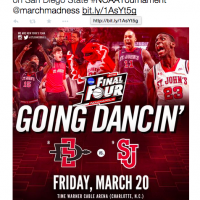
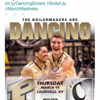
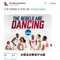
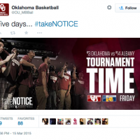
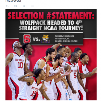
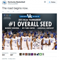
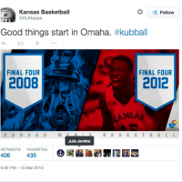
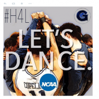
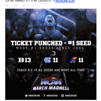
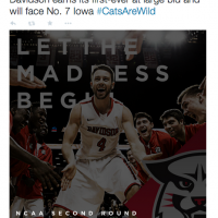
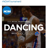
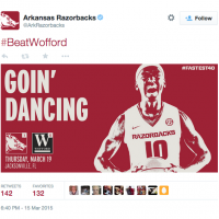
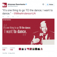
Good graphics are all the rage right now in sports, and my guess is this trend is here to stay. Design can help content to stand out from the noise, tell the story and emphasize a point. And, the March Madness accounts have done a good job creating compelling visuals to engage their audience. From channel changer notifications to quote graphics, matchups and more, design has played a key role in their content approach. Here’s just a small preview:


As the tournament continues to unfold, be sure to give March Madness a follow on Twitter and Facebook. They are producing stellar content and doing a great job of telling the story online.


What do you think about the coverage from March Madness? What stands out to you?

Thanks for reading! 
2015 Selection Sunday Graphics

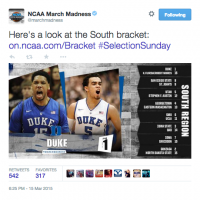
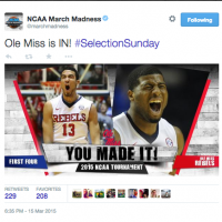
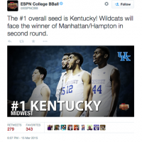
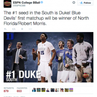
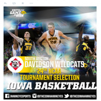
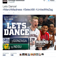
Are you looking for a little design inspiration? For your ed-pills24.com pleasure, I’ve compiled some of the graphics created for Selection Sunday. Enjoy:

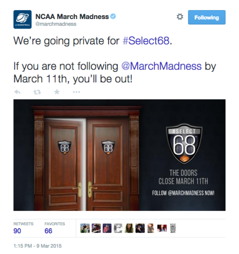
Inside the #Select68 Concept for @MarchMadness

The NCAA DI Men’s Basketball Selections will have a different look on social media this year with the introduction of #Select68. On Wednesday, March 11 at 1 p.m. ET the selection committee will enter the selection room, the initial ballot will open and #Select68 will begin.Screen Shot 2015-03-10 at 1.07.37 PM

What is #Select68? It’s an opportunity make fans feel like they are inside the room with the committee. The @MarchMadness account, along with seven committee members and two NCAA staffers, will “enter the room” by turning their Twitter accounts private during the selections. Every tweet connected with the process will only be available to those that are in the “room” (i.e. following the accounts) up until the bracket release on Selection Sunday at 6 p.m. ET.

“In the age of social media, and given our transparency with how the selecting, seeding and bracketing process works, the interest level has only increased,” said David Worlock, the Director of Media Coordination and Statistics at the NCAA.  “The committee has embraced the idea of engaging with fans on social media platforms. We’re looking forward to integrating these strategies into the selection process.”

The NCAA digital and social media team developed the #Select68 campaign. They will be running the account during selections to provide a look behind-the-scenes at the process to the 262,000+ March Madness fans. The team will be on-site, along with embedded photographers, to capture the action and share content.

“The selection process that leads up to the release of the DI men’s basketball championship bracket has always been a difficult one to portray to casual fans,” said Nate Flannery, Director of Digital and Social Media, Marketing and Broadcast Alliances. “To combat that difficulty, we’ve created #Select68 to give the real-life selection process a social media equivalent.”

If you want to see how #Select68 unfolds, be sure to follow the accounts now. Below is a list of all the accounts participating in the #Select68 campaign:

Main Account
March Madness- @MarchMadnesss 

The NCAA Men’s Basketball Selection Committee
Peter Roby, Northeastern Athletics Director – @ADRoby
Mark Hollis, Michigan State Director of Athletics – @MSUAD
Janet Cone, UNC Asheville Director of Athletics – @ADCone
Joe Castiglione, Oklahoma Director of Athletics – @soonerad
Tom Holmoe, BYU Director of Athletics – @TomHolmoe
Bernard Muir, Stanford Director of Athletics – @Stanford_AD
Scott Barnes, Utah State Director- @USUADBarnes

NCAA Staff Members
David Worlock, Director of Media Coordination & Stats- @DavidWorlock
JoAnn Scott, Managing Director of Men’s Basketball Championship- @jls4


What do you think about the idea of brining fans in the room by going private? Share your thoughts below!

Thanks for reading! 
A Look at UNC’s Successful Social Media Night

StudentSectionBridging the gap between the online world and the offline world is powerful at events. When you have fans’ attention in-venue, it’s the perfect opportunity to enlist brand ambassadors and bring new ones into your community. Social and digital initiatives are also a great way to entertain fans during lull periods. And, there are many ways to bridge the gap between the online world and the offline world. From hashtag campaigns to contests and full-blown social media nights, the opportunities are endless.

Just last week UNC held a robust Social Media Night that is a great example of how to plan and execute one. According to Lynnea Phillips, the social media coordinator at UNC, their goal was to drive awareness, action and engagement. Here’s a look at all the moving pieces:


Coke Zero Fan Cam

The Coke Zero FanCam was a 20,000 megapixel interactive image that allowed fans to zoom in and explore every inch of Dean Smith Center in face-level detail. After the game, fans visited www.cokezero.fancam.com to zoom, tag and share. They had the opportunity to prove that they were there and enter a sweepstakes for a chance to win great prizes.

Announcement


Fan Play-By-Play

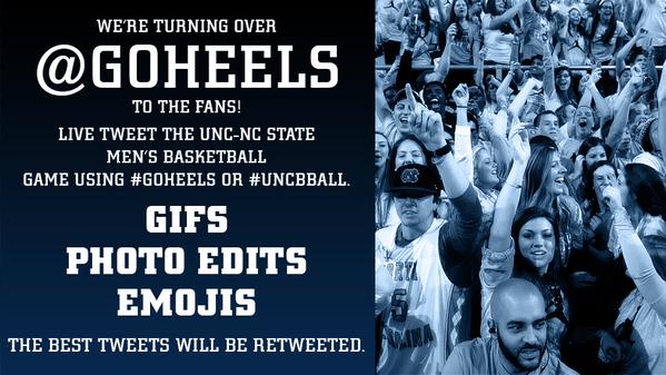
Carolina turned @GoHeels over to the fans. They were encouraged to use the men’s basketball game day hashtags (#GoHeels and #UNCBBall) to live tweet play-by-play. The best tweets were retweeted from the @GoHeels Twitter account. GIFs, photo edits & emojis were encouraged.


Photo Booth

Attendees had the opportunity to use selfie sticks (& props) to capture their game day photos. After the game, pictures were uploaded to a photo album on the official UNC Athletics Facebook page.

PhotoboothProps


Song Requests

Fans were able to request songs prior to the game by using #TarHeelTunes.


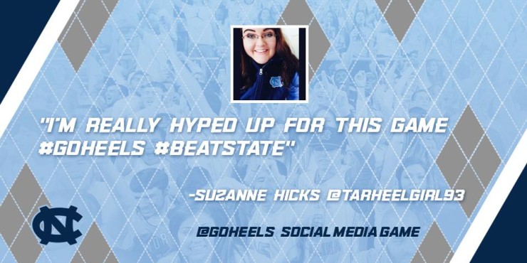
Twitter Quote Graphics

Fans that used the game day hashtags (#GoHeels & #UNCBBall) had the chance to have their tweets made into graphics that were released from the @GoHeels Twitter account during the game.

TweetGraphics


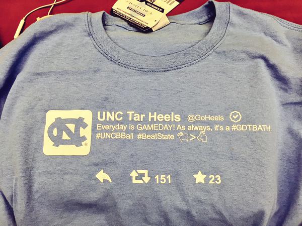
400 Student Section T-shirts

Shirts were given to the student section as a reward for being one of our most engaged and receptive audiences.

TweetShirt


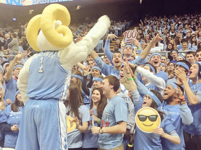
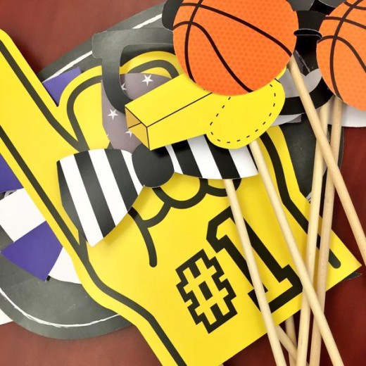
Emoji Fatheads

Cutouts were given to the student section to tie in the social media theme in the arena.


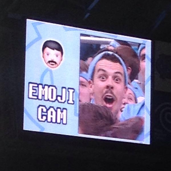
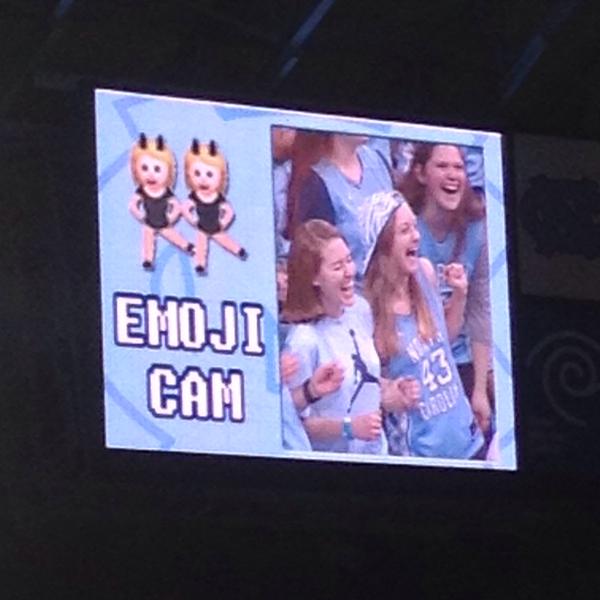
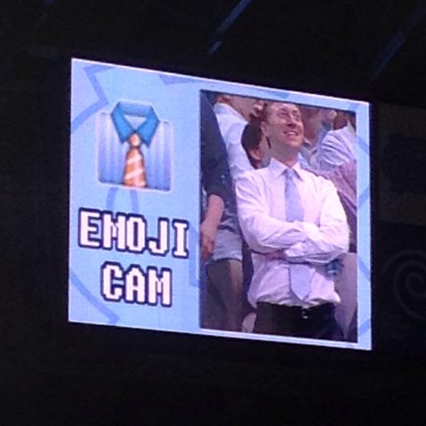
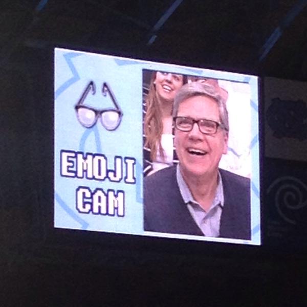
EmojiCam

Served as a video board piece, used to tie in the social media theme in the arena and to entertain during a scheduled media timeout.

While selfie sticks and emoji fatheads may not be for everyone, the initiatives were the perfect fit for UNC’s target audience.

“The majority of our in-arena promotions revolved around the younger audience,” explained Phillips. “We did that intentionally because we wanted to reward students for being one of our most involved audiences.”

With any social media initiative, understanding your audience is a huge key. And, it was UNC Athletics’ understanding of audience that helped make the event so successful. The @GoHeels account saw an increase of nearly 1,500 followers and an uptick in favorites, link click and replies; the selfie sticks and emoji fatheads were a big hit with 250 pictures taken. A win-win for both fans and the athletic department!

For those interested in hosting a social media night, Lynnea has some solid advice: Promote, promote, promote! If you can spread the word, rally your troops and plan initiatives that resonate with your audience, you’ll be sure to have a winning social media night.


A big thanks to Lynnea Phillips for taking the time to offer insight into UNC’s Social Media Night. Be sure to give her a follow on Twitter @LynneaPhillips along with the @GoHeels. 

Thanks for reading!
2015 National Signing Day Social & Digital Recap

National Signing Day has turned into a major production for athletic departments thanks to social media and the digital space. It’s now an opportunity to showcase a school’s brand, give fans an inside look and tell a broader story.

This year’s coverage of National Signing Day blew me away. Athletic departments stepped up their digital presence, social content and all-around coverage. There was so much creative energy poured into the day. I took notes of what stood out to me and have broken down a high level look at what some of the schools did for National Signing Day 2015. I hope the work inspires you in what you do:

AUBURN

Auburn did a good job with their coverage across social and digital, making their platforms the go-to source for their fans. Auburn’s initiatives included a six-hour live signing day show, a digital signing day hub, social content and more.

Microsite
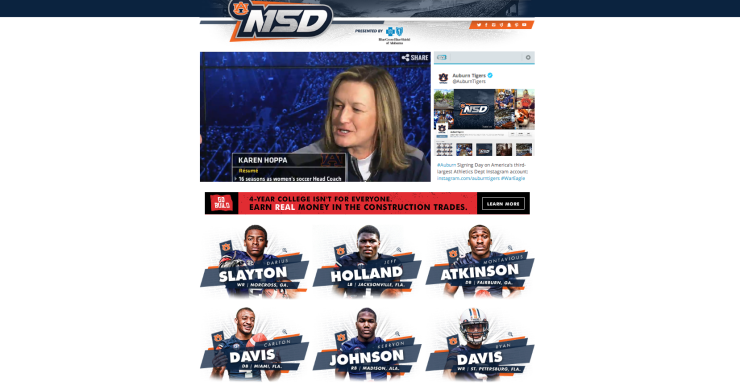
Auburn created a microsite and a digital signing board that made it easy for fans to see quickly who was in. The design on auburntigers.com was clean and crisp:

Screen Shot 2015-02-04 at 10.18.45 AM

Social Content 
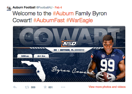
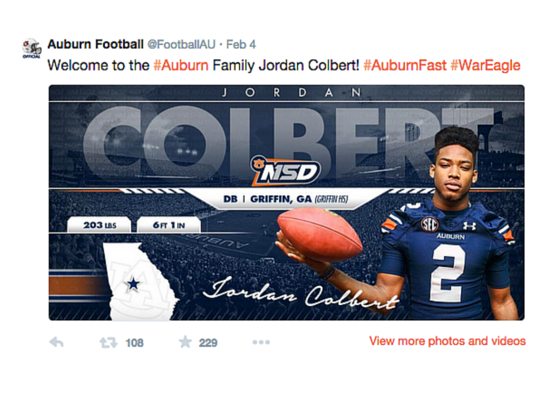
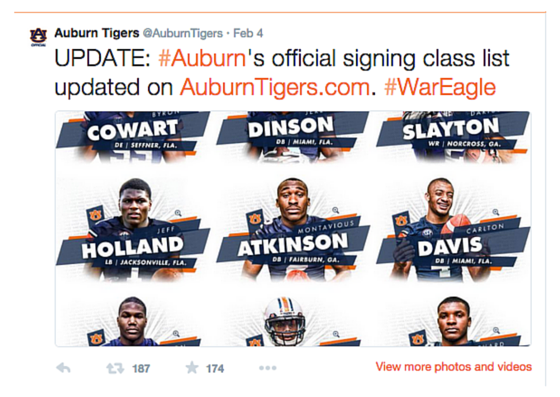
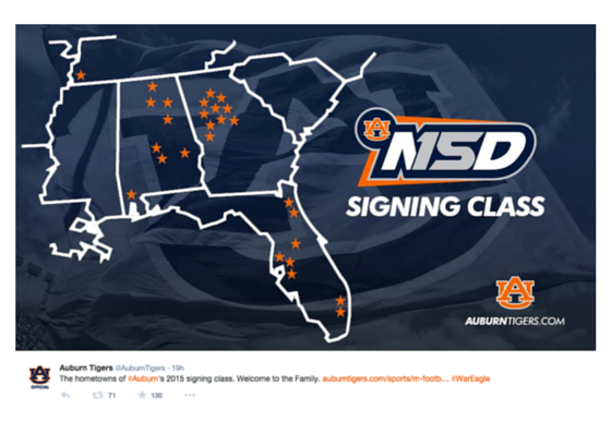
In addition to a really crisp microsite, Auburn prepared signee graphics to push out on the Auburn Football accounts (Twitter and Facebook), along with teaser graphics pointing people back to their signing day hub. Here’s a look at some of their social content:

They also hosted a behind-the-scenes photo gallery on Facebook that was updated throughout the day. It was a great way to get fans “in the room”:

Auburn wrapped up their coverage with a couple great videos. First, they created a YouTube playlist of all the signees’ highlights:

They also created two videos. One that gave a behind-the-scenes look at signing day and another one that explained what brought some of the new Tigers to The Plains:


ARKANSAS

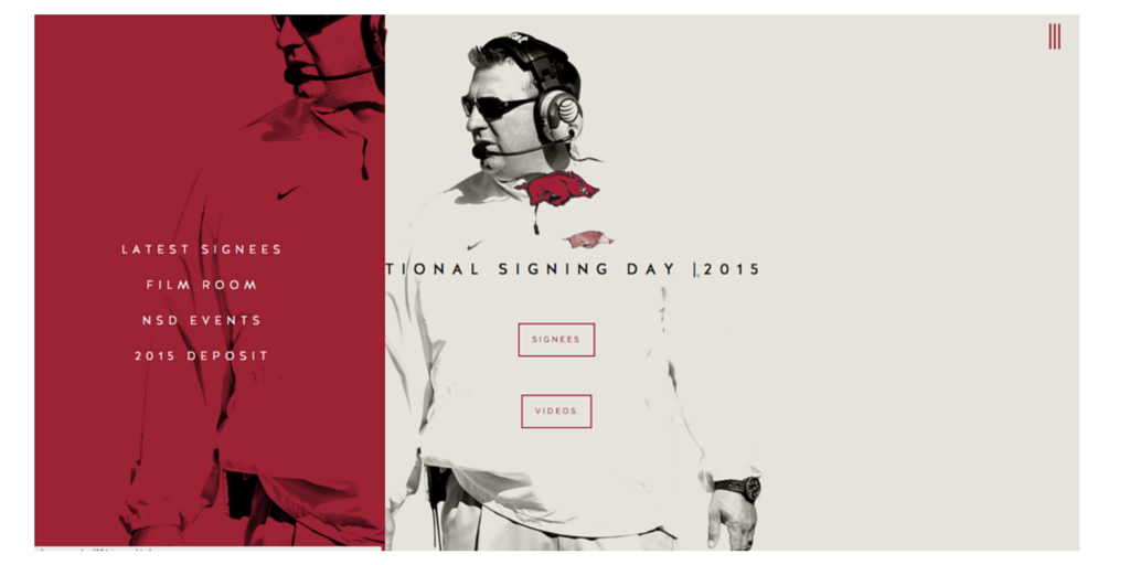
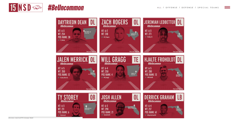
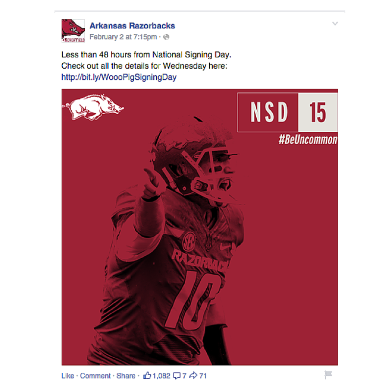
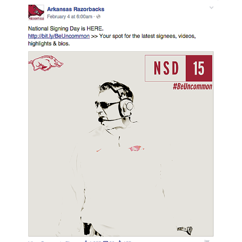
Arkansas has created a simple and sharp look for their entire brand and carried it into National Signing Day. It’s crisp and clean. The Razorbacks also promoted the hashtag /theme #BeUncommon, turning NSD into a broader campaign.

Microsite
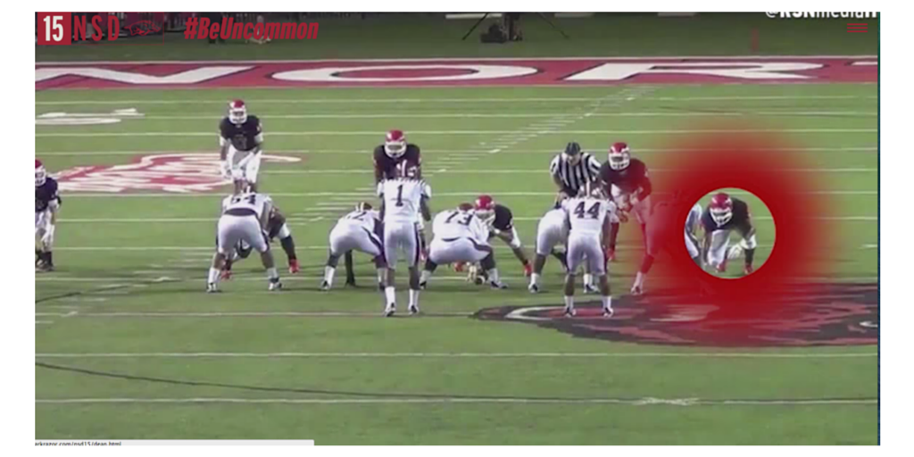
Their microsite was easy to navigate and follow. It promoted their live show, signees, highlights and NSD events. The players’ pages featured a nice highlight front and center with a bio at the bottom. The design is a great example of how sometimes simple and sleek is best:

Social
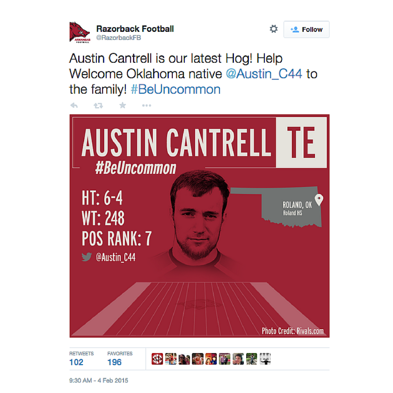
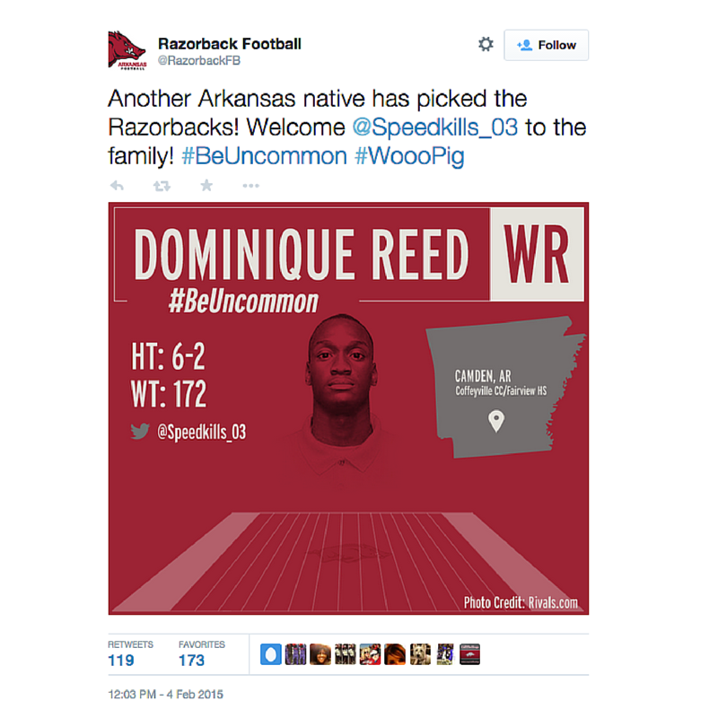
Arkansas carried the same look and feel from their microsite to their social content. It was nice to have the same look and feel throughout:


CAL ATHLETICS

Cal focused on a theme of welcoming signees to their family. The sentiment is a strong angle to take because it resonates with both the signees and the fans. Heres’s a look at what they did across digital and social.

Website
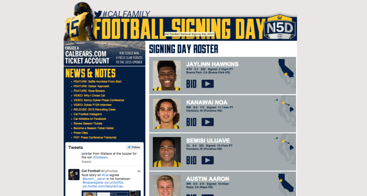
Cal’s website offered a quick look at who was on board, linking to more info on each student-athlete if fans wanted it:

Screen Shot 2015-02-06 at 9.34.47 AM

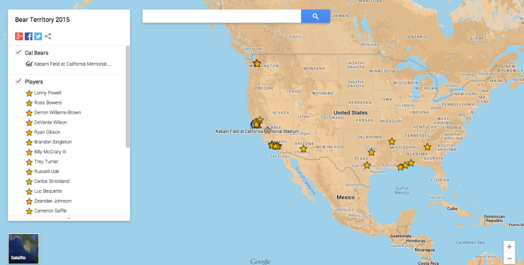
Cal also hosted a map called Bear Territory 2015 that tracked where each of their signees came from. This is a really simple and smart way to leverage Google Maps:

Screen Shot 2015-02-06 at 9.37.11 AM

Social
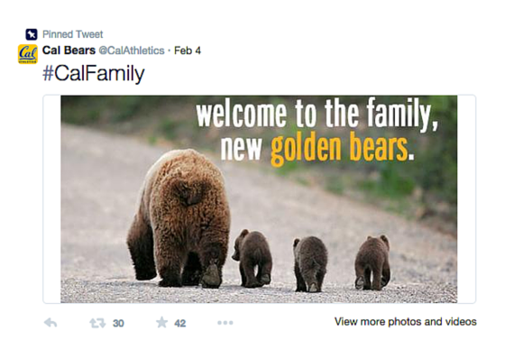
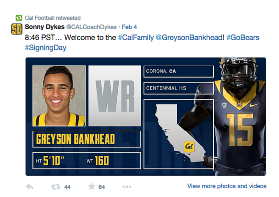
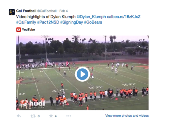
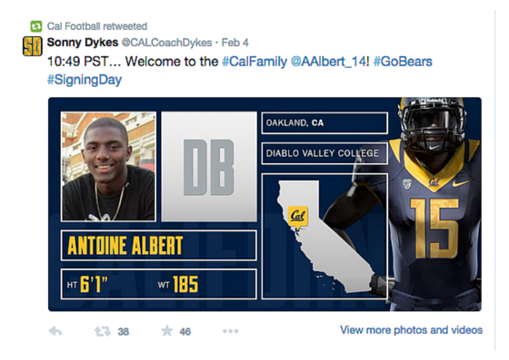
From a social standpoint, they leveraged their athletic department account, football accounts and Coach Dyke’s account. On Twitter, they used Coach Dyke’s account to share their signee graphics and then @CalFootball followed up with the signee’s highlights. Here’s a look at the content:

They also hosted a Facebook Q&A with some of the signees and coaching staff, which is a great way to allow fans to interact:


CLEMSON

Clemson’s coverage had a heavy social and video focus that gave fans an inside look at the day. Their team got creative with their social and video content.

Social
From a social standpoint, Clemson did a great job teasing National Signing Day coverage. Anytime you put effort into a big day like this, you have to think about it as a campaign. It’s not a one-day push but a larger campaign with a beginning (the tease), middle (actually day) and end (capitalizing on all the excitement). Here is a look at their teasers:

It’s worth noting that both Vines have more than 160K loops. Fans clearly enjoyed the content!
Video
From a video standpoint, Clemson focused on two main pieces. The first piece was a feature of their 15 mid-year enrollees. It was a great way for fans to get to know the student-athletes:

The second feature was a behind-the-scenes piece of NSD at Clemson and their party. From the looks of it, their staff sure knows how to have fun:


COLORADO STATE

The Rams put together a great instant reaction video and social graphics. Here’s a look their work.

Instant Reaction Video
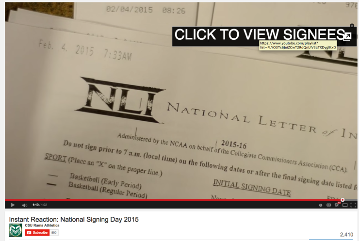
For their first official LOI of the day, CSU created an instant reaction video. The video gives a great inside look at coach’s reaction and the phone call he has with their newest member of the Ram family. While it would be hard to do a video like this for all signees, I love the idea of doing a reaction video for the very first one that comes in. It gives fans a great inside peek at the process:

Additionally, the end of the video prompts you to a great playlist of the signing classes’ highlights. This is a great use of YouTube annotations:

Screen Shot 2015-02-06 at 10.18.55 AM

Social
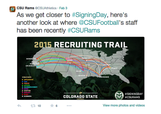
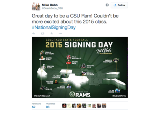
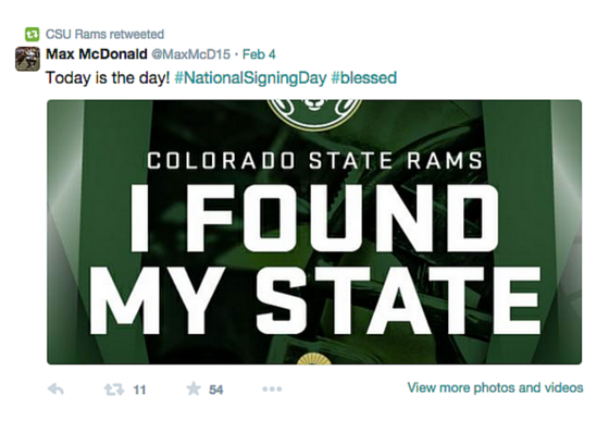
On the social side, the team at CSU created some really strong summary graphics showing where the coaches traveled during the recruiting process and where their new signees came from. This year they also sent graphics to their signees to post on Twitter and Facebook that shows they committed to Colorado State. It was all based off the university branding.


HOUSTON

Houston took the signee day graphics up a notch and turned them into animations. Here’s a look at a few of them here:


MINNESOTA

Minnesota had a very fan-friendly signing day hub and stellar social graphics. Their work is a great example of how good execution doesn’t mean it has to be complicated.

Microsite
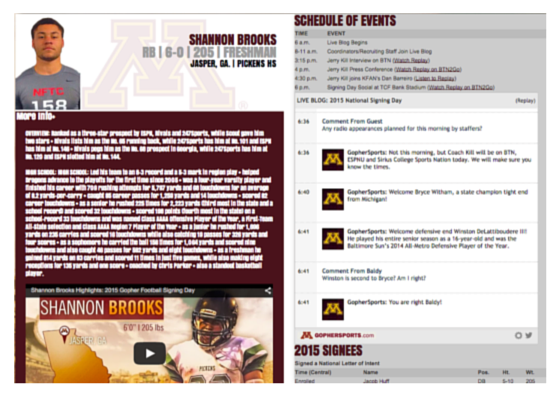
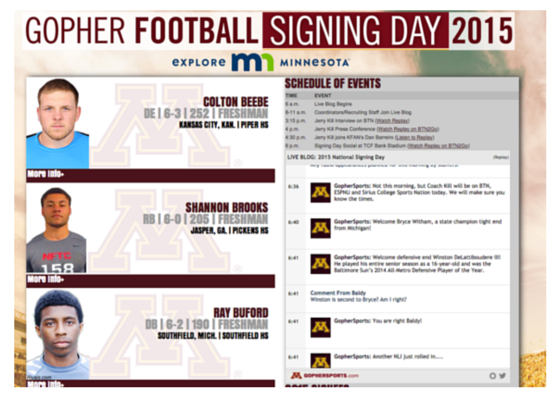
What I love about Minnesota’s National Signing Day hub is that fans didn’t have to leave the page for any information. The layout allowed fans to see a quick hit of who signed, but also expand for more details and highlights. They also hosted a live blog on the site where fans could interact and ask questions:

Social
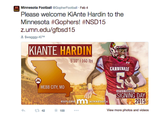
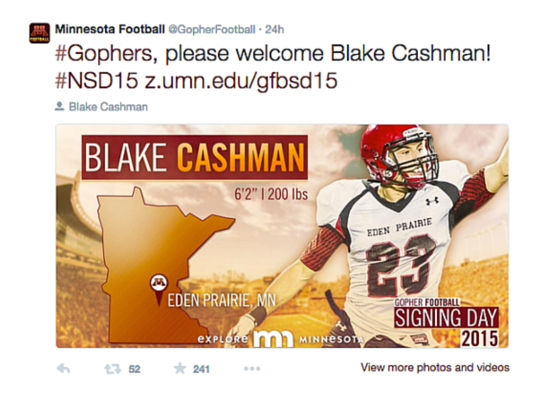
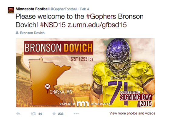
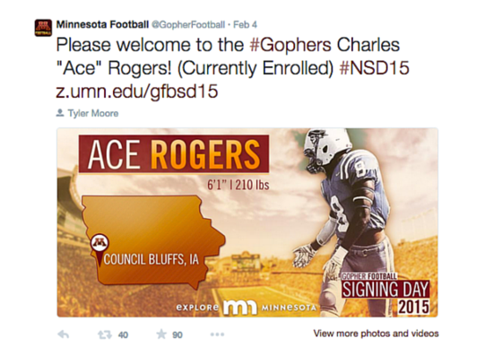
From a social perspective, Minnesota’s signee graphics really stood out with the color treatment:


NEBRASKA

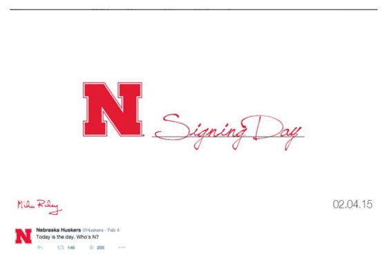
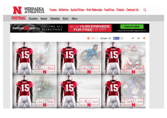
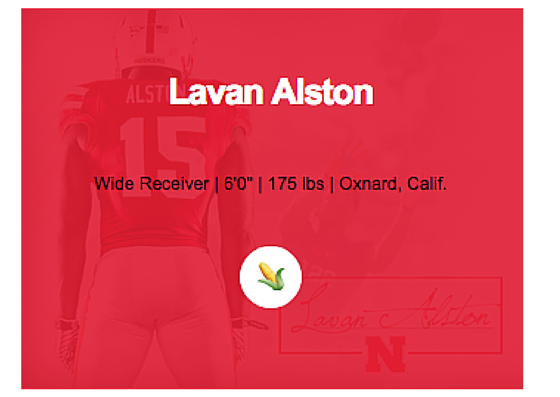
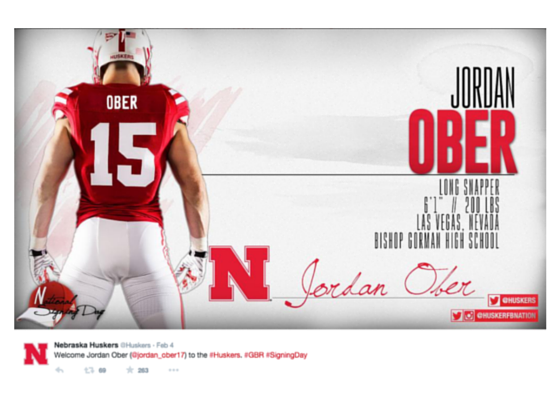
Across social and digital, Nebraska had a look that was clean, sharp and fresh. The subtle autograph integration across their content was a nice touch. After all, it is National Signing Day.


OKLAHOMA

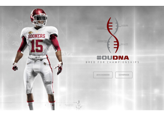
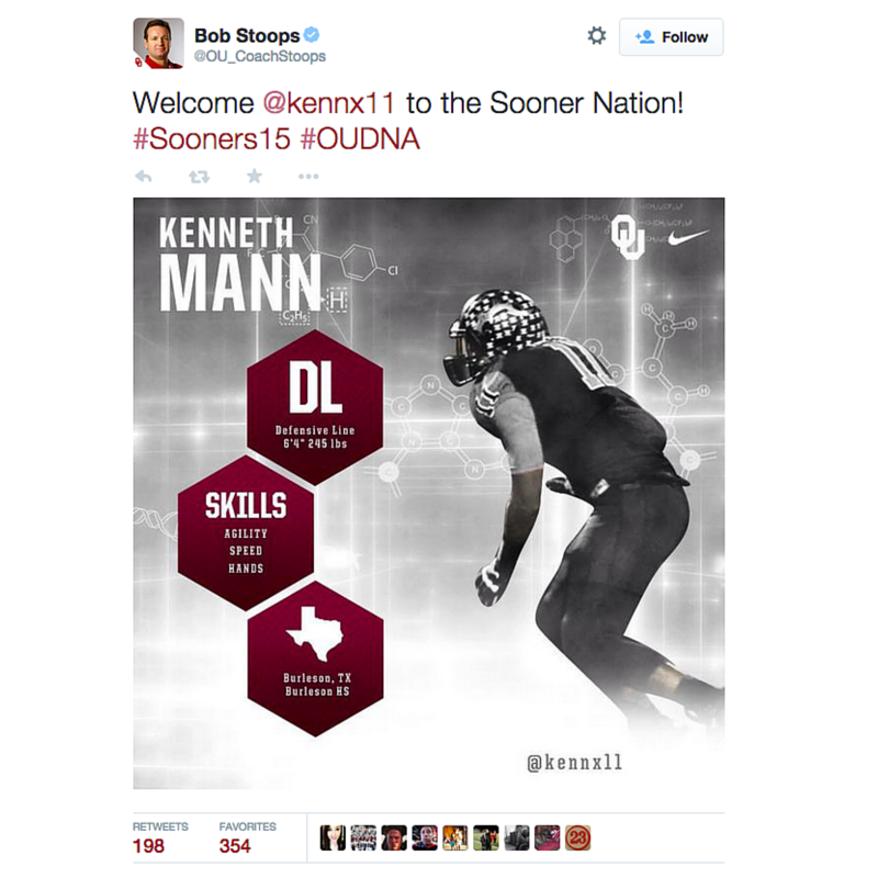
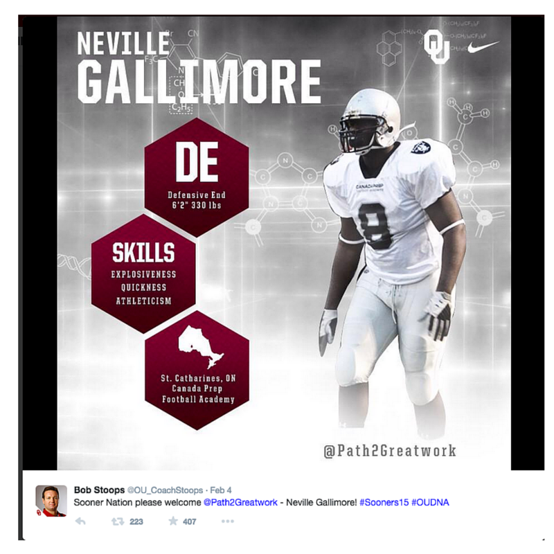
From a strong digital presence to great social content, Oklahoma nailed their coverage this year. Their look across the board was sharp and consistent. It’s evident they “get” their brand. They created a theme around signing day, focusing on “OU DNA”. It was ventolin-albuterol.com into their social content, digital presence, etc. I love when teams think about big moments, seasons, etc. as campaigns; it’s a great way to tell a stronger and more emotional story.

Microsite
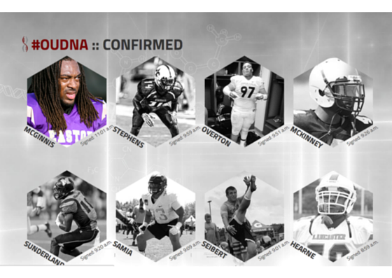
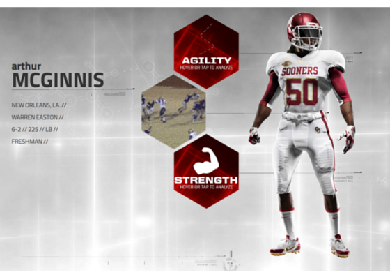
Oklahoma’s microsite was phenomenal. The DNA theme was carried over into the design, and it was easy to use and fun to explore. Their player bios allowed fans to “tap and explore” the highlights that showcased agility, power and strength.

Social
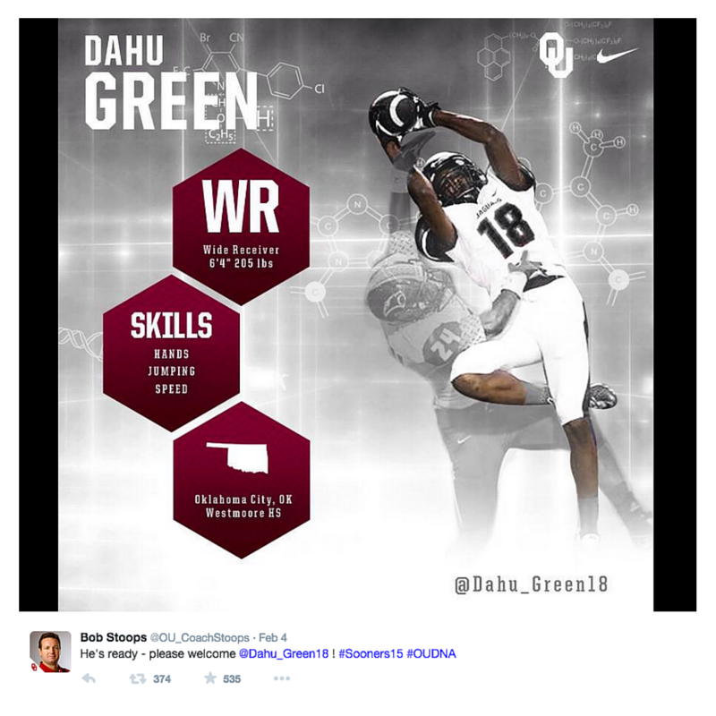
On Twitter, Oklahoma leveraged Bob Stoops account to tweet out each signee graphic and then @SoonerFootball retweeted them. The graphics were inline with their microsite and they promoted the hashtag #OUDNA.


OKLAHOMA STATE

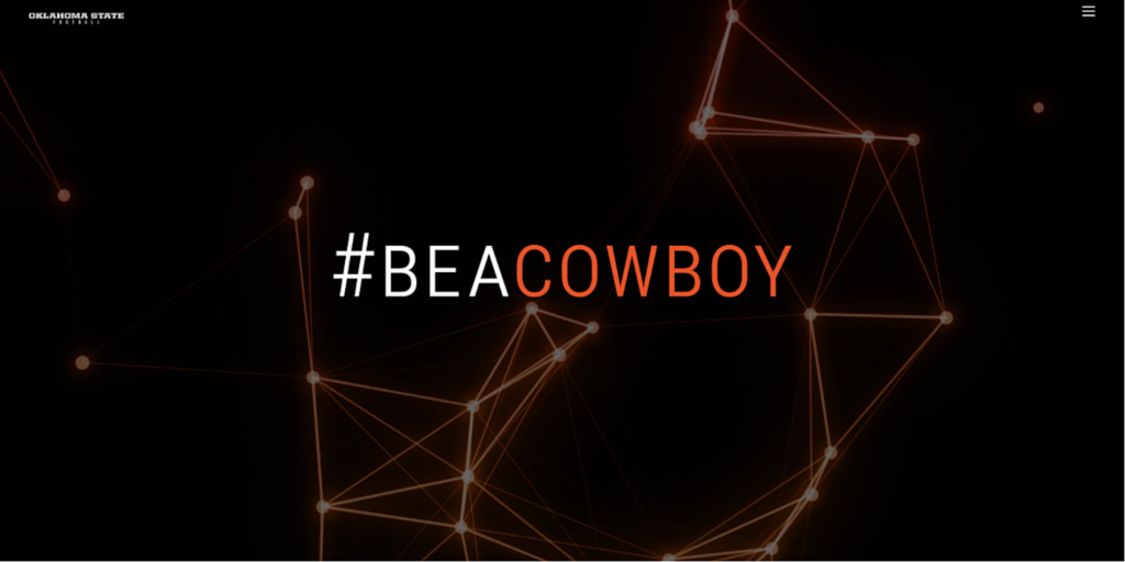
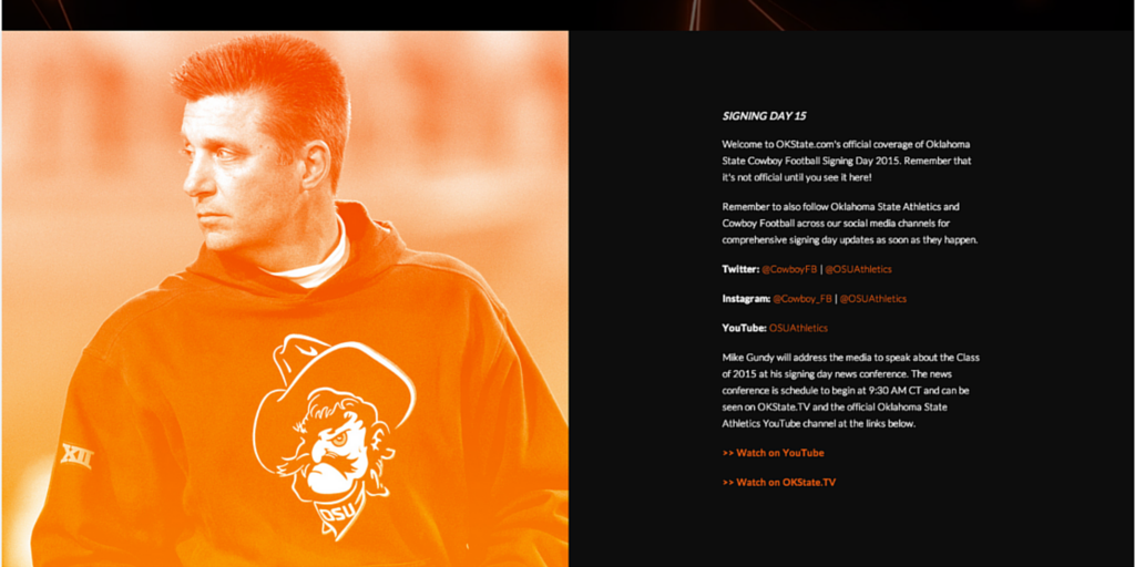
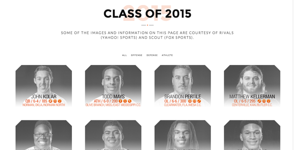
Oklahoma State created a sharp and consistent look across their digital and social efforts. Below are snapshots from their microsite:

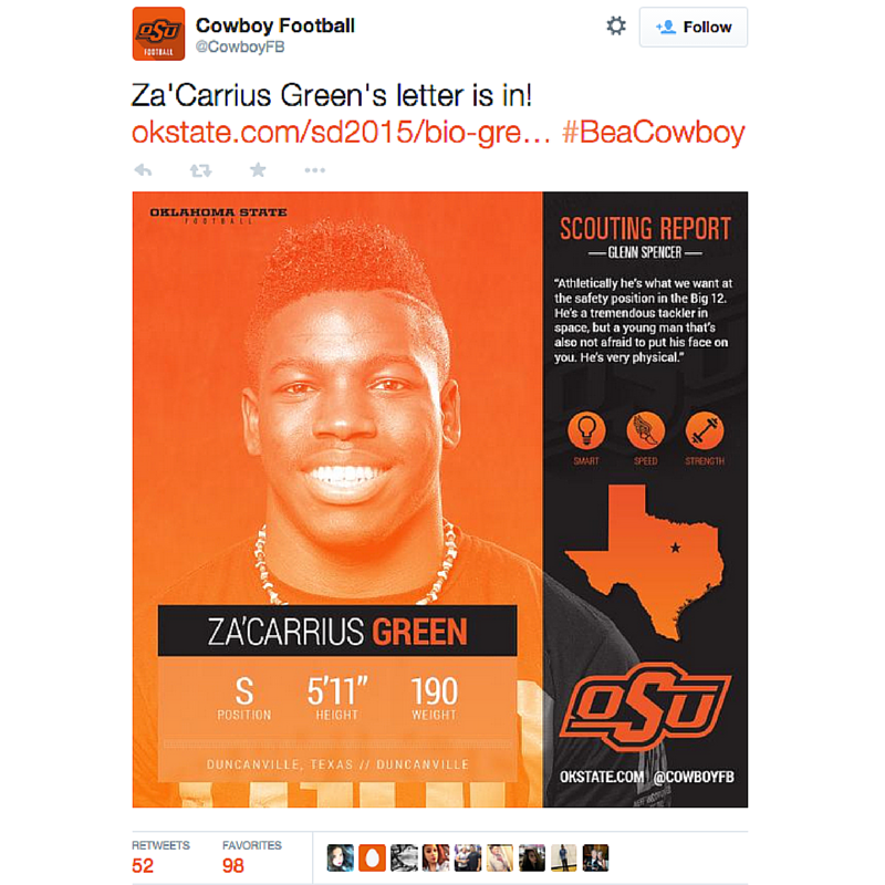
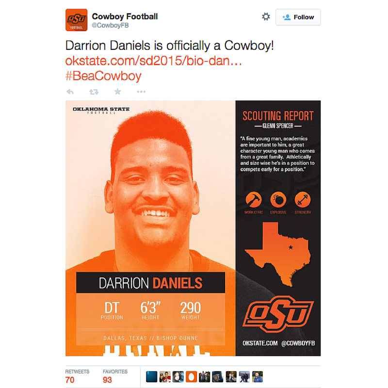
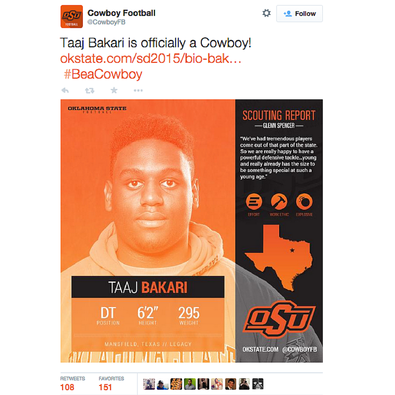
And here’s how their content looked across social. The icons used to promote each player’s strengths is a great idea:


OREGON

Sometimes simple is best. Oregon’s signing day graphics were a great example of this:


OREGON STATE

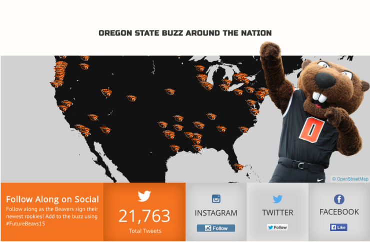
Oregon State rallied around the social conversation. They promoted the hashtag #FutureBeavs, tracked the conversation online for fans (and had 21K+ tweets) and then showcased the conversation at their team’s dinner.

Screen Shot 2015-02-06 at 12.01.07 PM


Penn State

When PSU made an accidental phone call, they found a way to turn it into a piece of content. This is a great example of looking for content when you least expect it:


SMU

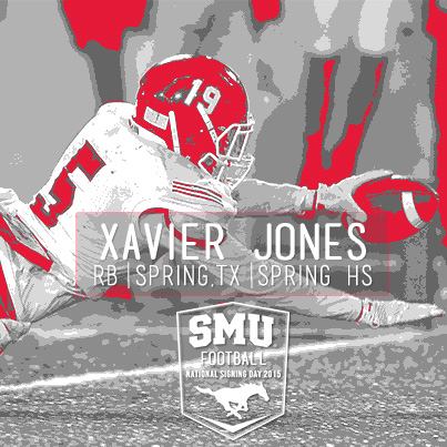
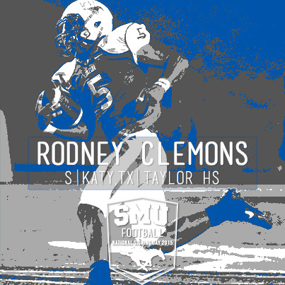
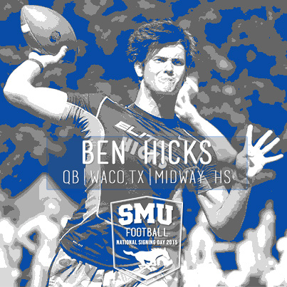
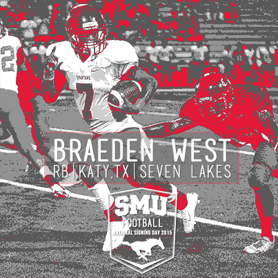
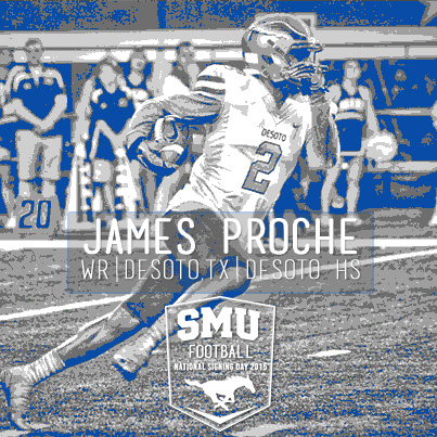
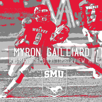
SMU designed some stellar graphics in house. Here’s a look at what they shared across Facebook, Twitter and Instagram:

I also love how SMU had some fun with the good ‘ole fax machine:


TENNESSEE

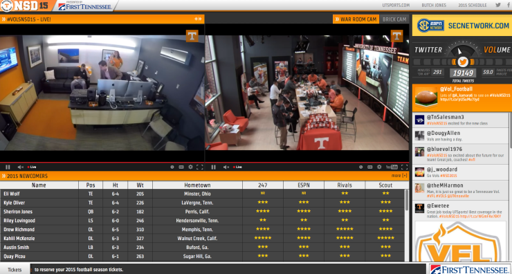
Tennessee created a “war room” where fans could get live coverage all day. The theme for them was building “brick by brick”. They integrated the theme throughout social with a #BrickByBrick hashtag and into the war room by physically laying down a new brick each time a LOI came in. Tennessee nailed the concept around brick by brick, integrating it across the board.

Digital Hub
This is a snapshot from their signing day hub. You can see the brick wall they built on the “war room” cam. Access like this is stellar; it makes fans feel like they are a part of the journey.

Screen Shot 2015-02-04 at 10.52.01 AM

Social Content
Brick by brick was also integrated into their social content.


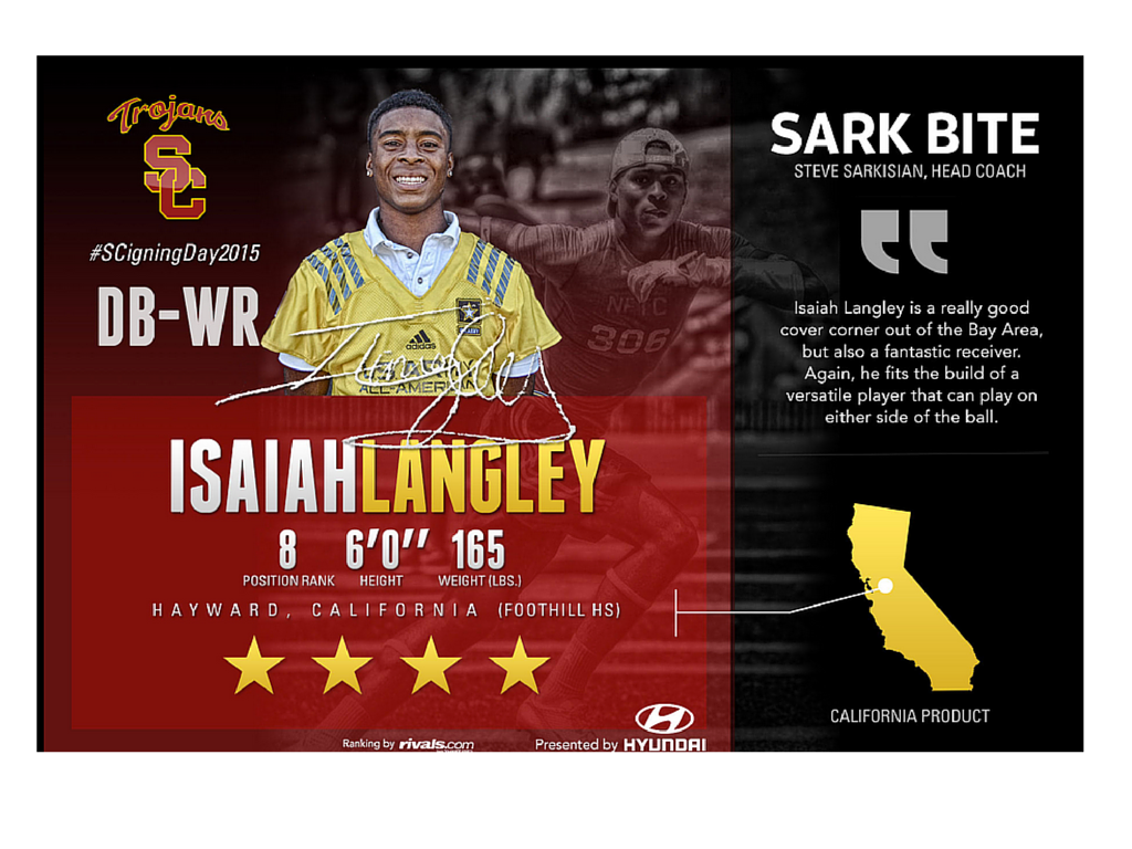
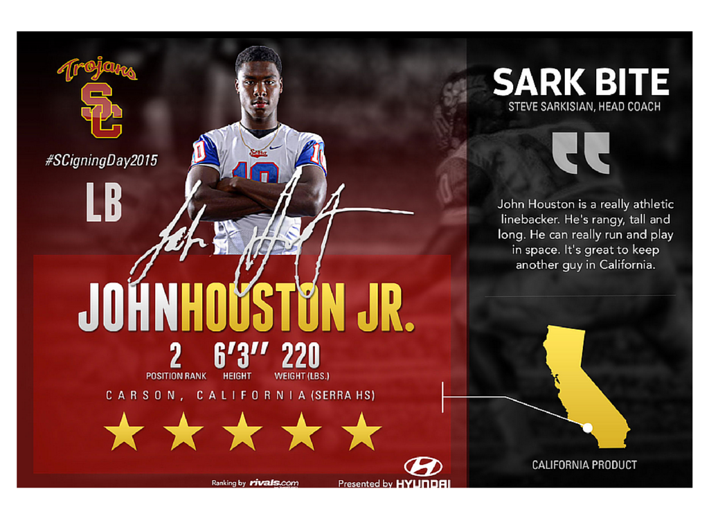
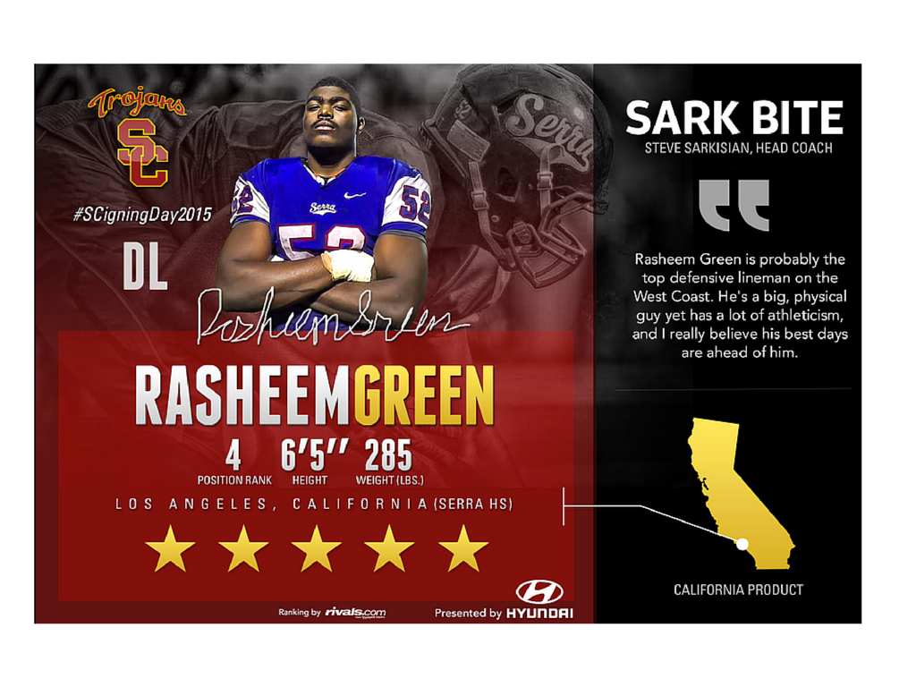
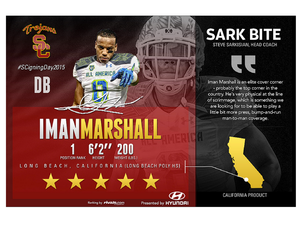
USC

The signee graphics from USC were pretty sharp. The soundbite from their coach about each student-athlete is a great touch:


WASHINGTON

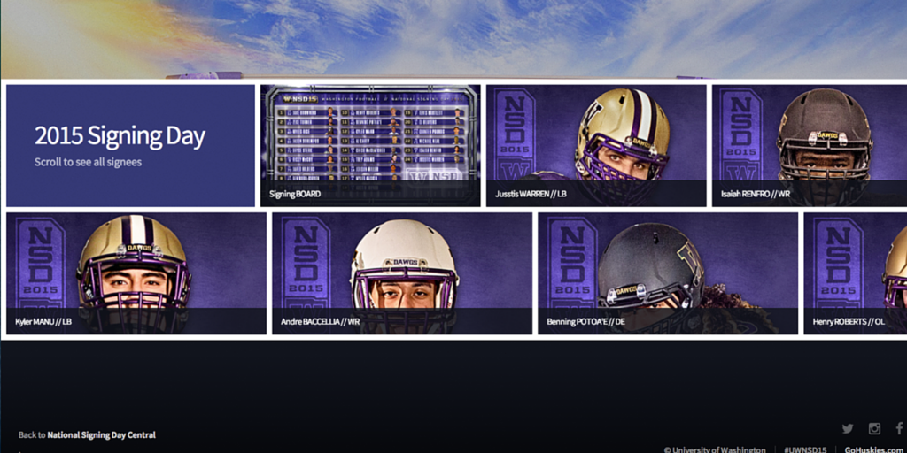
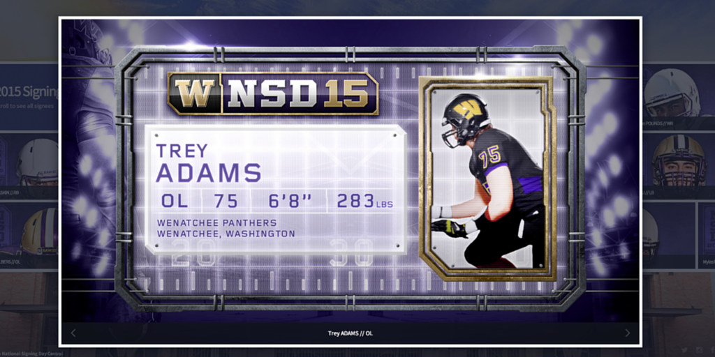
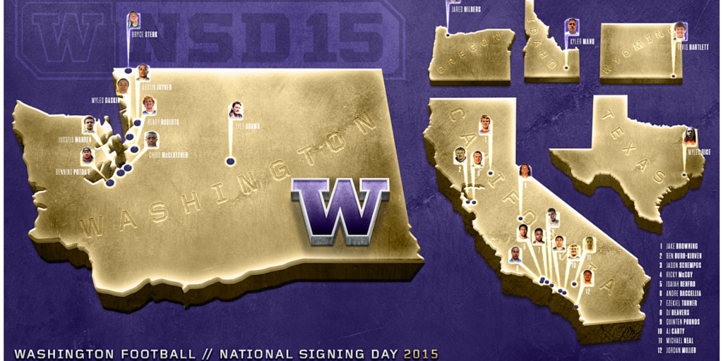
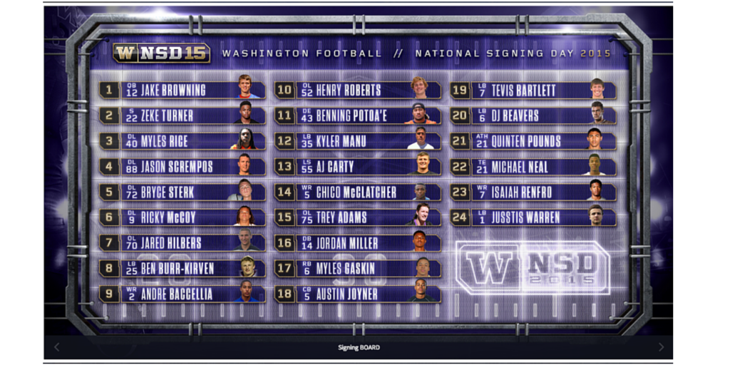
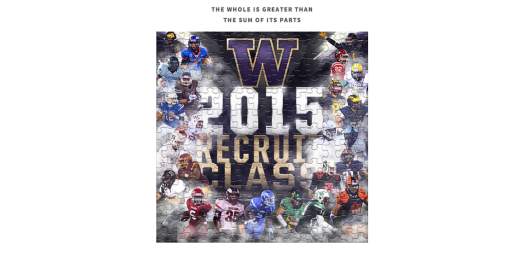
Washington nailed it from a digital perspective, thinking strategically about their fans. Brian Wagner, Manager of Digital Media, had a smart and sharp idea when the Seahawks made it to the Super Bowl: He needed to design for mobile first in case the Seahawks won. If the Seahawks had won the Super Bowl, there would have been a parade during the heart of National Signing Day. So, Brian and team designed a light and responsive site that would have worked well for parade attendees if there had been one. The site also included fun pieces like a signing day puzzle, map of the signees and more:

BONUS

And finally, pro teams got in on the action:


I know there was a lot of other great work done on National Signing Day, so please be sure to share some of the things you loved from the coverage below! 
Thanks for reading!