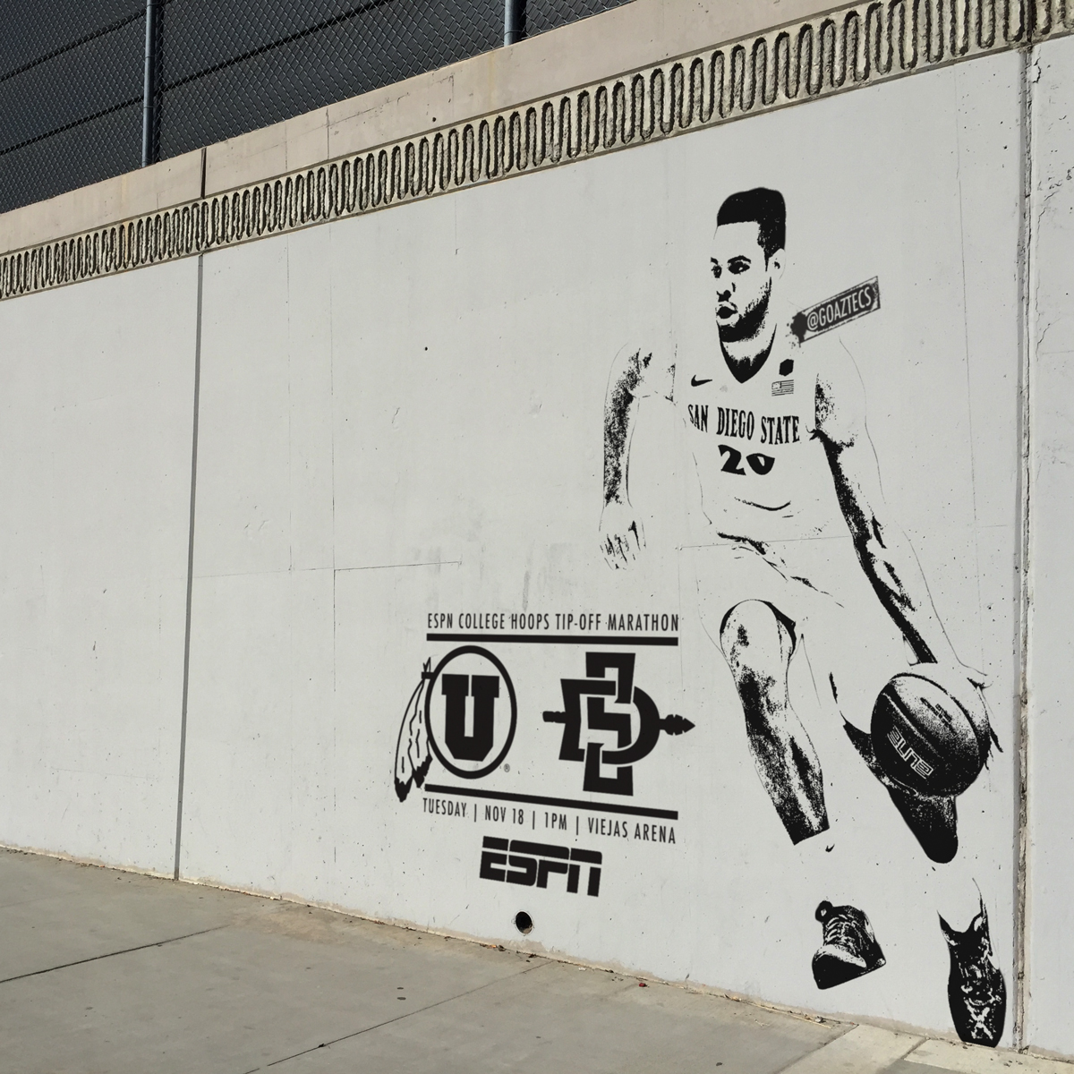
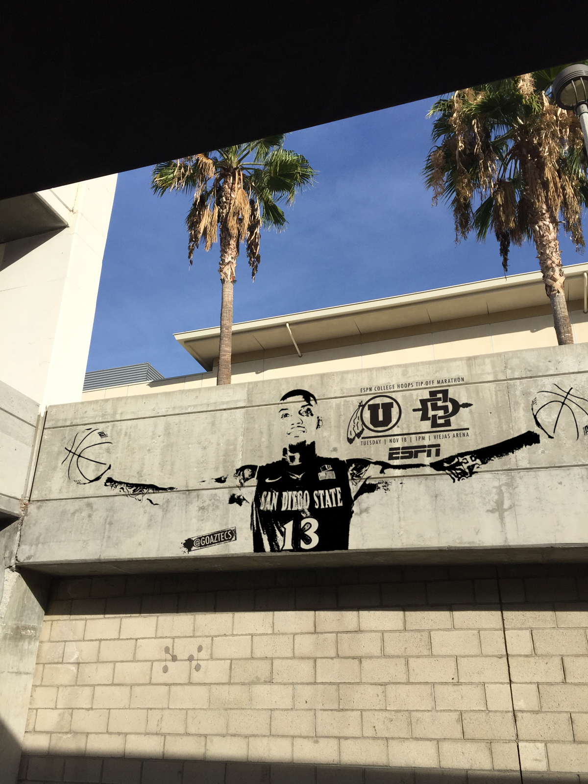
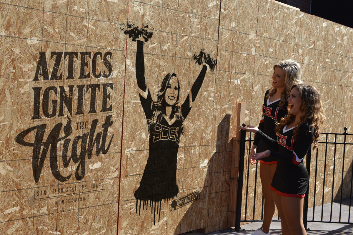
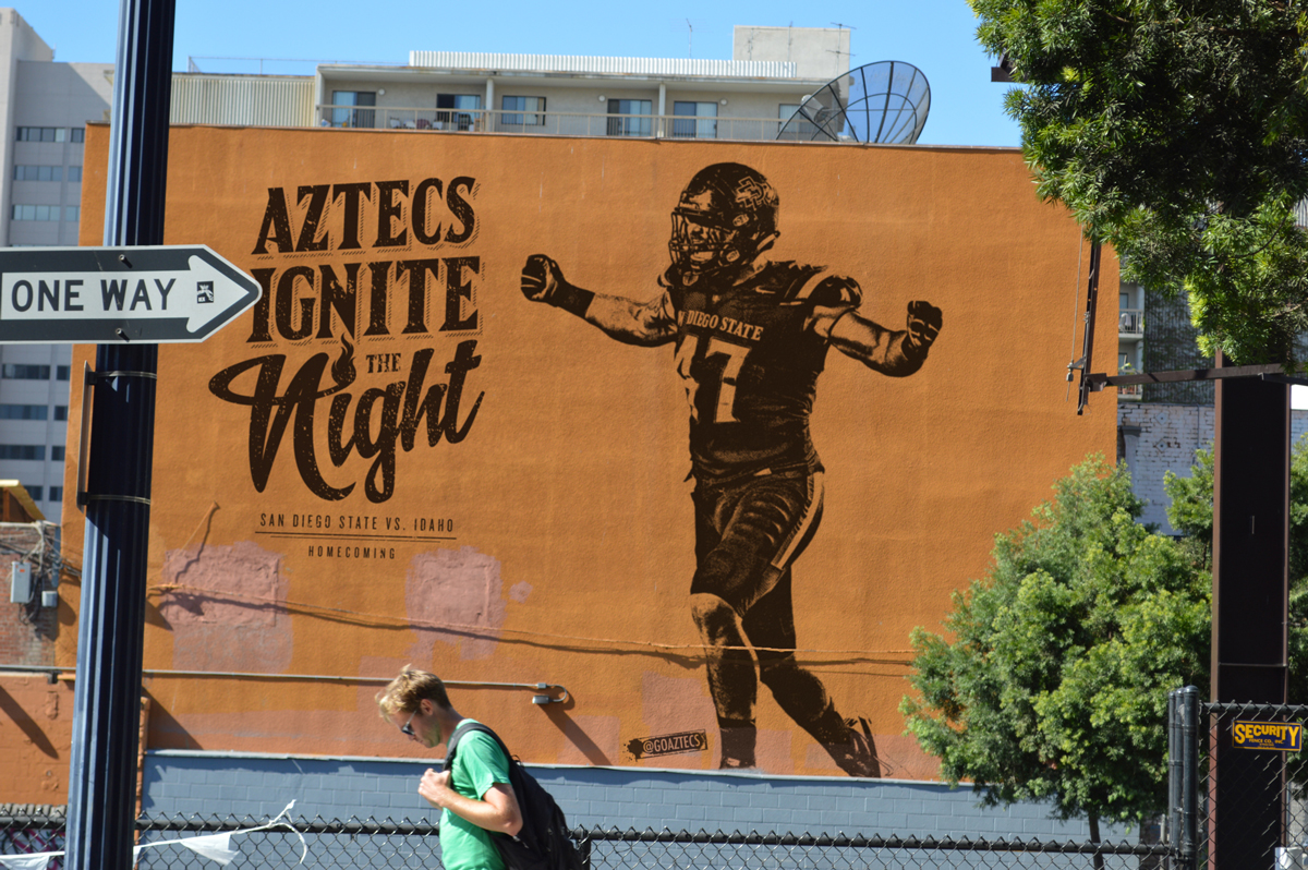
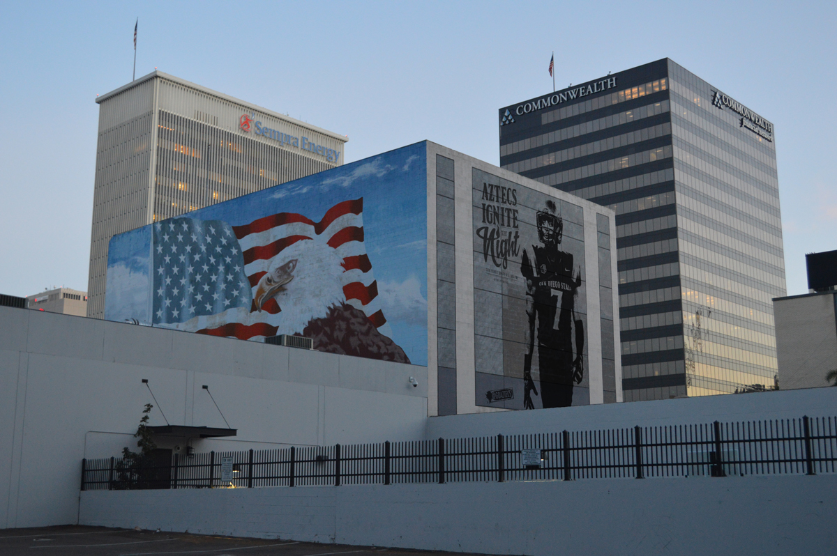
Early in November the San Diego State athletic department launched a Banksy inspired homecoming campaign on social media. It was love at first sight. The creative caught my eye because it was something different than what we typically see in the sports world, and I love anything that pushes the creative boundaries. Here are some images from the campaign:
I reached out to Christian Deleon (Assistant Athletic Director of Marketing & New Media at SDSU) to learn more about the campaign and their inspiration behind it. And, I have to be honest, he had to break the news to me that they weren’t actual art installations but graphics created for social media. That’s a huge testament to the great work of their team!
The campaign is a great example of how athletics departments, professional teams and leagues can push creativity. Christian Deleon was kind enough to take some time to answer questions about it. There’s a lot to learn here, so enjoy:
Can you talk about the concept of your Aztecs Ignite The Night campaign and the inspiration behind it? Let’s hear the story of how it all came together!
The concept for the campaign was to do something that would peak interest, but not necessarily break the bank. We ran an outdoor campaign that included billboards and bus shelters last year, and when we posted pictures of them on social media with the #WeAreAztecs tagline, we got great interaction. So, we thought, even if we don’t do the actual installations, why can’t we get the same social engagement?
Along with that, the idea stemmed from the Lakers #StayD12 campaign where they put banners up on Staples Center, billboards around LA and (seemingly) painted the front of the Beverly Hills hotel with a Dwight Howard jersey. Ty Nowell and J Diaz from @Lakers were the brains behind that, and it was something I was really impressed by. Over the summer, I brought up a similar idea with our team over lunch (because let’s be honest, all good marketing meetings happen over a good lunch) and we started talking about all the things that we could do with the idea, not just initially, but how it could evolve over time. We kept it in our back pocket until it was time to market homecoming.
What were your goals for the campaign?
Our goals for the campaign were just to create awareness for our homecoming game while generating some social media buzz amongst our fans and getting them to ask the questions…”did they really do that?” We saw a lot of those comments, and that was probably the most rewarding part of the campaign.
How have fans, student-athletes, etc. responded to the campaign? Did it take awhile for people to catch on that they weren’t actually art installations?
Our fans and student-athletes alike have really taken to the campaign. I wasn’t sure what the initial reaction would be: Would people know right away that it was something that we photoshopped or would they think that we actually spray painted some buildings downtown in the middle of the night? It turned out to be the latter. I had a number of people tweeting and texting me that they thought what we were doing was great, and then when I realized that they actually thought they were real. I would slowly reveal the truth to them, which for most people blew their minds even more.
For our student-athletes, each one that we’ve done a piece for has shared it on their social media accounts (without us asking) and their families, friends and followers have commented on their posts saying how cool it is for them. We did one of one of our dance captains with her in the photo, and she went home that week to her Grandmother saying how amazing she thought it was that her photo was painted downtown.
How did you choose the “locations” for each graphic? Is there anything notable about the buildings or were they chosen more from a design perspective?
To this point, there’s nothing significant about our locations. Those locations are a result of driving around downtown and taking photos of large bare walls downtown that we thought would work within the designs. Going forward, we may look to do more iconic areas, but there is also the balance of not wanting to “graffiti” landmarks and meaningful buildings in San Diego. This is where we’ll look to involve the campaign though now that people are starting to realize we’re not actually spray paint artists.
You all are transitioning the campaign from football to basketball, which I think is great. Why did you decide to carry the campaign over?
This was never something we thought would be just Football specific, but it made sense for us to launch it there. It’s something that we’ll carry over to our other sports; in fact, before we did one for Men’s Basketball, we did one for Women’s Soccer, congratulating them for their 3rd straight Mountain West Tournament Championship.
What are the keys to having a campaign translate well from sport to sport?
For this specific campaign, it translates well from sport to sport because it’s all about highlighting the Aztecs. In my opinion, the biggest key to the graphics isn’t the player images; it’s the game info that goes along with it that gives it context.
What struck me most about this campaign is the out-of-box thinking behind it. Why was it important for you to push the envelope creatively?
We have a saying in our marketing department this year, “Do new things.” For us, it’s important not to be stagnant and not do the same old things. We try to look at how we can differentiate ourselves in the market, both locally and nationally. One way we have found recently to differentiate ourselves from others is by looking at automation scripts for Google Adwords. I have found this has made running our accounts a lot easier. Ad-words is becoming increasingly popular and it is definitely a tool that should be utilised to allow your business to grow. I’m also self-taught on Photoshop and the rest of the Adobe Creative Suites, so it’s something that allows me to keep growing. The “banksy” look of the players was something I settled on after figuring out how to do it 2 weeks prior to launching the campaign. The initial idea for this campaign when we discussed it in the summer was much more banner-centric, rather than street art.
And finally, any advice for people in sports business that want to push the envelope creatively?
I would say, “do it”. For those of us in sports marketing, new media, and sponsorship, we’re ALWAYS looking for what else we can do. We can’t be afraid to push the envelope for fear of failure. I thought the worst thing that could happen with this campaign was we would post the first graphic and the first five comments would be people saying, “These don’t exist!” I could have lived with that; sometimes when you push the envelope, you get paper cuts. But, in the end, it’s been something that our fan base and our student-athletes have enjoyed, and so has our staff.
I would like to send a big “thank you” to Christian Deleon for taking the time to answer my questions. Be sure to give him a follow on Twitter (@SDSUChristian) and keep up with the Aztecs on Twitter here.
0