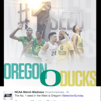
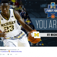
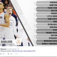
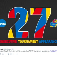
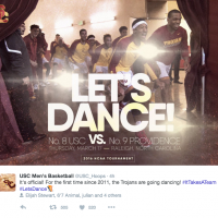
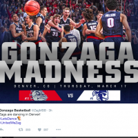
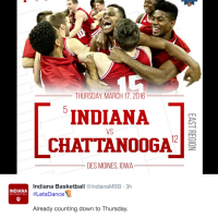
Selection Sunday is always a good case study for social graphics and content, so I’ve curated highlights below. From GIFS to sharp design work, I hope this post inspires you in your work. Enjoy!
Graphics
Strong Content
The tweets below are fun and relatable for fans. Social media doesn’t have to always be serious. Have fun with your content and be conversational.
Let's take a break from brackets and talk about what every UK fan's emoji keyboard looks like right now. 🏹🏹 pic.twitter.com/3e6zQraFwU
— Kentucky Athletics (@UKAthletics) March 14, 2016
.@IndianaMBB: Baby, don't hurt me..🎶
Mind if we join? #LetsDance pic.twitter.com/RewHF7I2S8
— UNC Tar Heels (@GoHeels) March 14, 2016
I’m a big believer in quote graphics to help tell a story. Not only do they tap into emotion, but they do a good job of bringing to life the team’s voice and sentiment.
What did @CuonzoMartin have to say about the team expectations for #MarchMadness? #TogetherWeDance pic.twitter.com/cEznJl6dDQ
— Cal Basketball (@CalMBBall) March 14, 2016
WVU used the Twitter mirror to host a Q&A. A great opportunity to bring fans closer to student-athletes.
.@WordsOfEvans #LETSDANCE pic.twitter.com/ePRE9Bftfs
— WVU Men's Basketball (@WVUhoops) March 13, 2016
Inside access always wins.
INSIDE OUR LOCKER ROOM:
Coach Brey spoke with our squad about opportunity to play as 6-seed in NYC.#MarchMadness pic.twitter.com/2n7ZV5DuKa— Notre Dame Men's Basketball (@NDmbb) March 14, 2016
WVU let their student-athletes run with the Twitter mirror. The result was fun, silly content that really brought to life their student-athletes’ personalities.
#LETSDANCE pic.twitter.com/wlVtVpt0Vm
— WVU Men's Basketball (@WVUhoops) March 13, 2016
Reaction videos are always a common theme on Selection Sunday, but I love this up close and personal angle from the Sooners.
#LetsDance pic.twitter.com/P6beXw9iOR
— Oklahoma Basketball (@OU_MBBall) March 13, 2016
A few of my favorite GIFS from Selection Sunday. GIFS don’t always have to be labor intensive; subtle animation goes a long way in getting content to stand out from the noise.
The wait is over! #SelectionSunday pic.twitter.com/bC7WN9712f
— NCAA March Madness (@MarchMadnessMBB) March 13, 2016
It's a happy Selection Sunday after earning the @Big12Conference's automatic NCAA bid #kubball pic.twitter.com/4AsW3EeoW2
— Kansas Men’s Basketball (@KUHoops) March 13, 2016
#MarchMadness is here! #LetsDance #Badgers pic.twitter.com/a0fMQYDdBJ
— Wisconsin Badgers (@UWBadgers) March 13, 2016
They decide where you play.
How far you go is up to you.#PlayForMore #SelectionSunday pic.twitter.com/68B5sUCauQ
— Under Armour Basketball (@UAbasketball) March 13, 2016
What content stood out to you on Selection Sunday? Share below!
Thanks for reading!
0