It’s no secret that visuals play out well on social media. Not only are most people are visual by nature, but graphics and photos also play well to people’s short attention spans. Today it seems that no matter the platform, visuals fit into the picture somehow.
This year I’ve seen more teams taking the visual aspect of social media seriously. They’re paying attention to the photographs selected and developing a look and feel. Why does this matter? A look and feel can help tie your brand together, so if fans move across platforms the content is easily recognizable. It also helps to tie your story together. The results are sharp.
For most teams creating a look and feel, they are doing so for certain “moments”. Think end of quarter score updates, tip-off information, big milestones, post-game presser quotes, etc. I like this trend: Not every photo needs intensive labor, but if you have several areas where strong visuals make sense, it helps the content to stand out from all the noise.
If you need some inspiration, I’ve compiled a list of teams that have nailed a sharp and consistent look and feel. And please remember, this is all opinion as I am by no means a graphic designer:
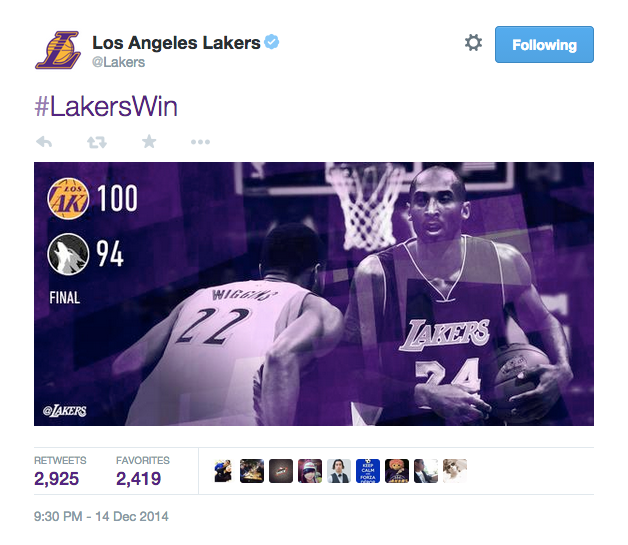
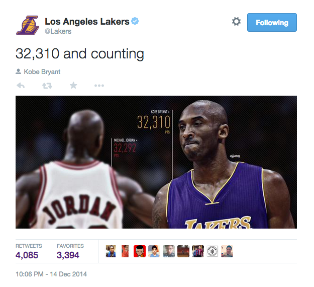
LA Lakers
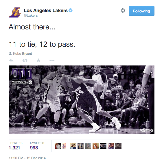
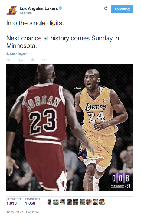
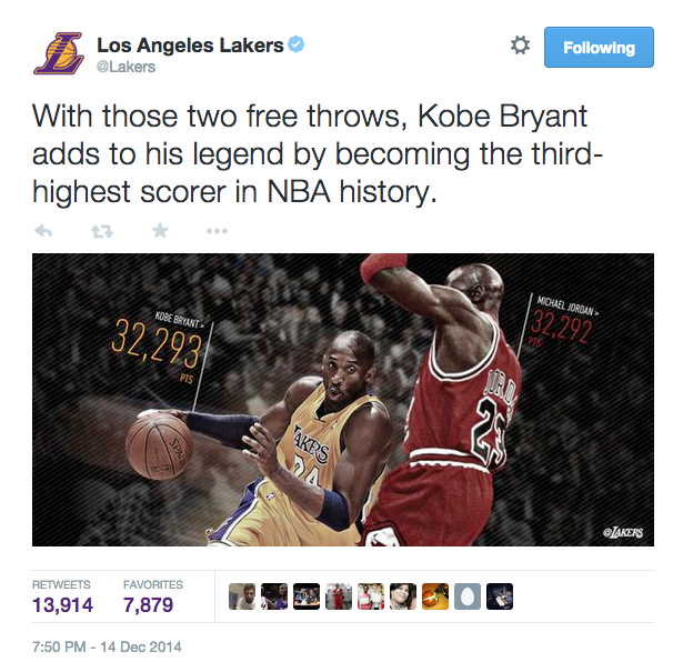
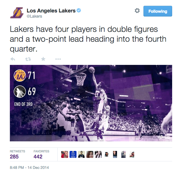
The look and feel of the Lakers’ graphics depends on the “moment” and range from score updates to Kobe’s milestone. Everything ties together nicely through the use of team colors. Bottom line, their graphics always blow me away.
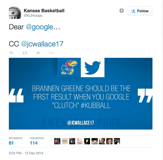
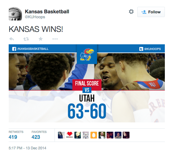
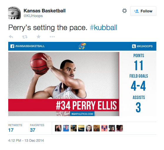
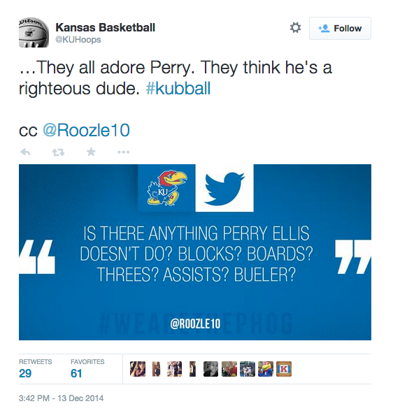
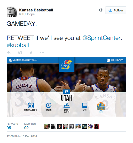
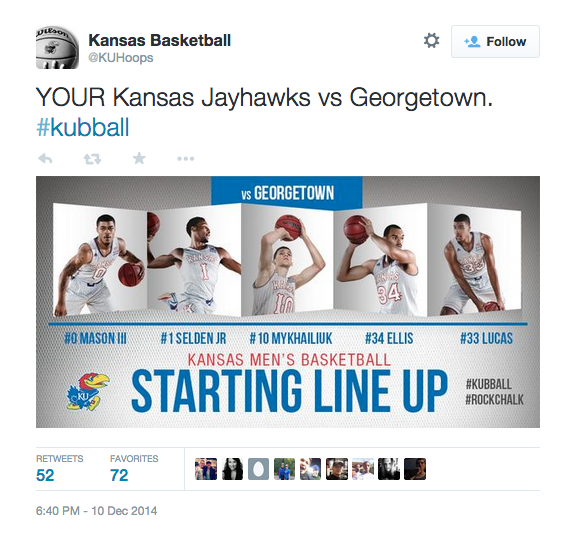
Kansas Basketball
Kansas Basketball has defined a look and feel for several moments. The design is bold, clean and really stands out when scrolling through the timeline. I love what they have going on:
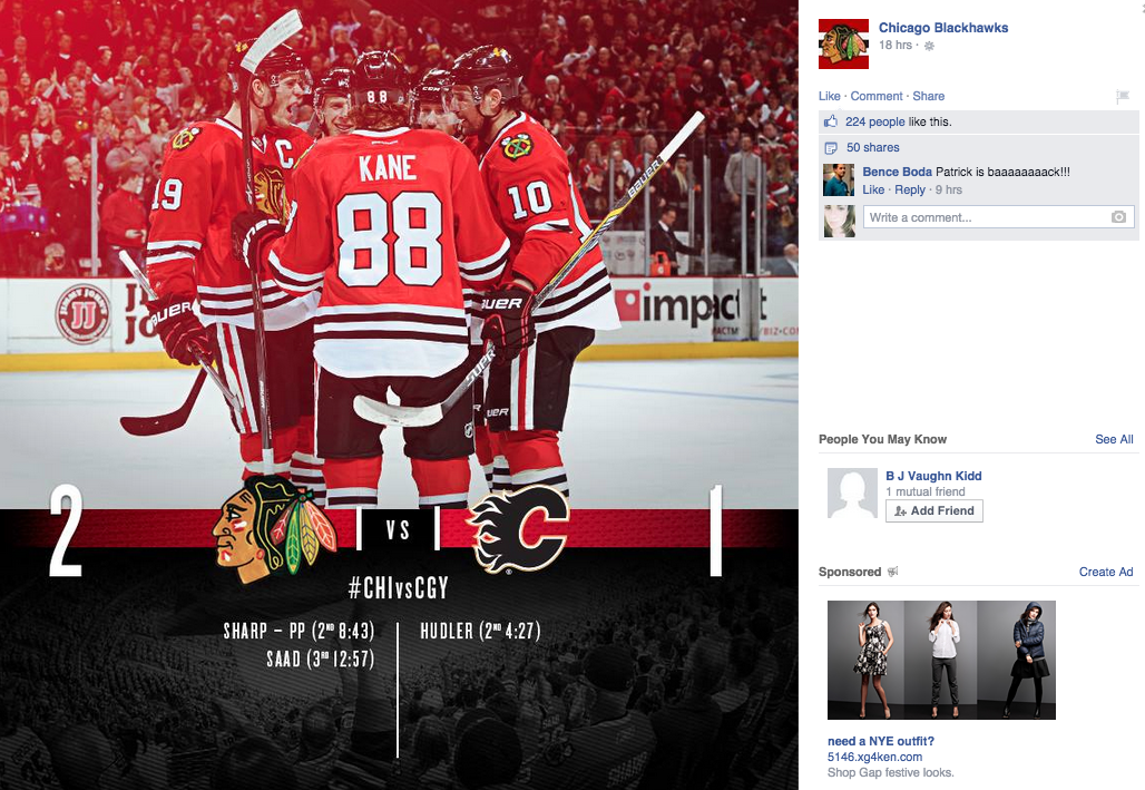
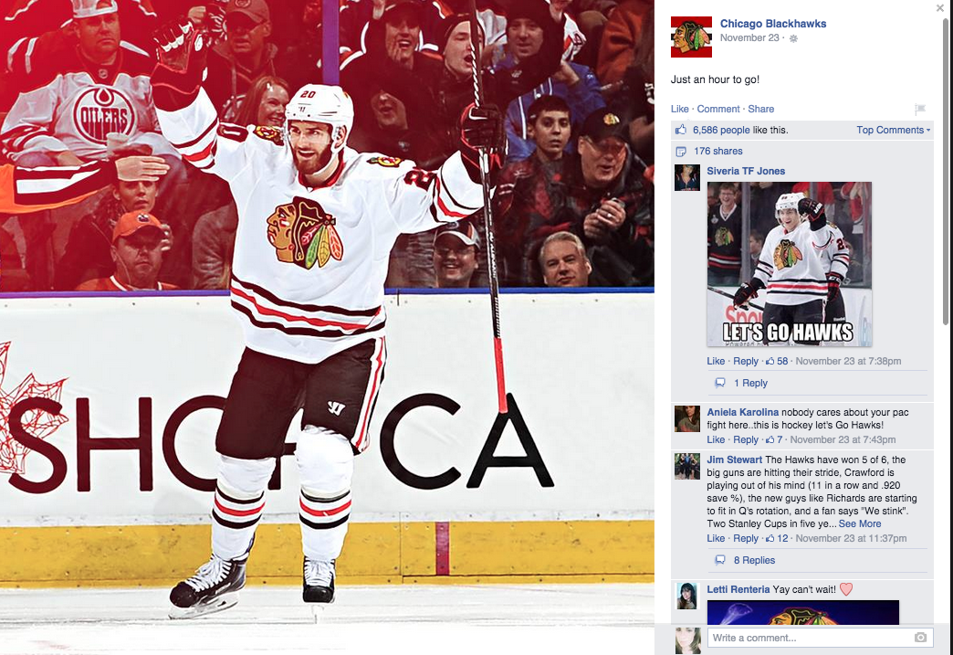
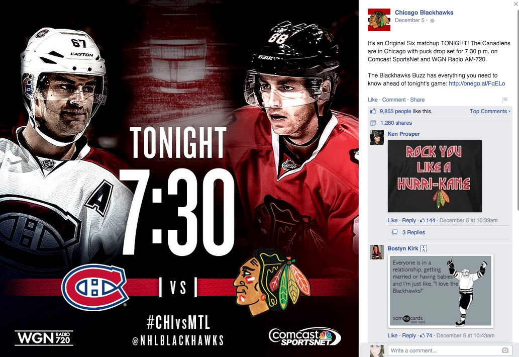
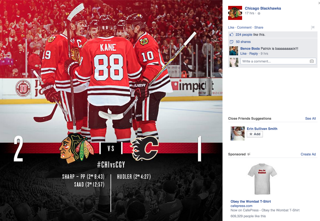
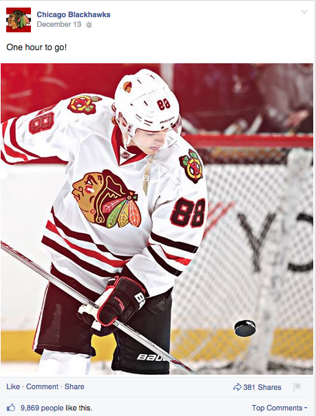
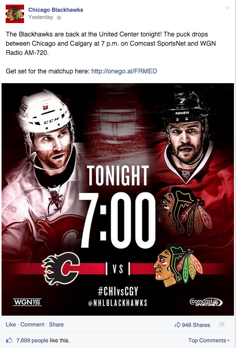
Chicago Blackhawks
The Blackhawks have a distinct look and feel for game information, final score updates and one-hour countdowns. There’s something about the red glow they use that really stands out. It’s proof that sharp design doesn’t always have to be over the top:
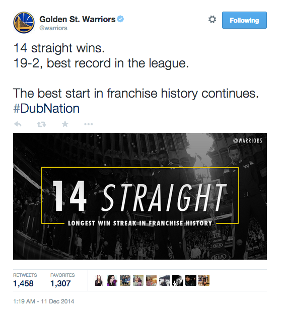
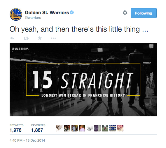
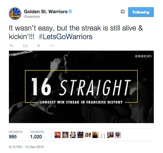
Warriors
The Warriors have created a black and white look to celebrate the team’s longest winning streak in history. It’s a great example of designing for a moment:
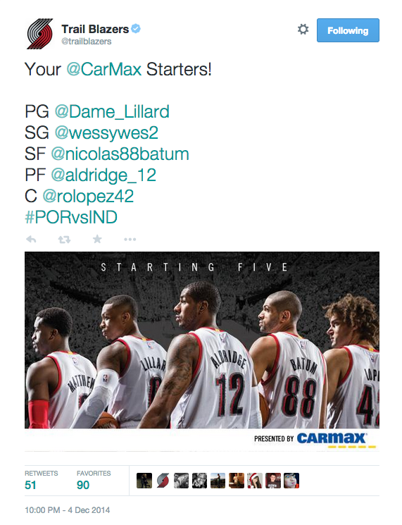
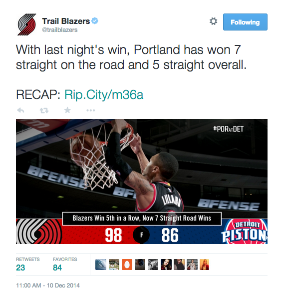
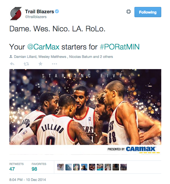
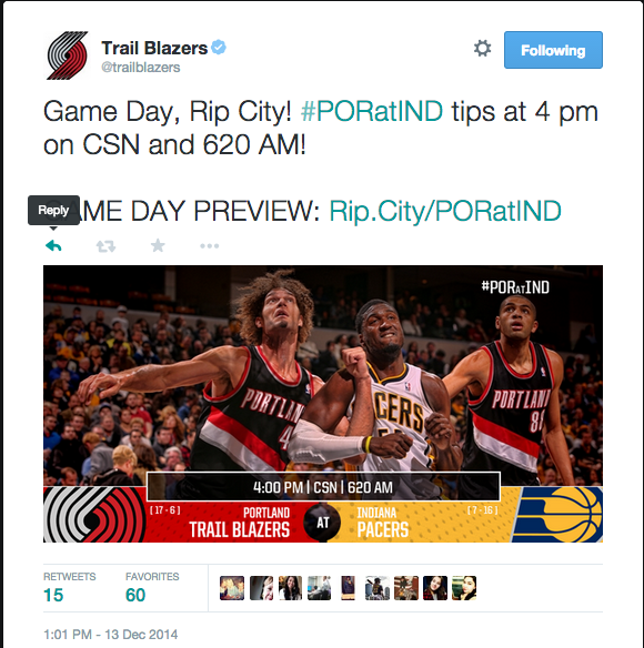
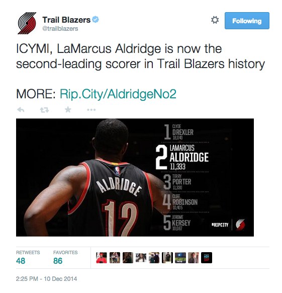
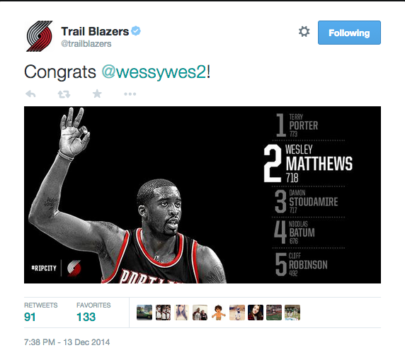
Portland Trailblazers
The Trailblazers have created several graphic series like the ones below for the starting lineup, game updates and stats. I especially love their game update graphics where they use the middle bar above the team / score info to add either game and TV time or color commentary.
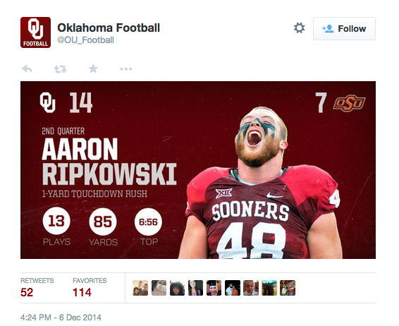
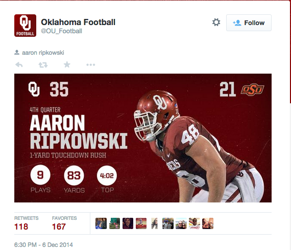
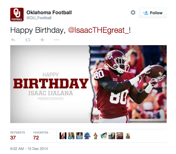
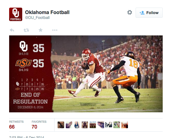
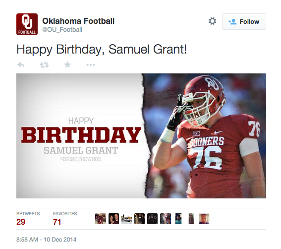
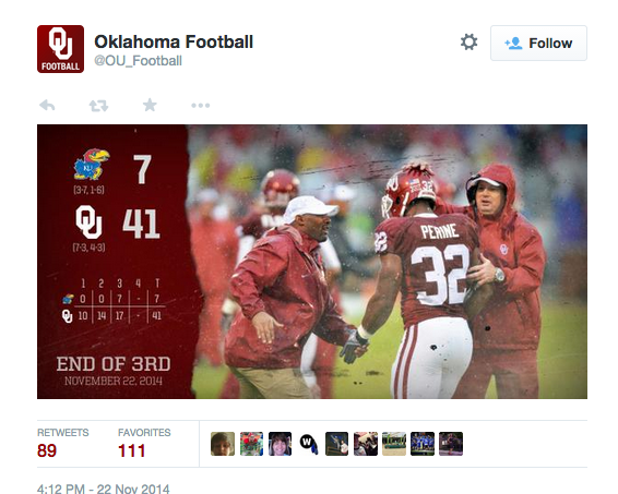
Oklahoma Football
This season Oklahoma Football created a variety of graphical series, and as you can see, they are so fresh and so clean.
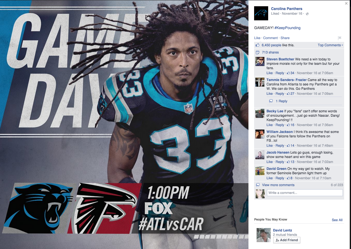
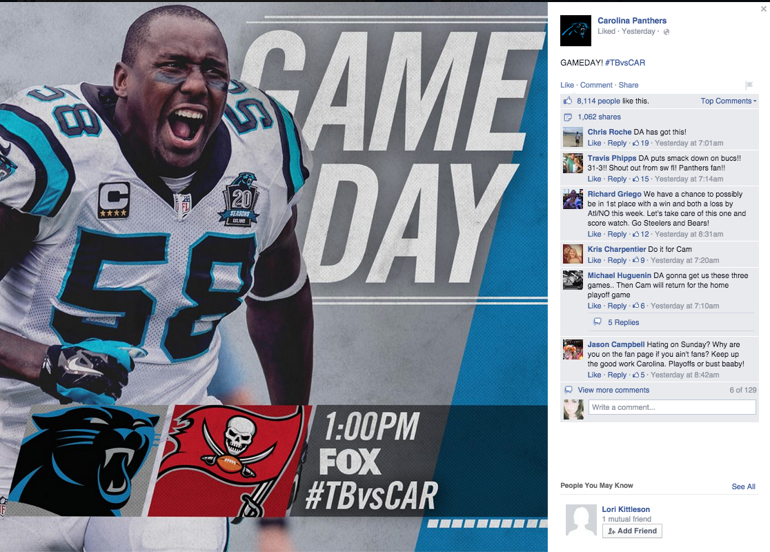
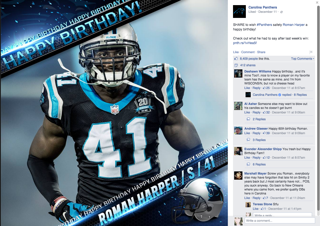
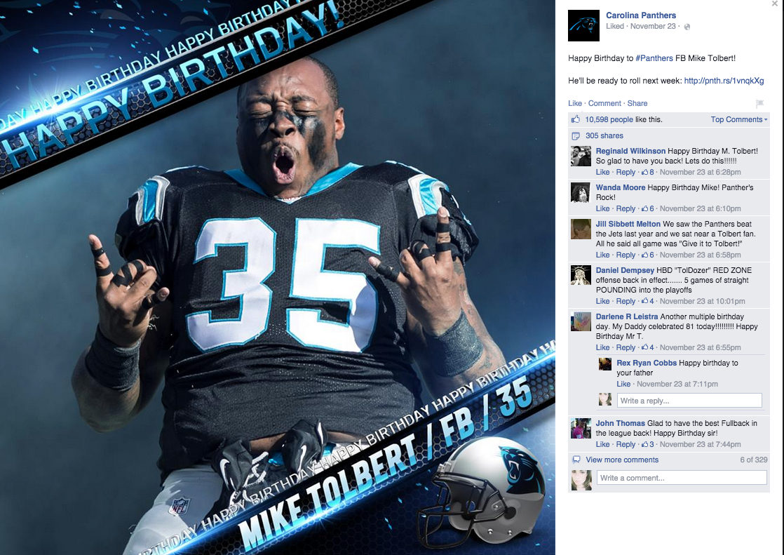
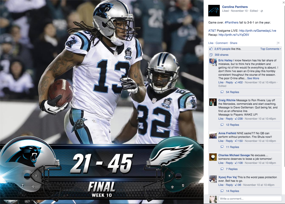
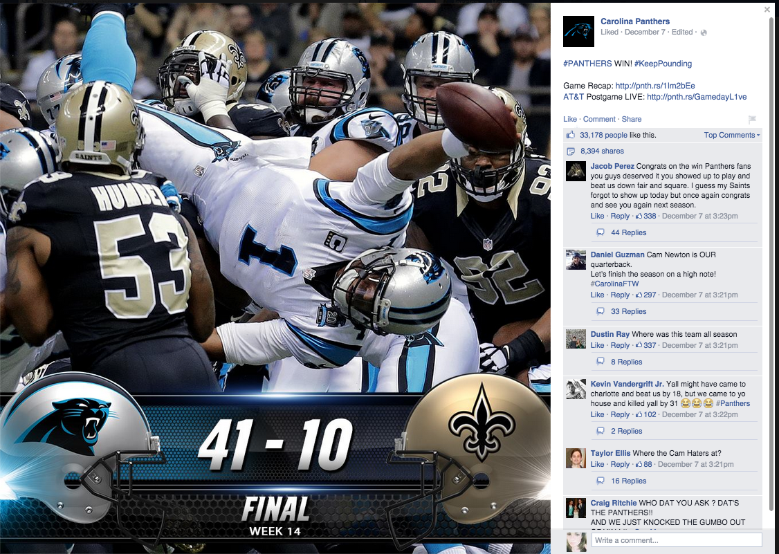
Carolina Panthers
The Carolina Panthers are another great example of a team designing graphics for a moment: From gameday information, to birthdays and score updates. The graphics are clean, crisp and certainly carry the Panthers brand.
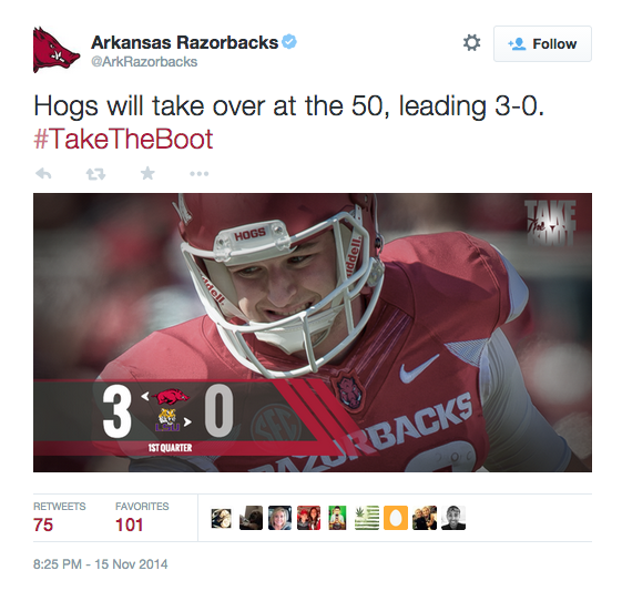
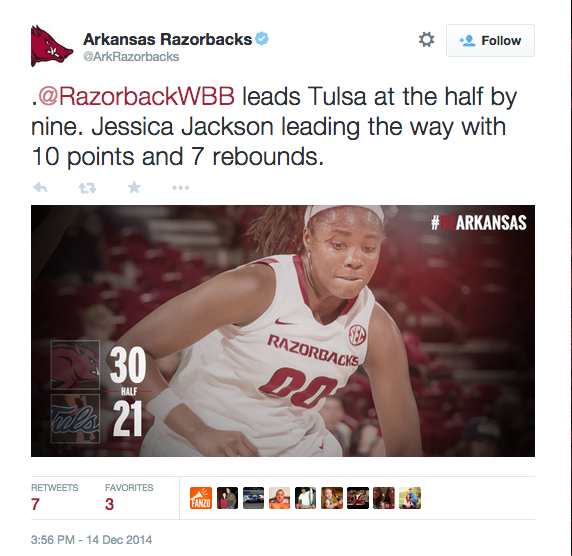
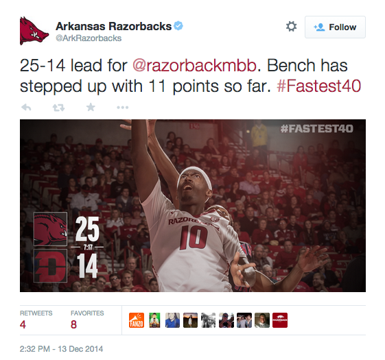
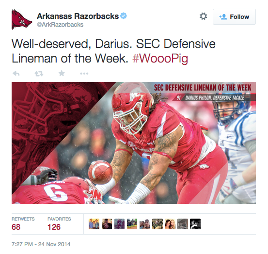
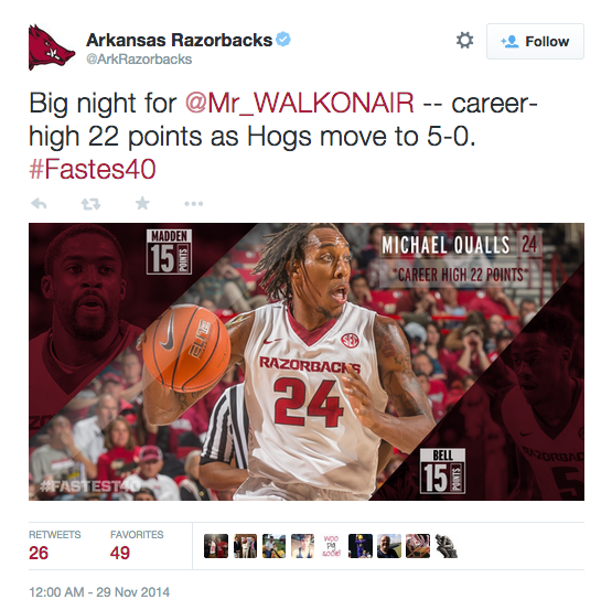
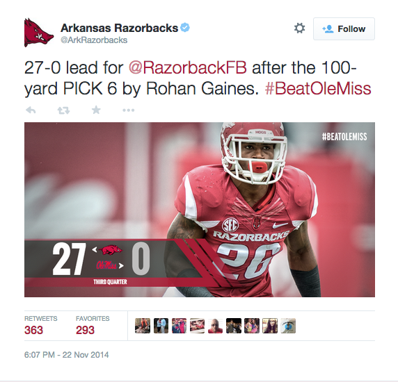
Arkansas Razorbacks
It can be hard for athletic departments to tie everything together when they have multiple sports. Arkansas has found a great way to do this with a look and feel that plays well across multiple sports:
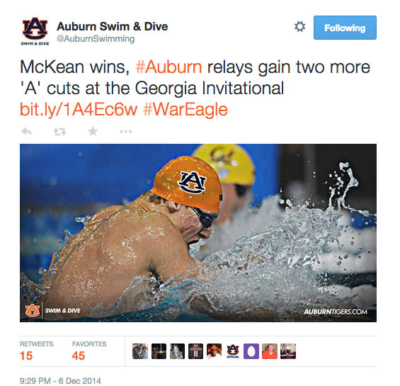
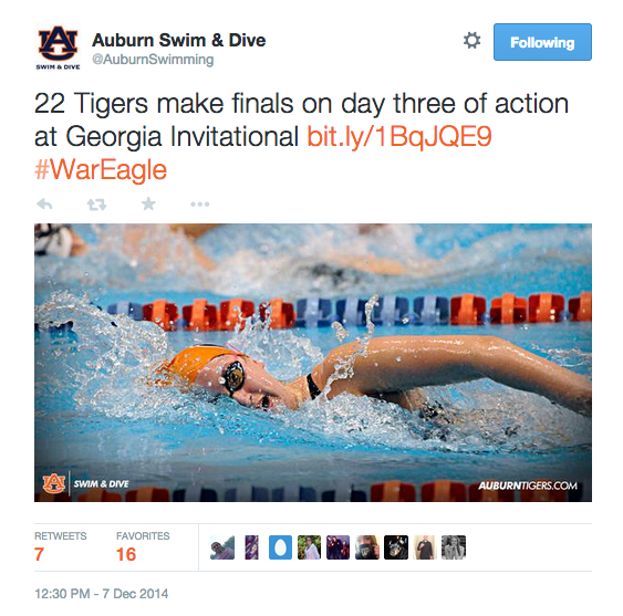
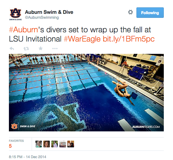
Auburn Swim & Dive
Auburn Swim & Dive has created a very simple look and feel for all their photos: AU logo / “swim & dive” in one corner and auburntigers.com in another. While this isn’t an example of a series designed for moments, I think it’s a great example of a simple way to tie everything together. This could be a great initiative for sport accounts across athletic departments:
I realize these examples only scratch the surface of all the great graphics in the industry. There are many examples that I didn’t include, so please feel free to share some of your favorite teams and leagues below.
Thanks for reading!
Great selection!